This report begins with lots of obvious criticisms but genuinely, this is just the easiest place to start and is certainly not meant to horrible. It then concludes with a range of examples presenting the best technical and aesthetic choices from the current 406 UK FE/6F/AE College VLEs. There will inevitably be some subjectivity involved in the more detailed distinctions but a consistent standard is maintained throughout this and all other tertiary education sectorwide reports. The fundamental principle of these reports, including this one, is adherence to a minimum standard of usercentrism through technical design and operations.
There is an opportunity for nuanced aesthetic and technical analysis but because the overwhelming majority of tertiary education sector websites and VLEs do not achieve the minimum standard, this report only details the most basic issues.
Defining minimum standards of usercentric design is actually pretty straightforward. Asking questions from the perspective of busy, serious, experienced, and visually impaired users begins with the question 'how do I undertake the action I want to complete?'. This then prompts a series of more detailed versions:
How do I ensure participation?
How do I contact somebody to ask about participating?
Where do I participate and how do I get there?
What is the date and time of the activity I am participating in?
How do share my participation?
How do I automatically populate my personal organiser with the details - date, time, location, what I will need to bring - of the activity I am participating in?
How do I access the materials associated with the activity I am participating in?
How do upload my participatory contributions?
How do I engage in public forums with other participants?
How do ensure that differentiated needs are facilitated to enable my participation?
How do I provide feedback on, complain about, or publicise the experience of participating?
Who is organising the participatory activity? And where are their professional biographies and portrait images?
How do I help others to participate?
How do I volunteer to be involved in improving the delivery and the outcomes of participatory activities?
How do I access data on the participation delivery and outcomes generally and specifically about individual participants?
What complimentary activities run by other organisations and additional activities run by the same organiser do you suggest I participate in?
Are there any questions that are missing?
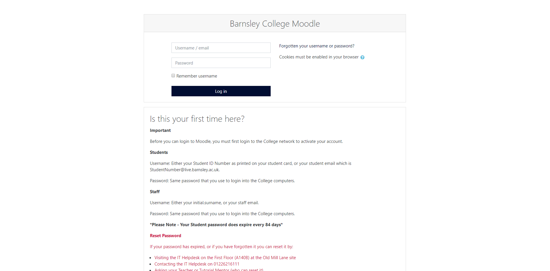
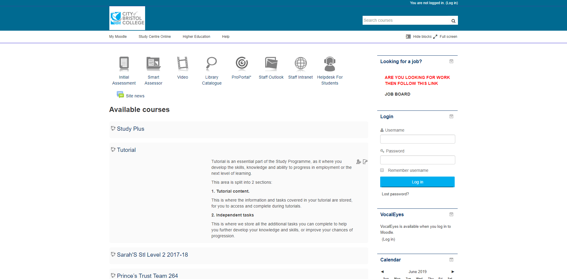
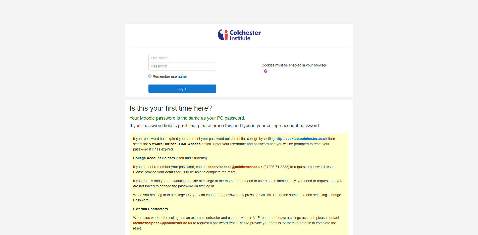
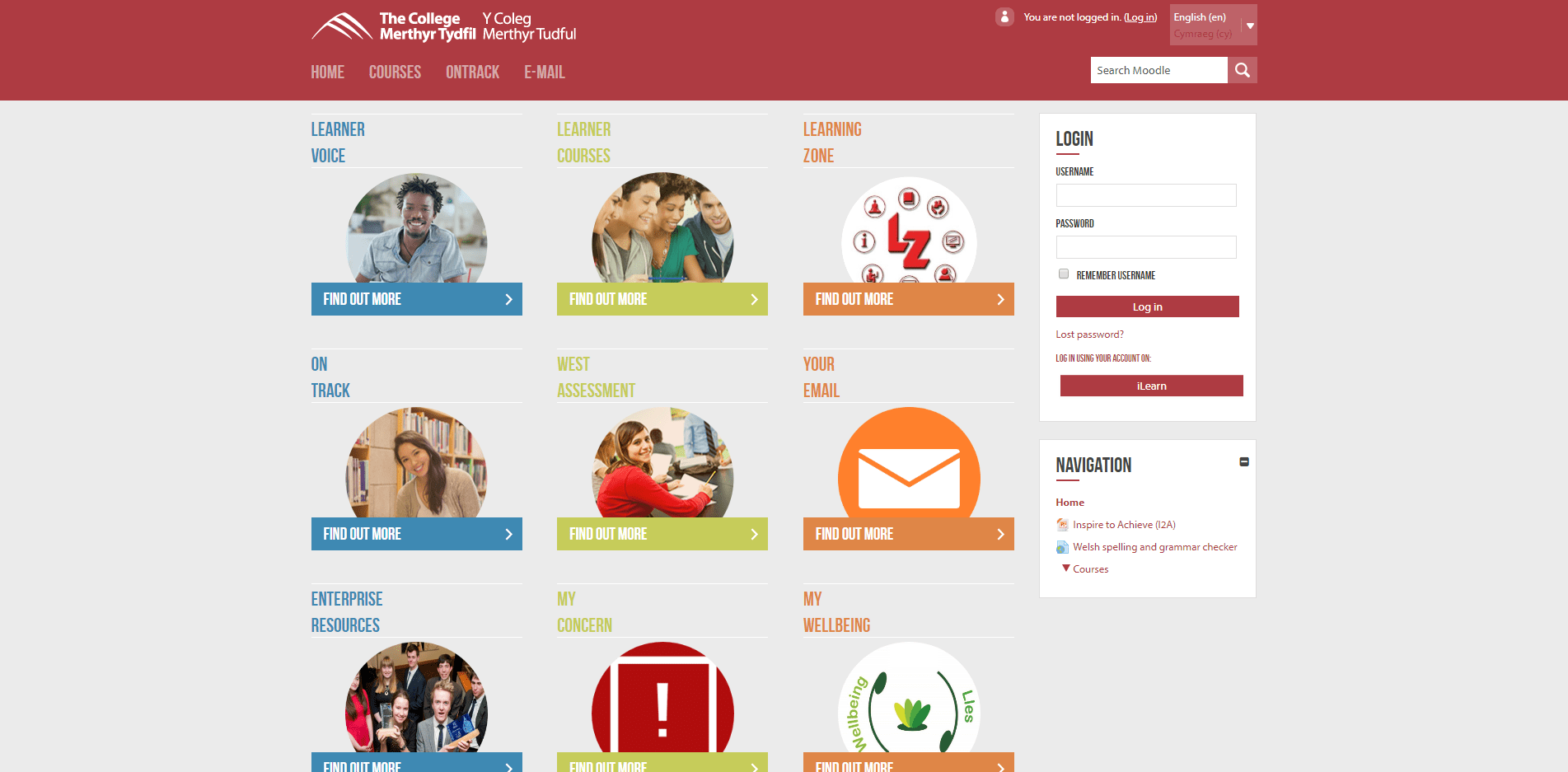
The VLE Helpdesk contact details are the most important content. The College's general contact details and the direct contact details for the tutors and support services including the Library, IT, and Learner Support should always be presented in their specific areas of the VLE.
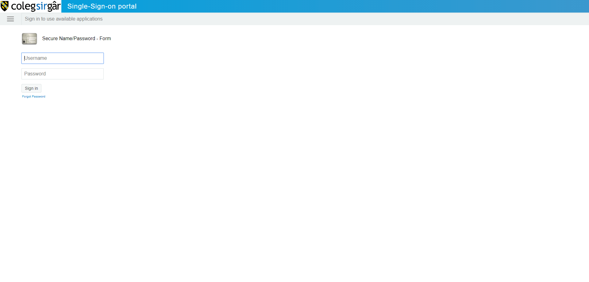
Basic VLE Design Errors (And sincere apologies for selecting these particular examples to illustrate these errors)
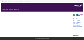
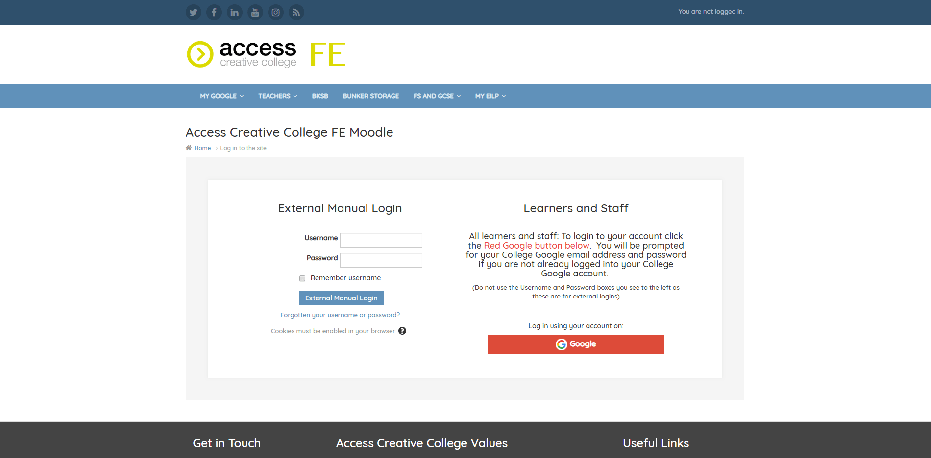
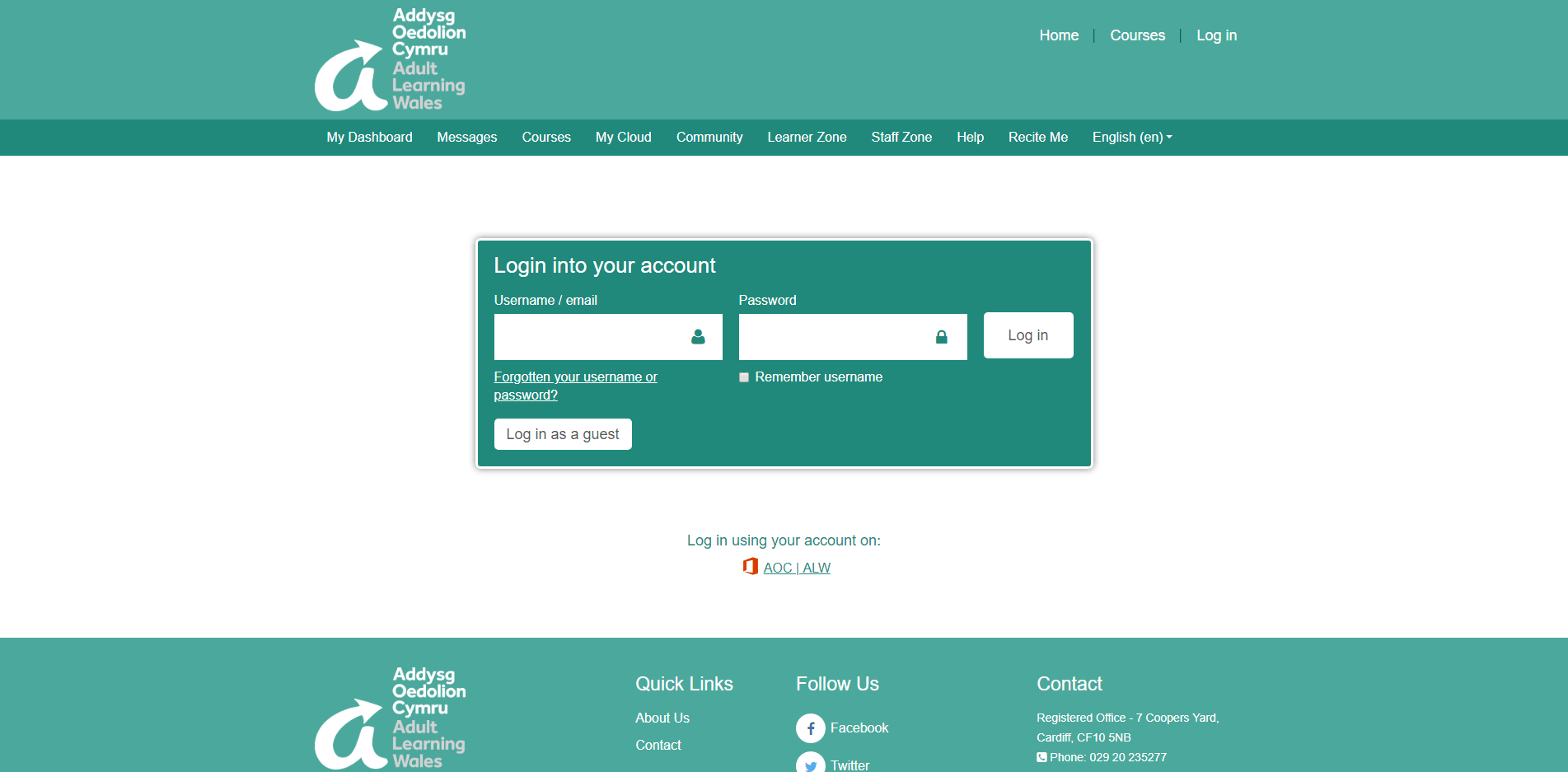
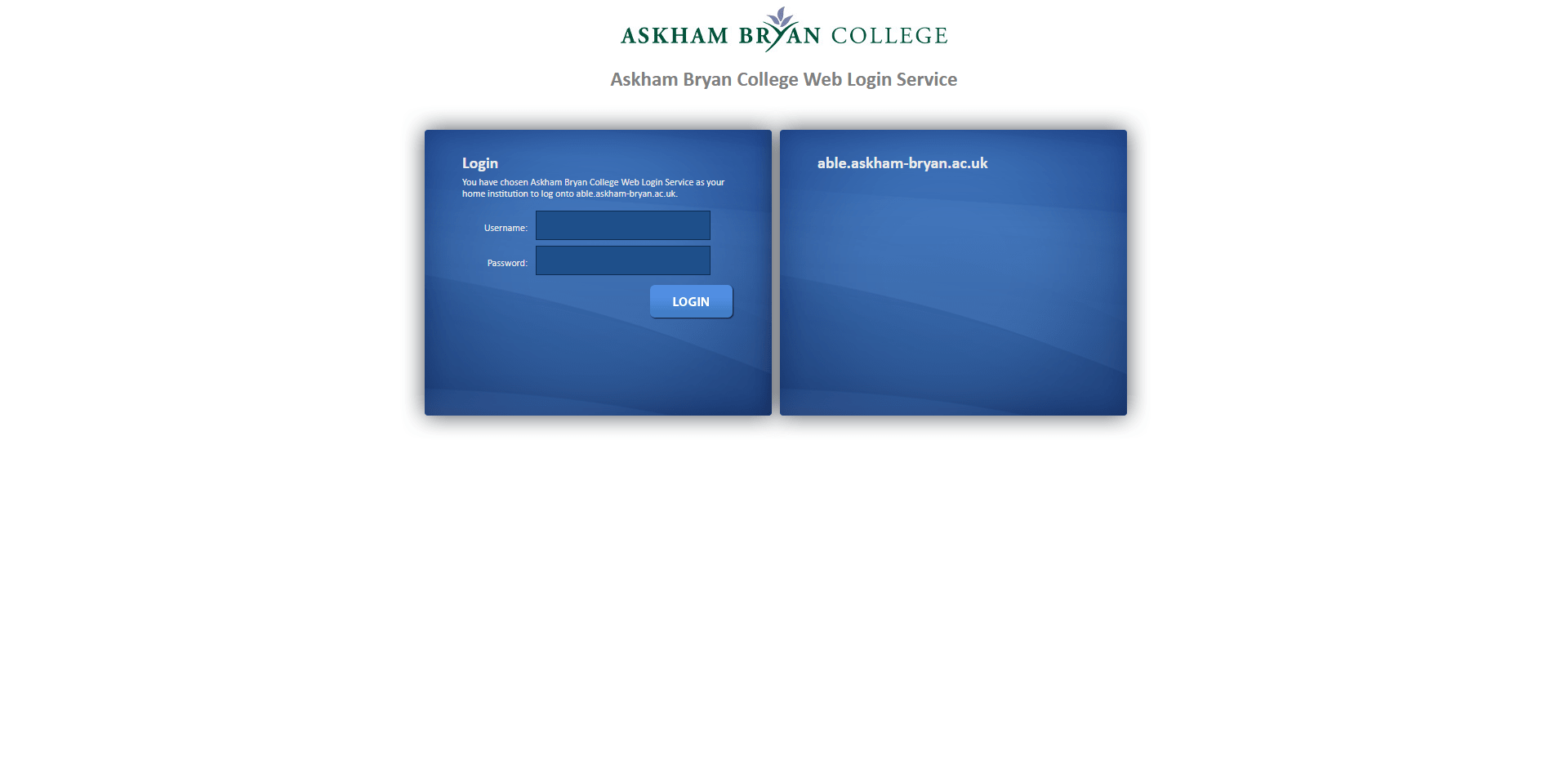
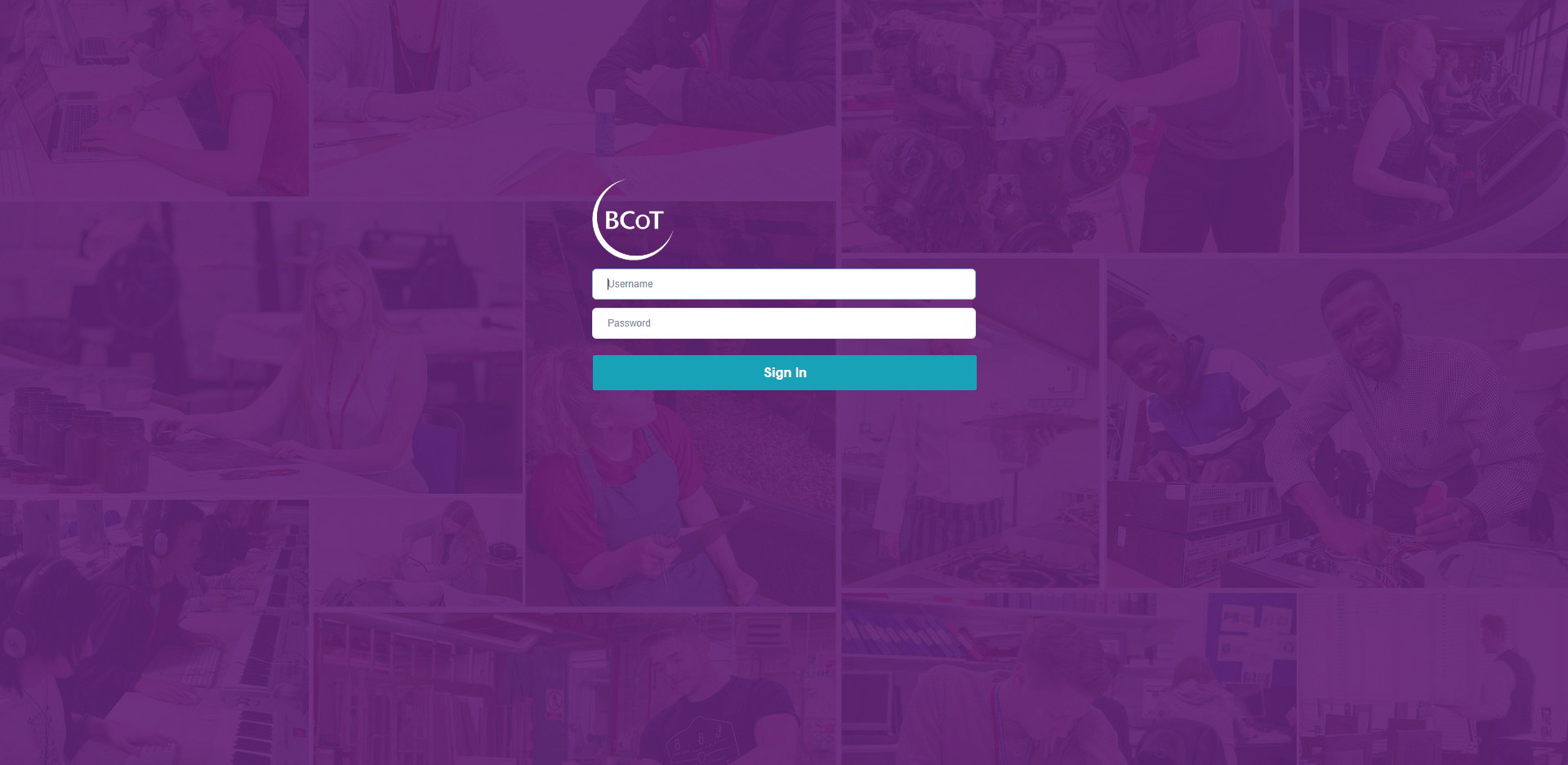
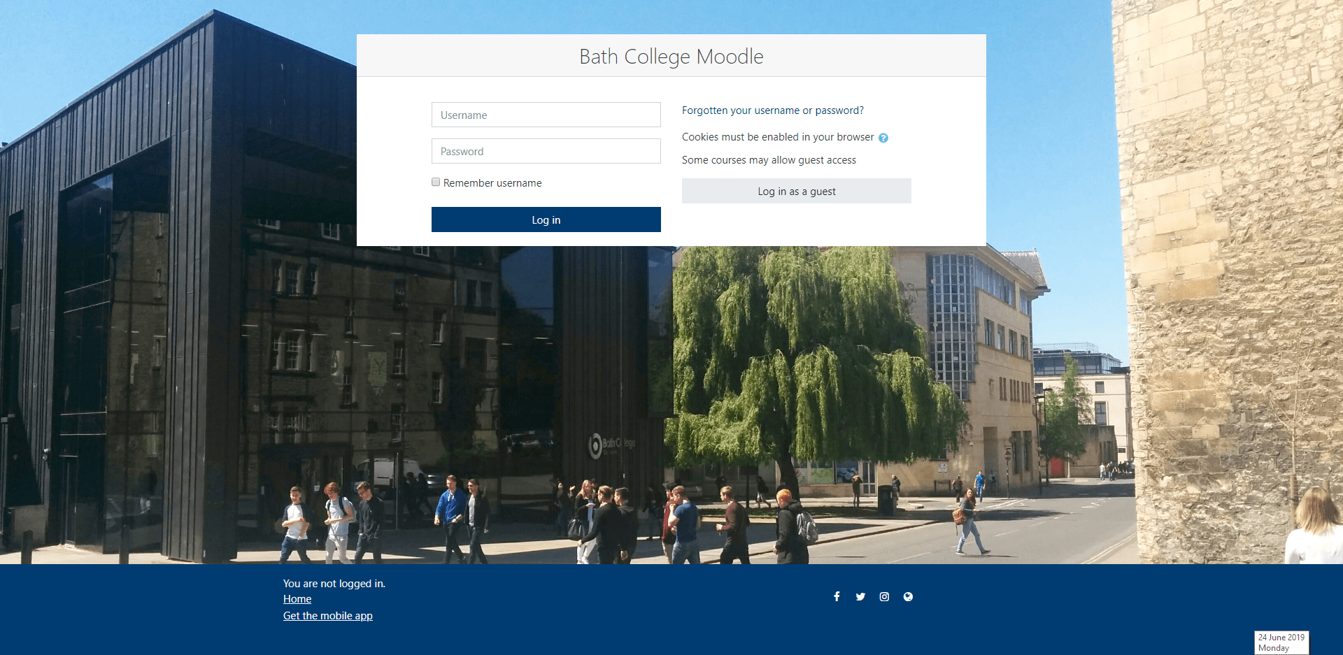
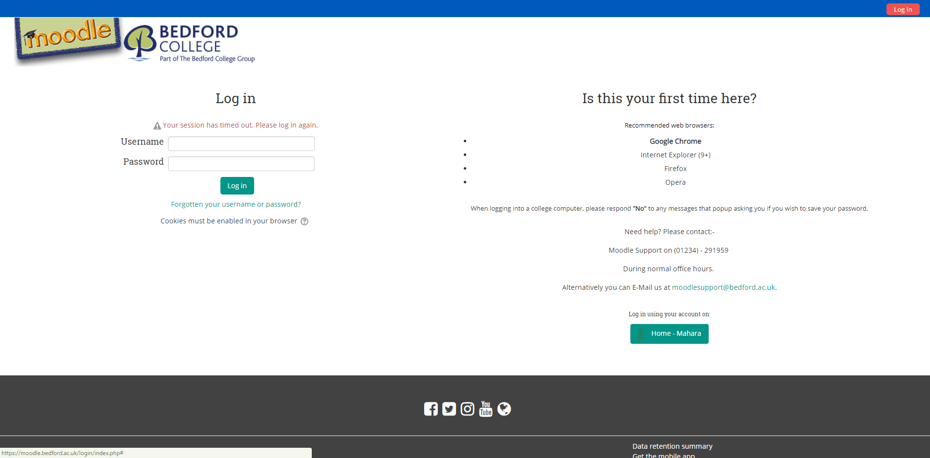
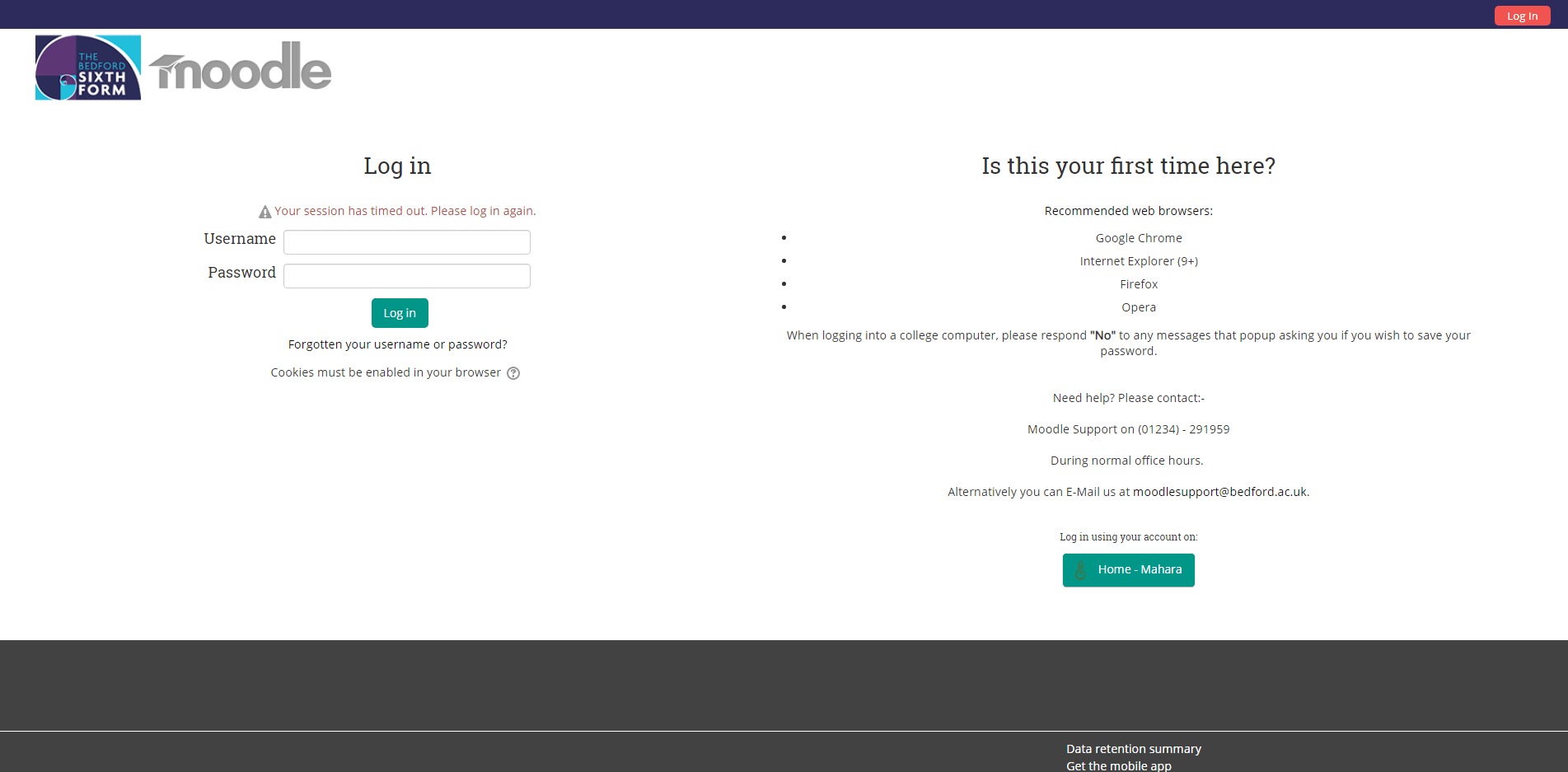
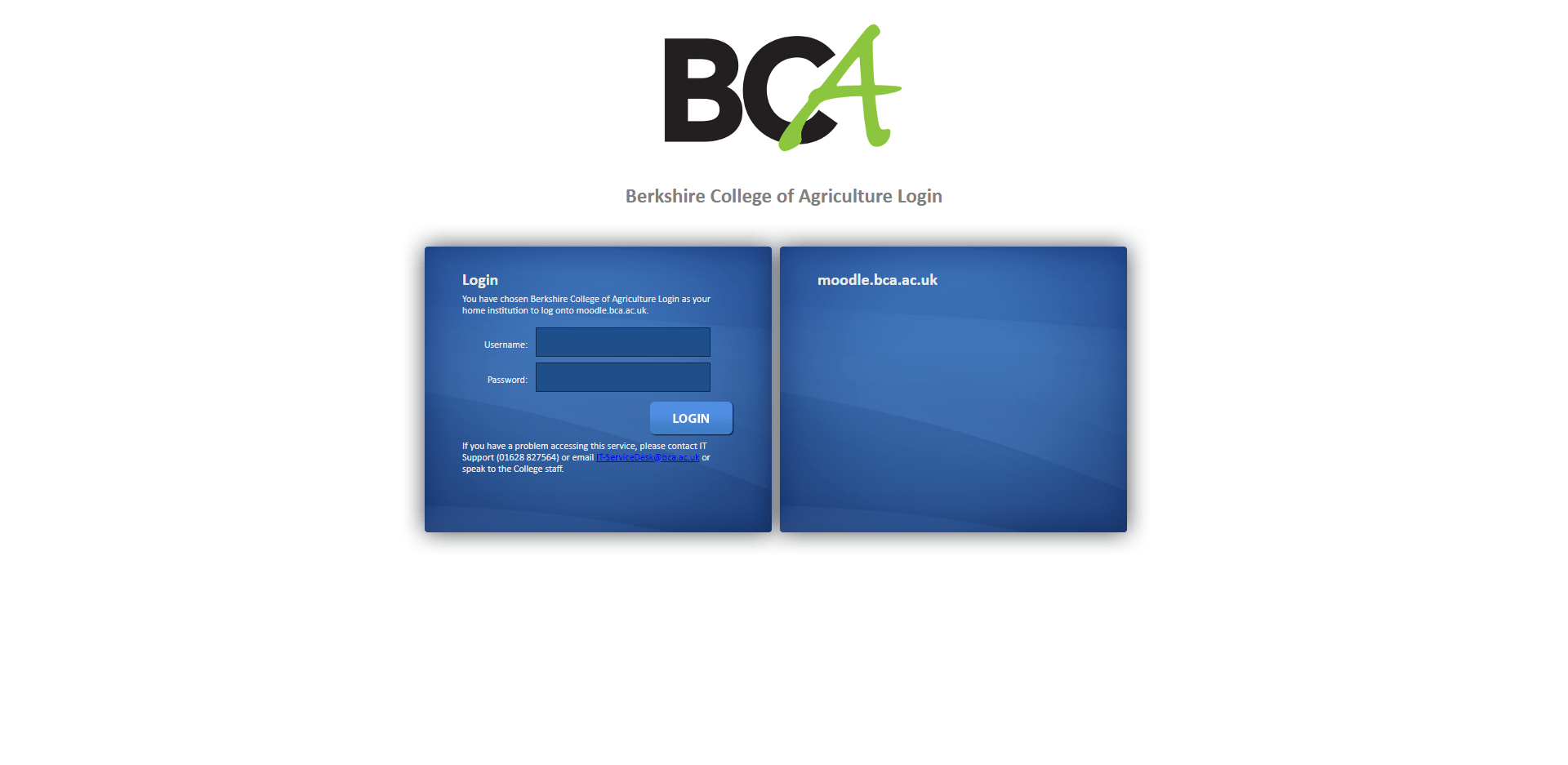
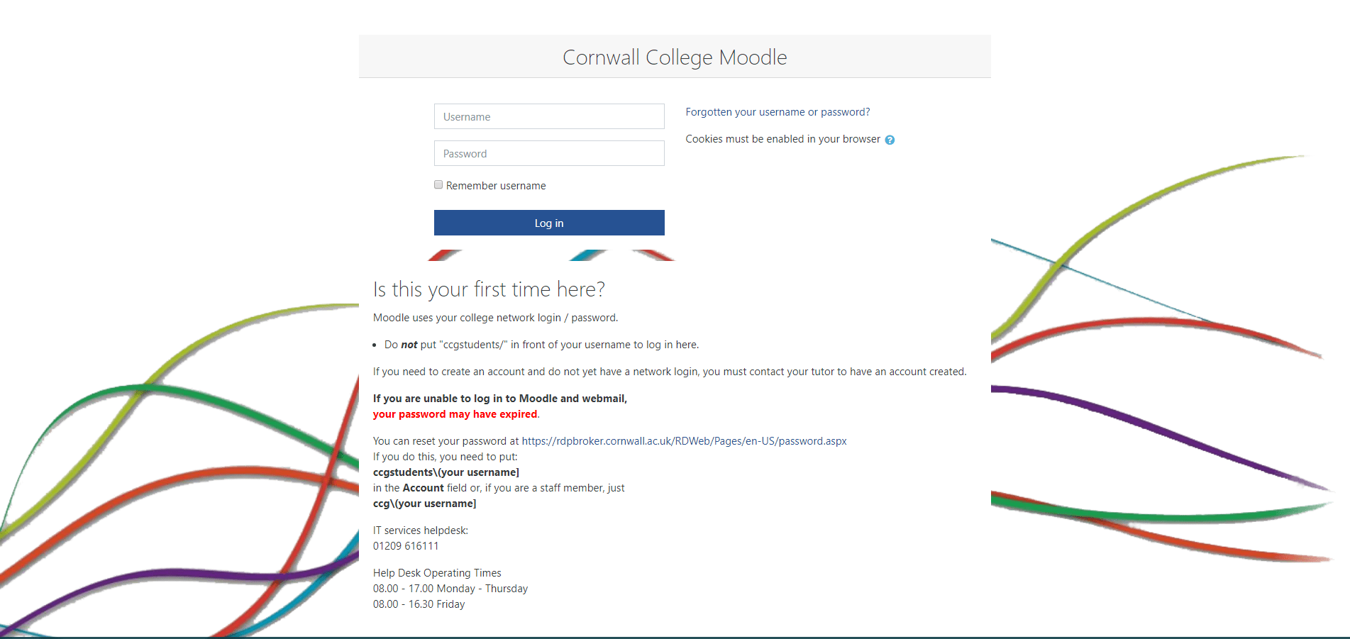
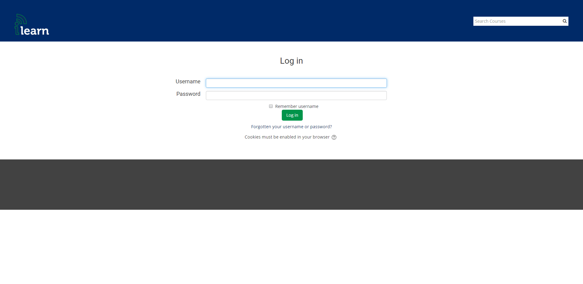
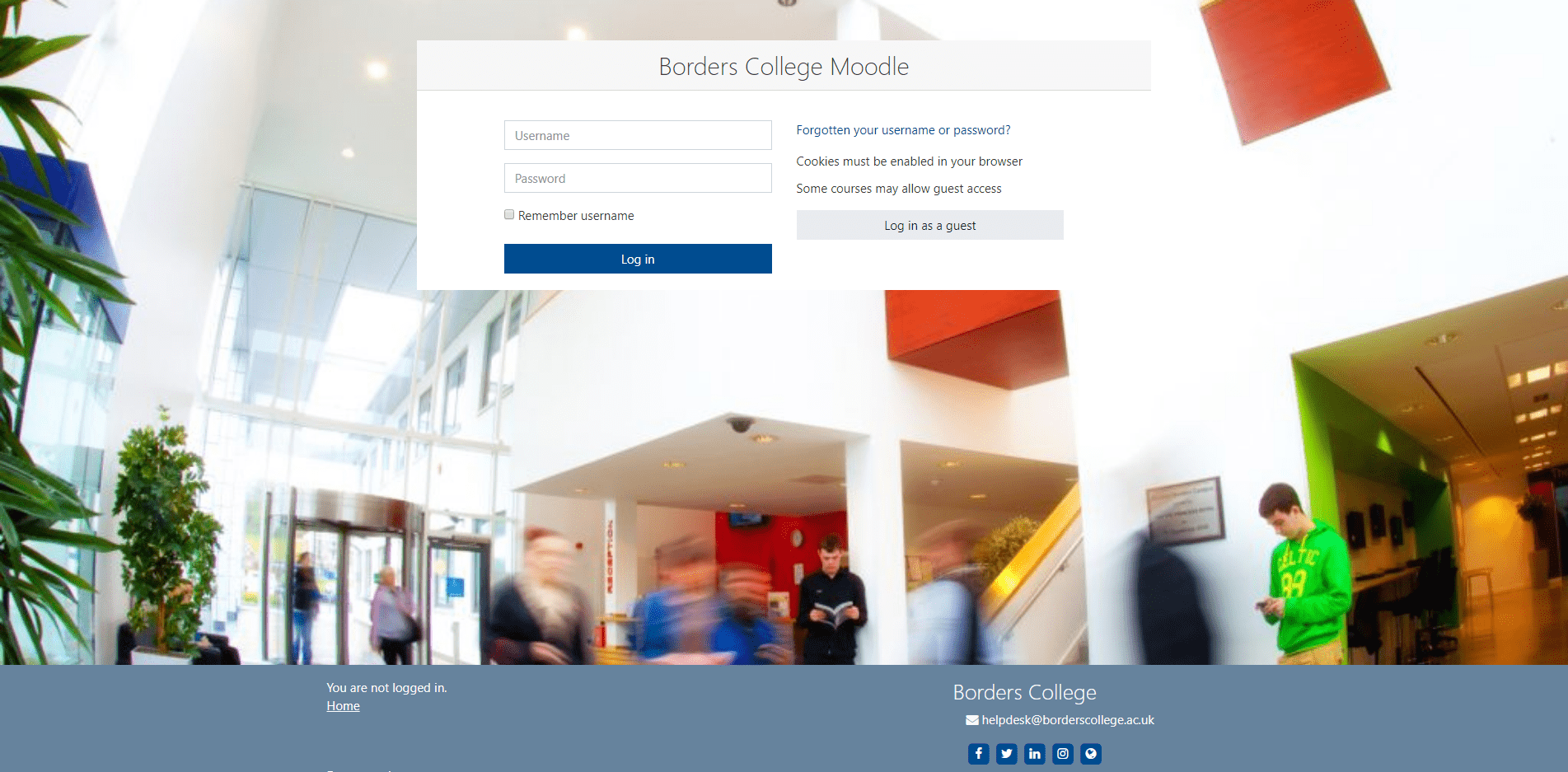
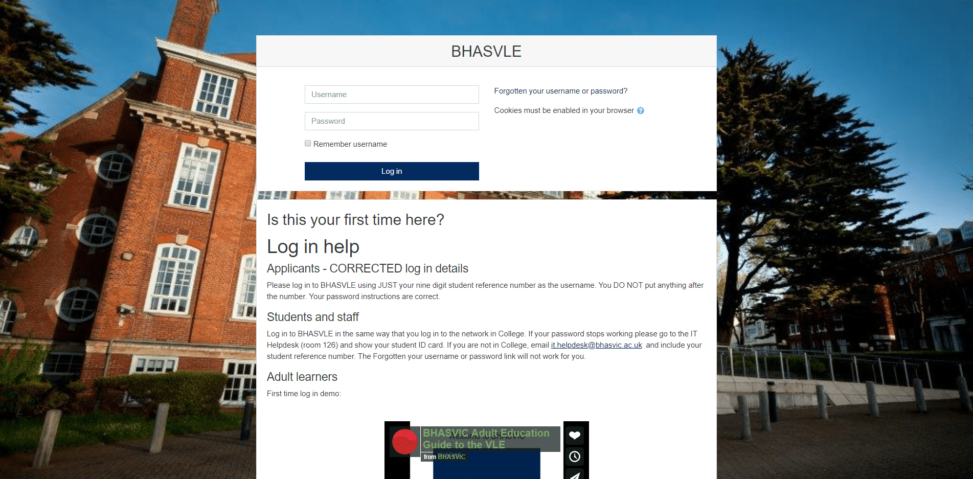
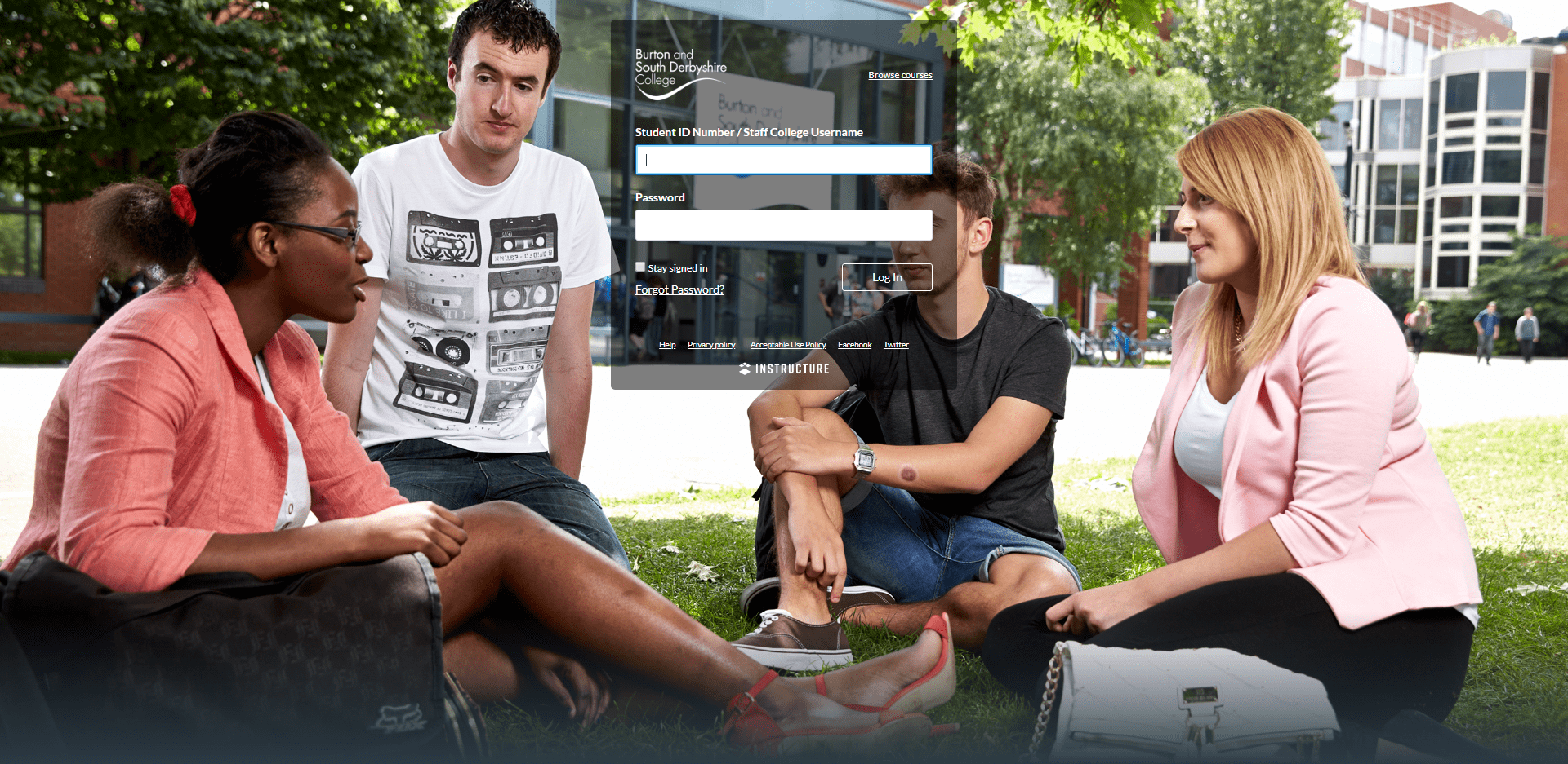
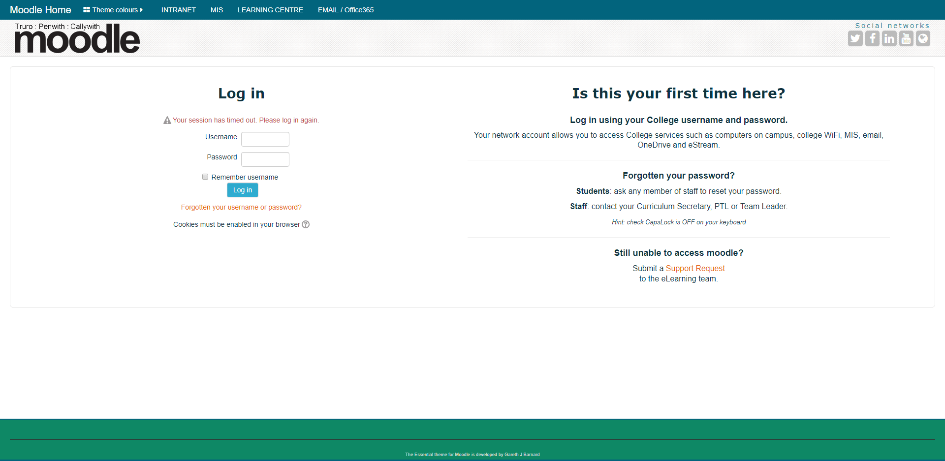
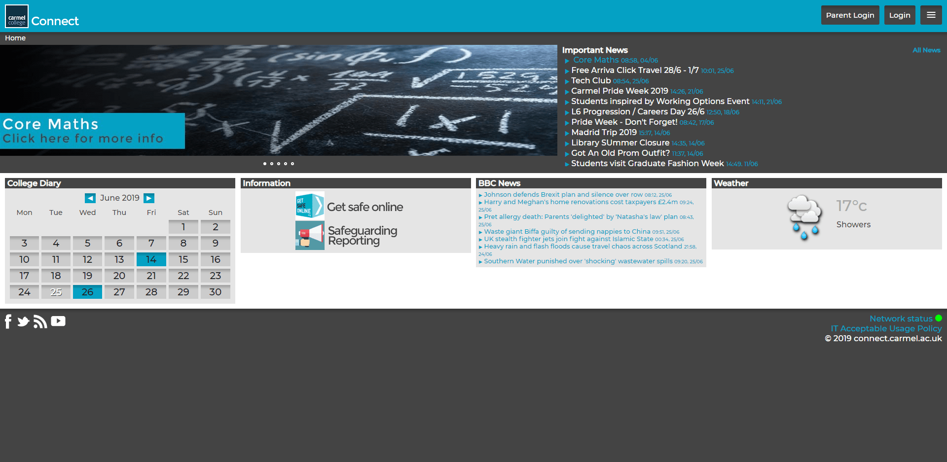
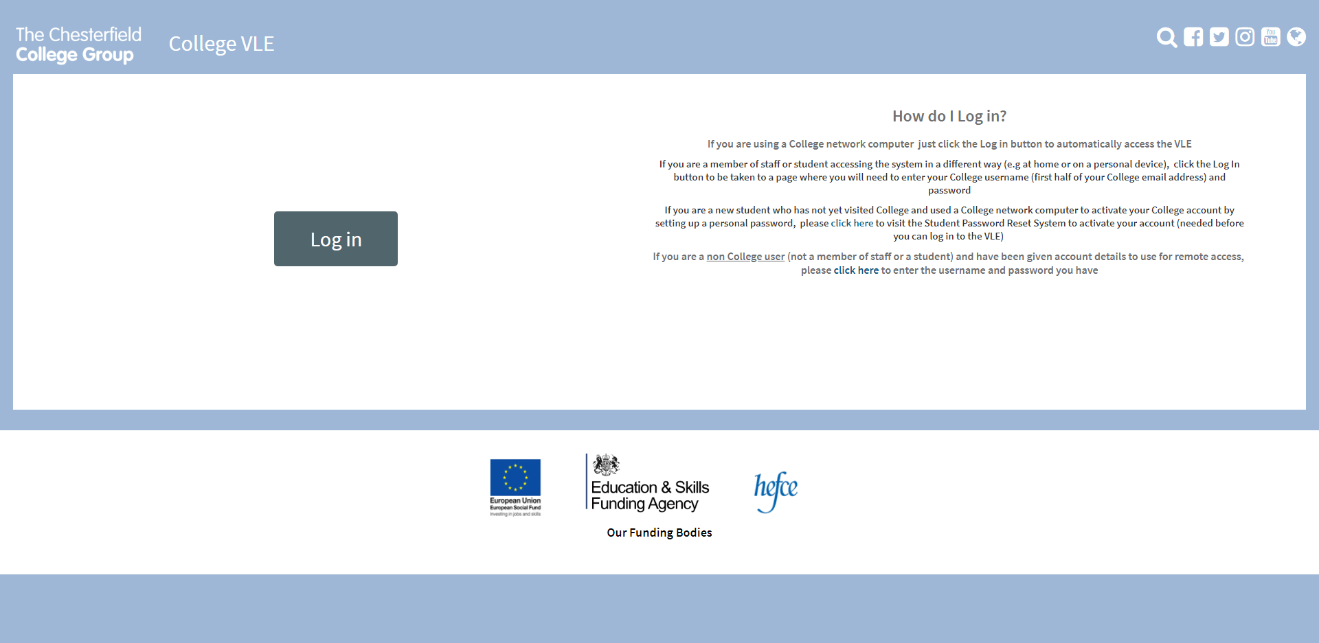
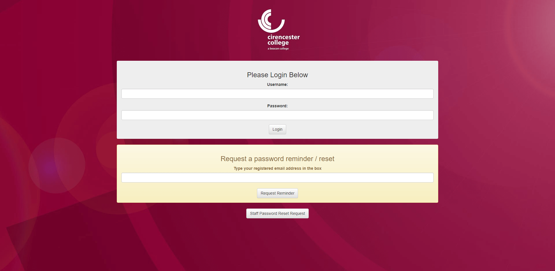
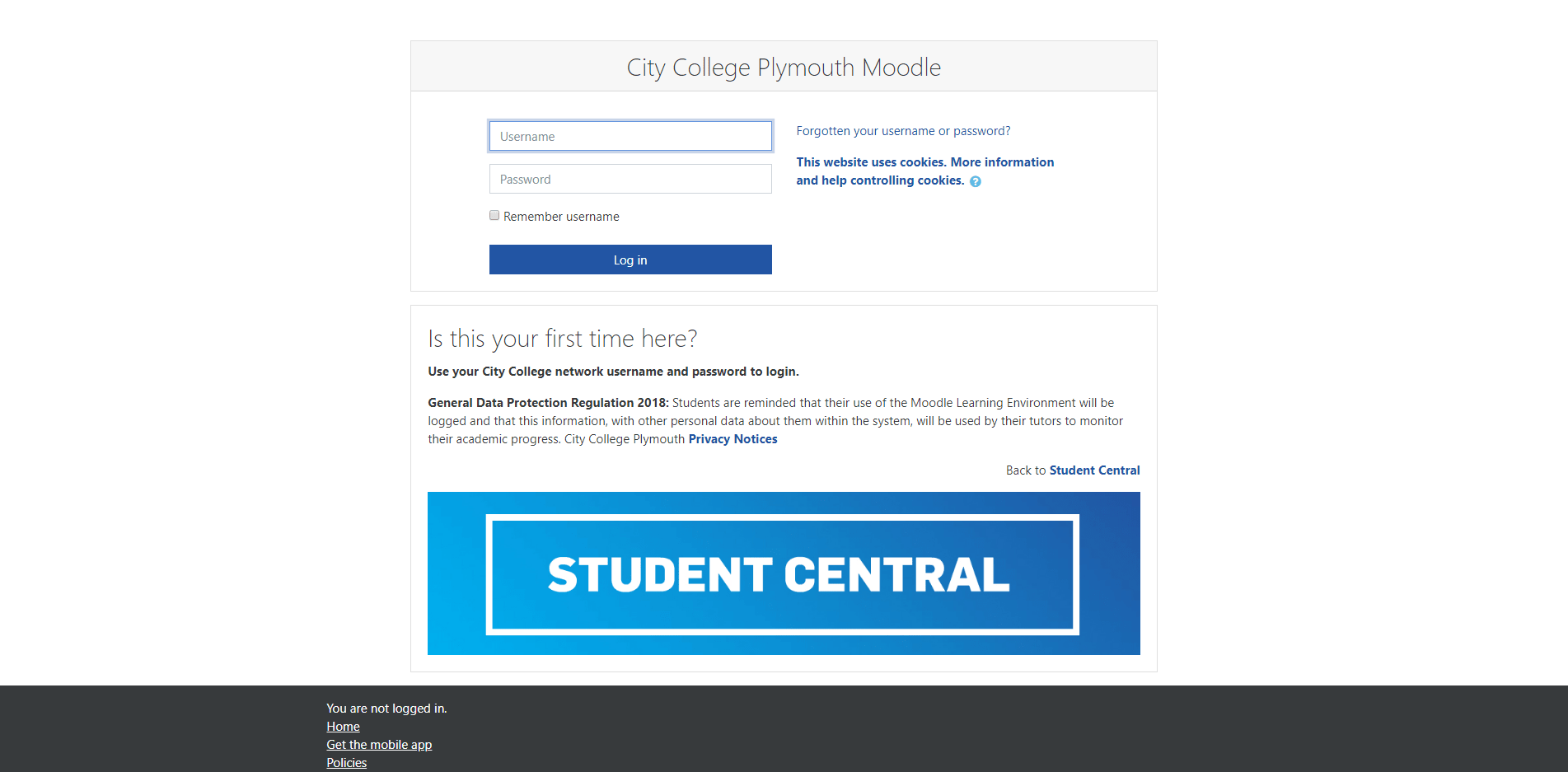
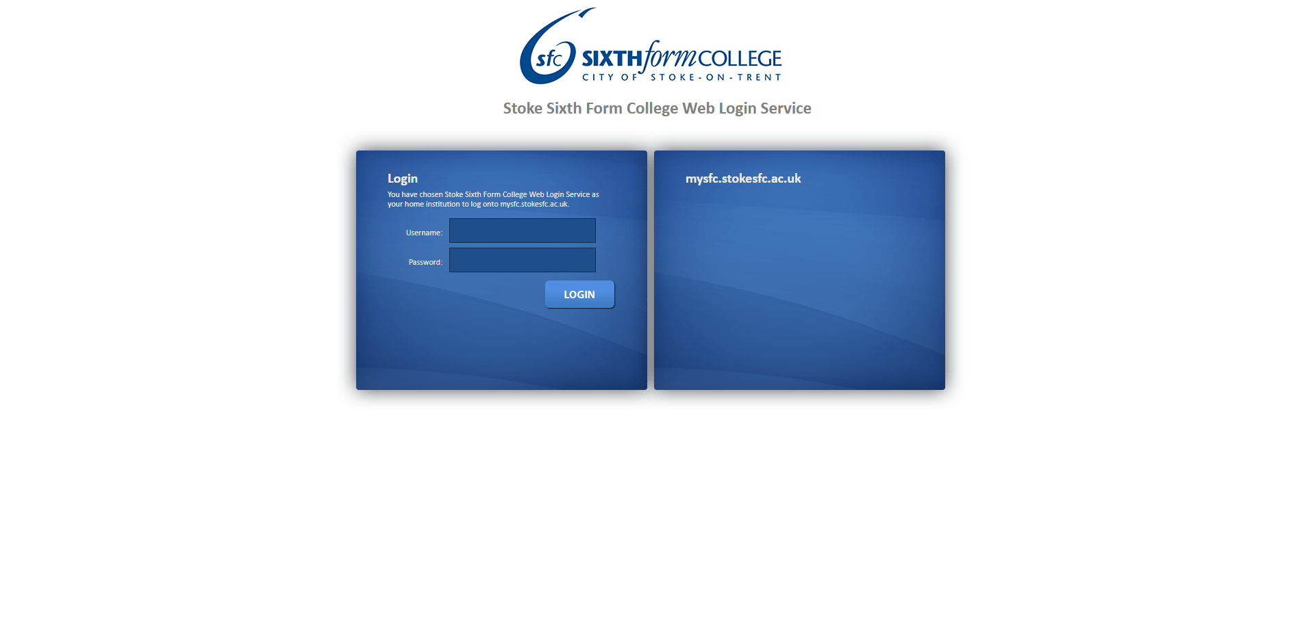
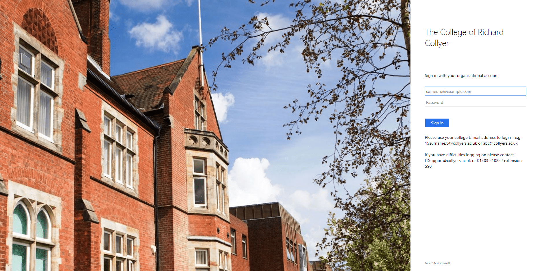
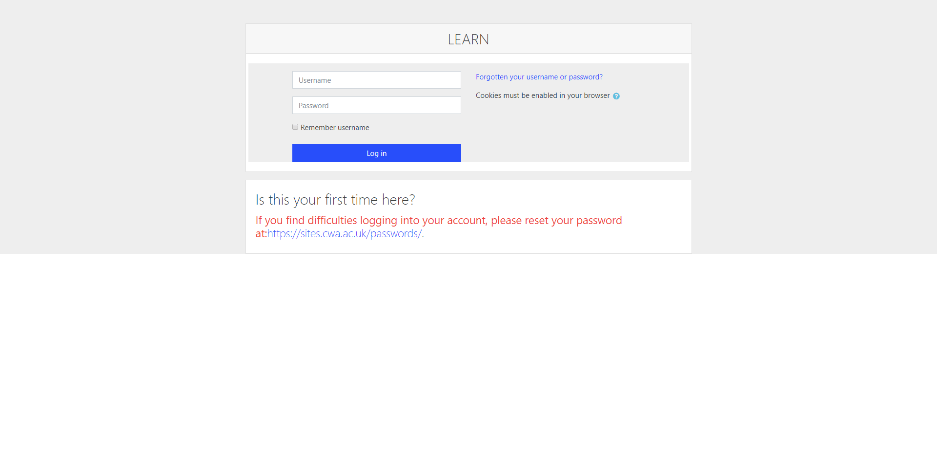
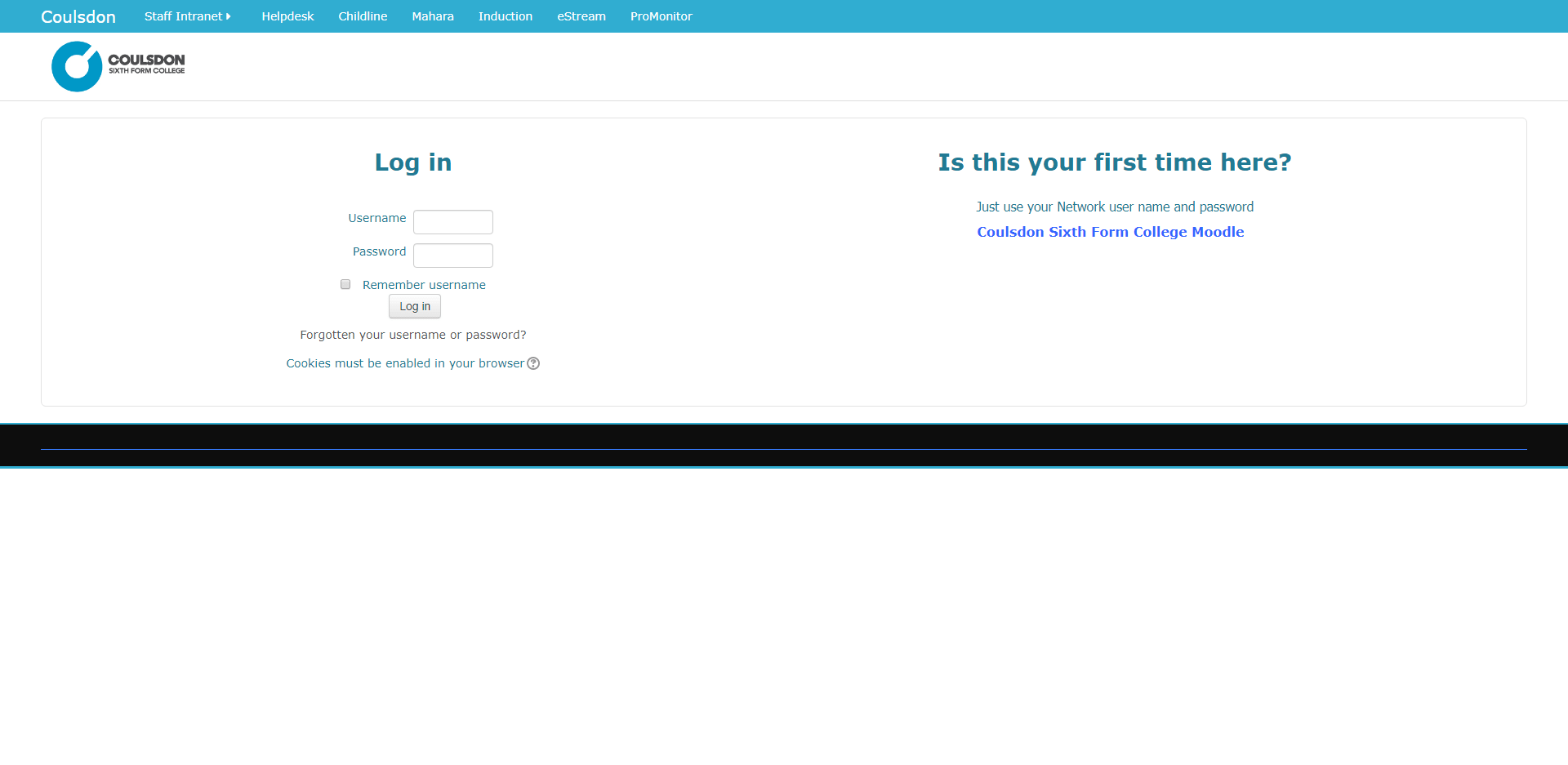
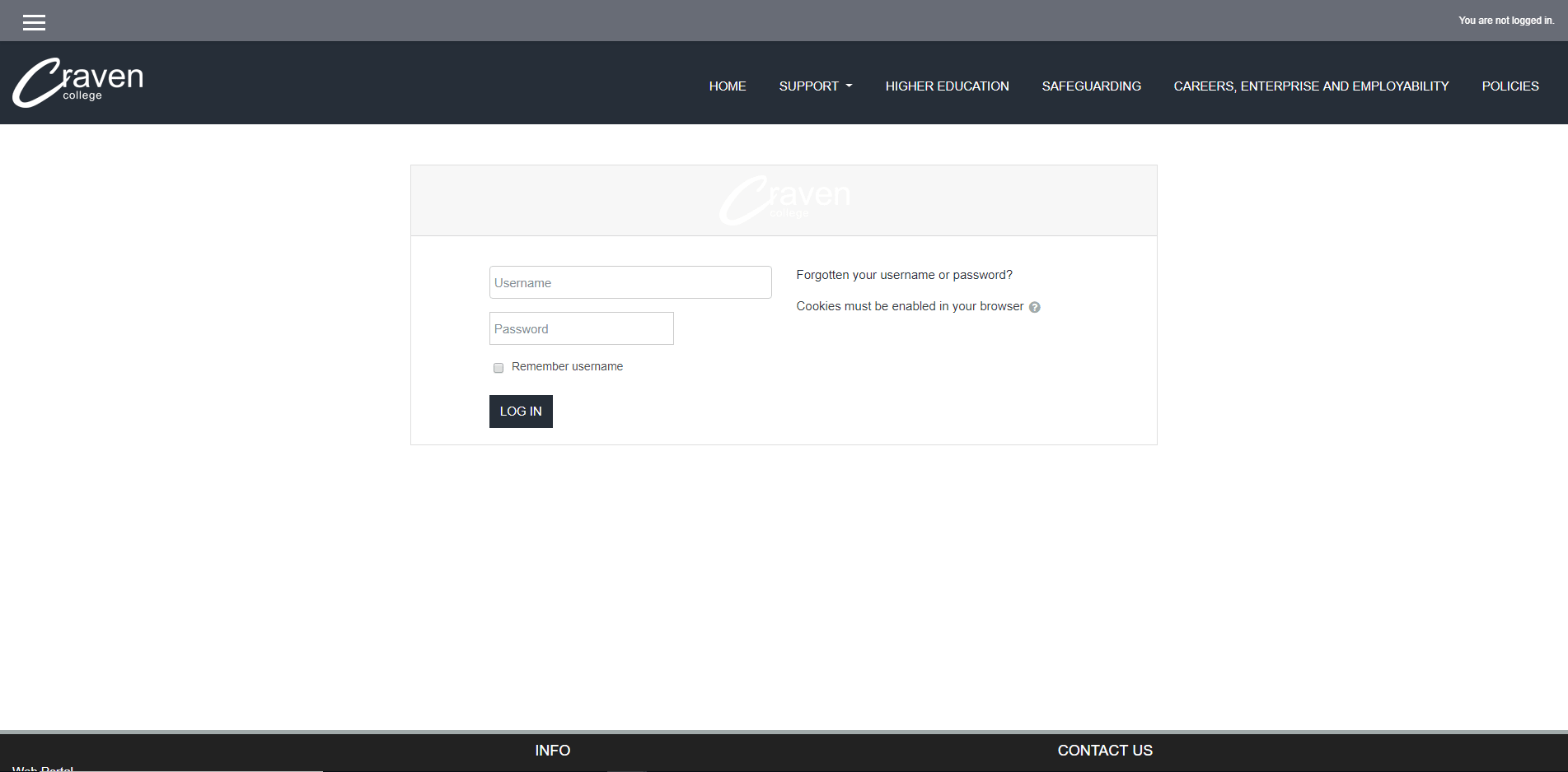
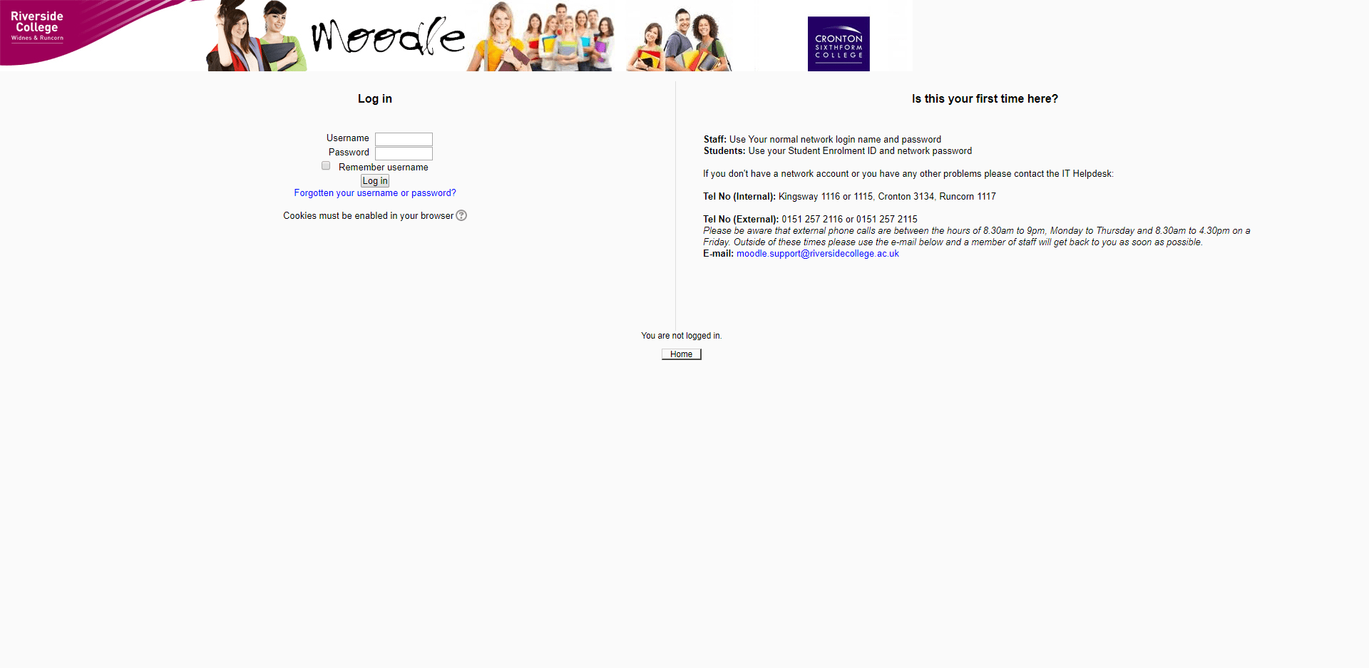
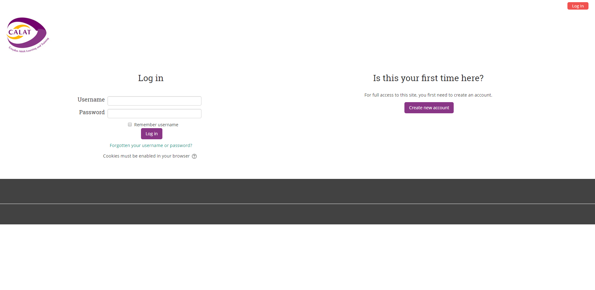
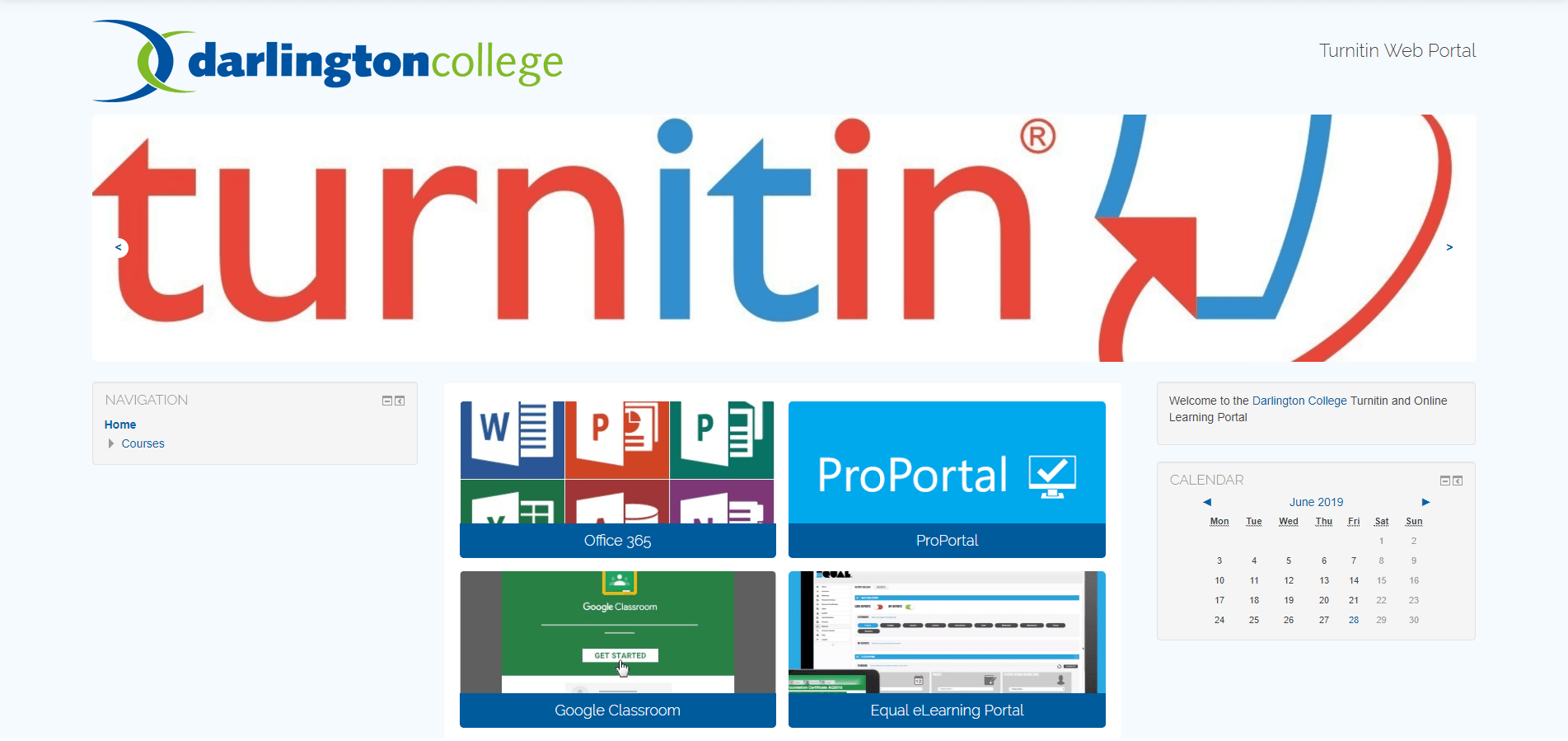
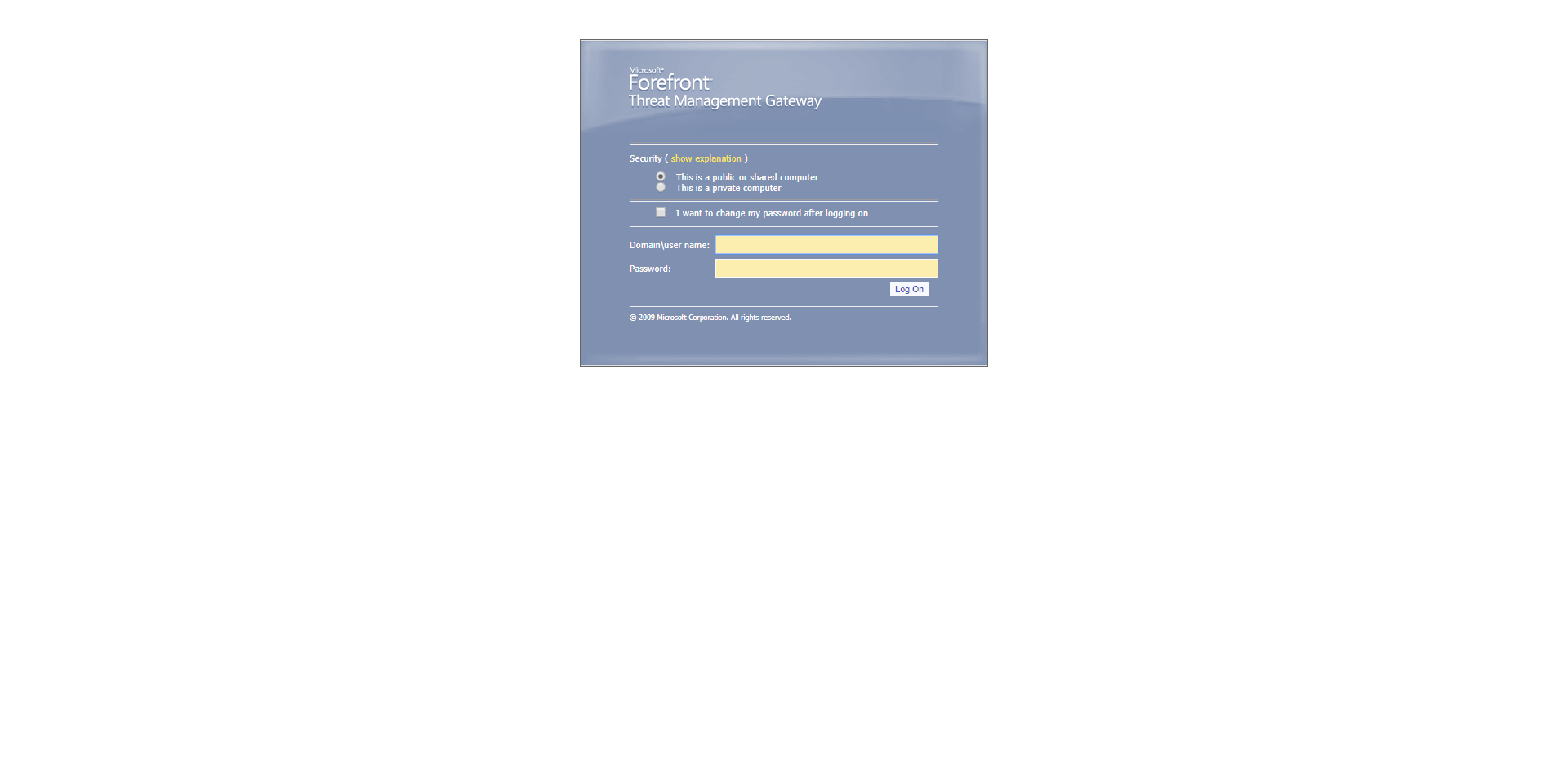
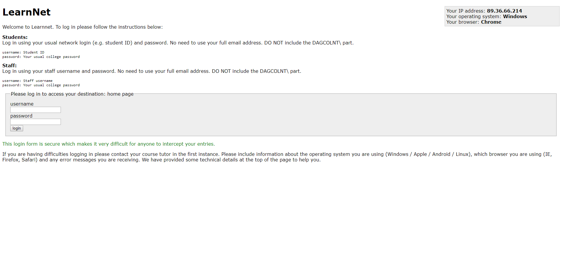
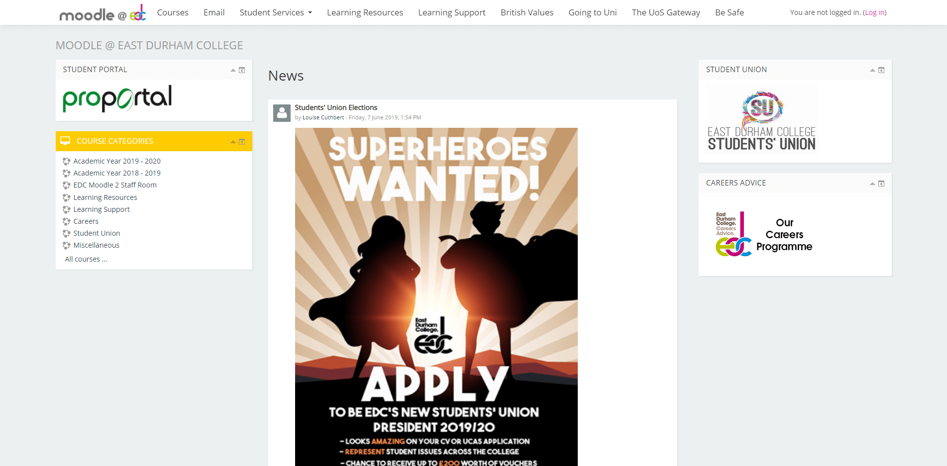
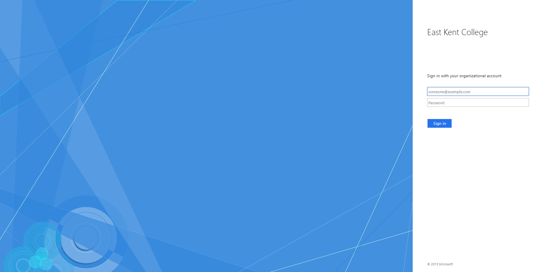
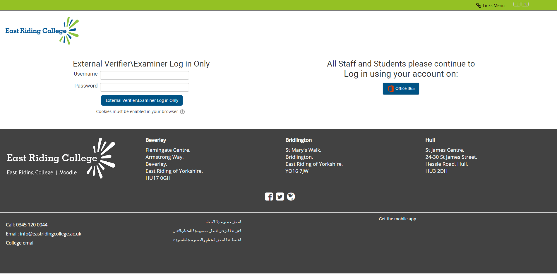
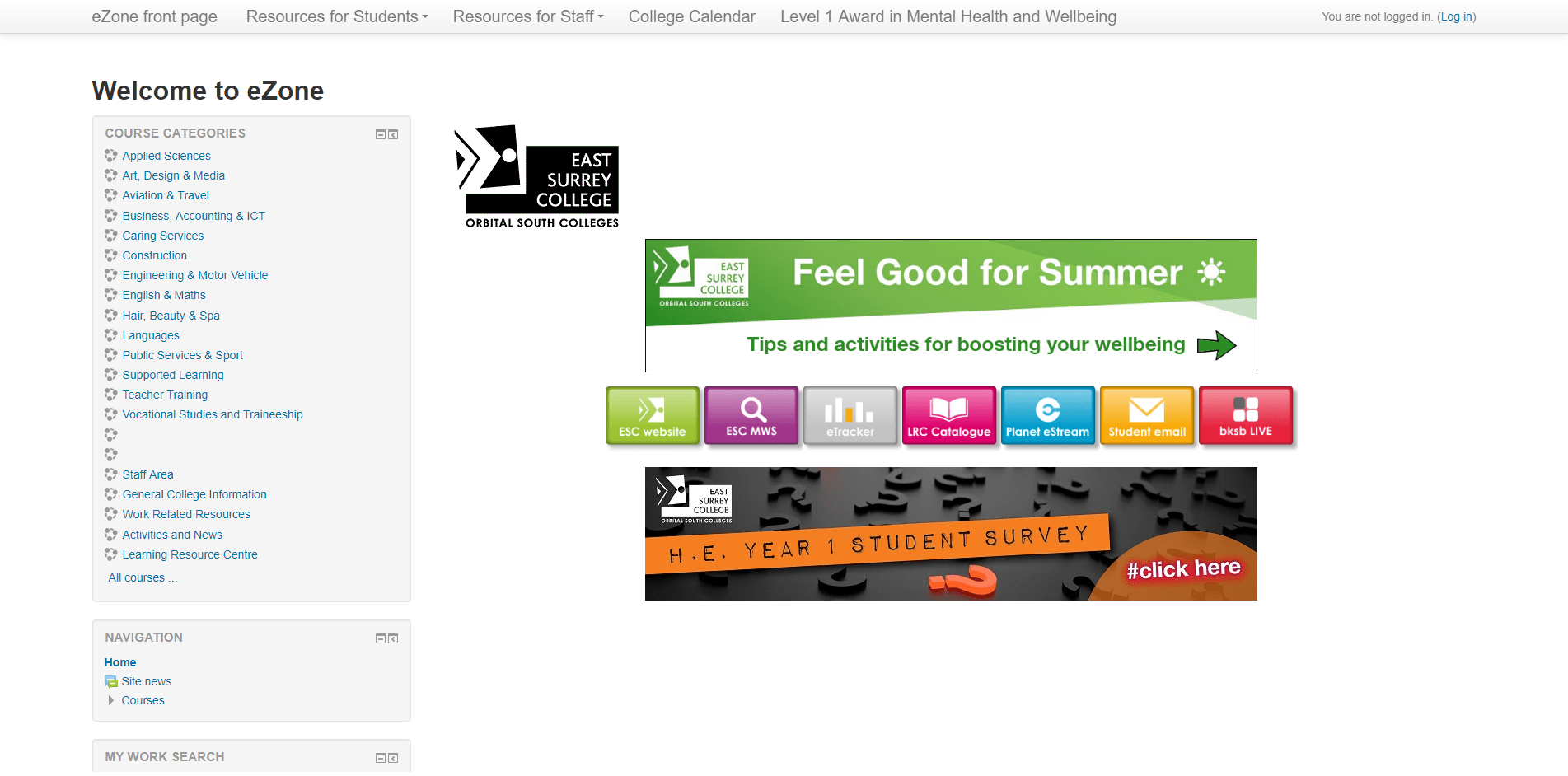
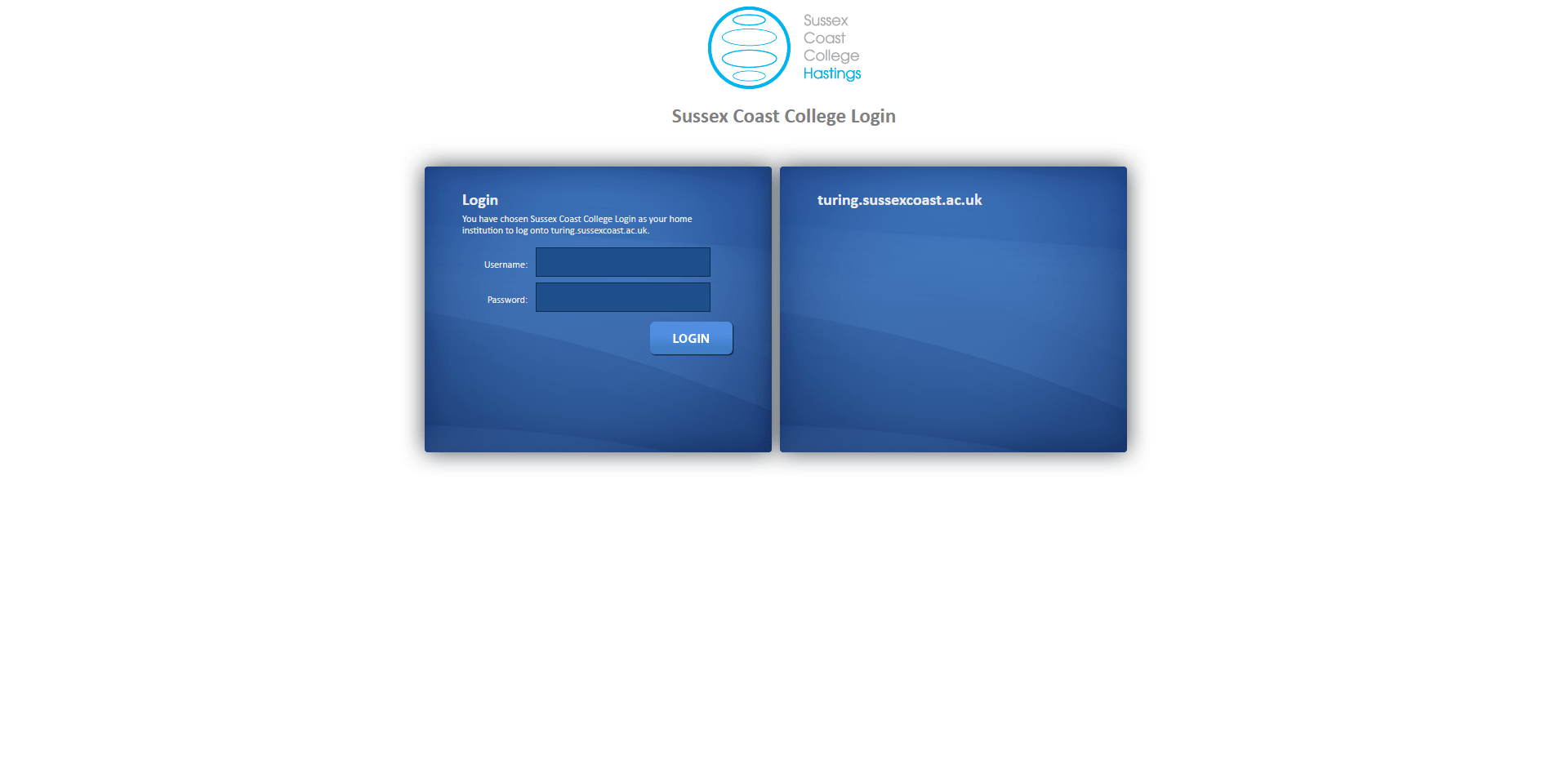
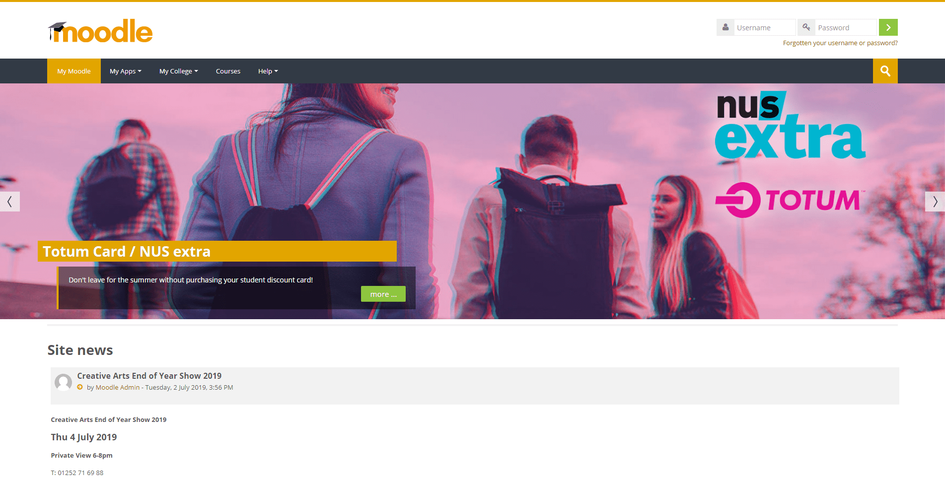
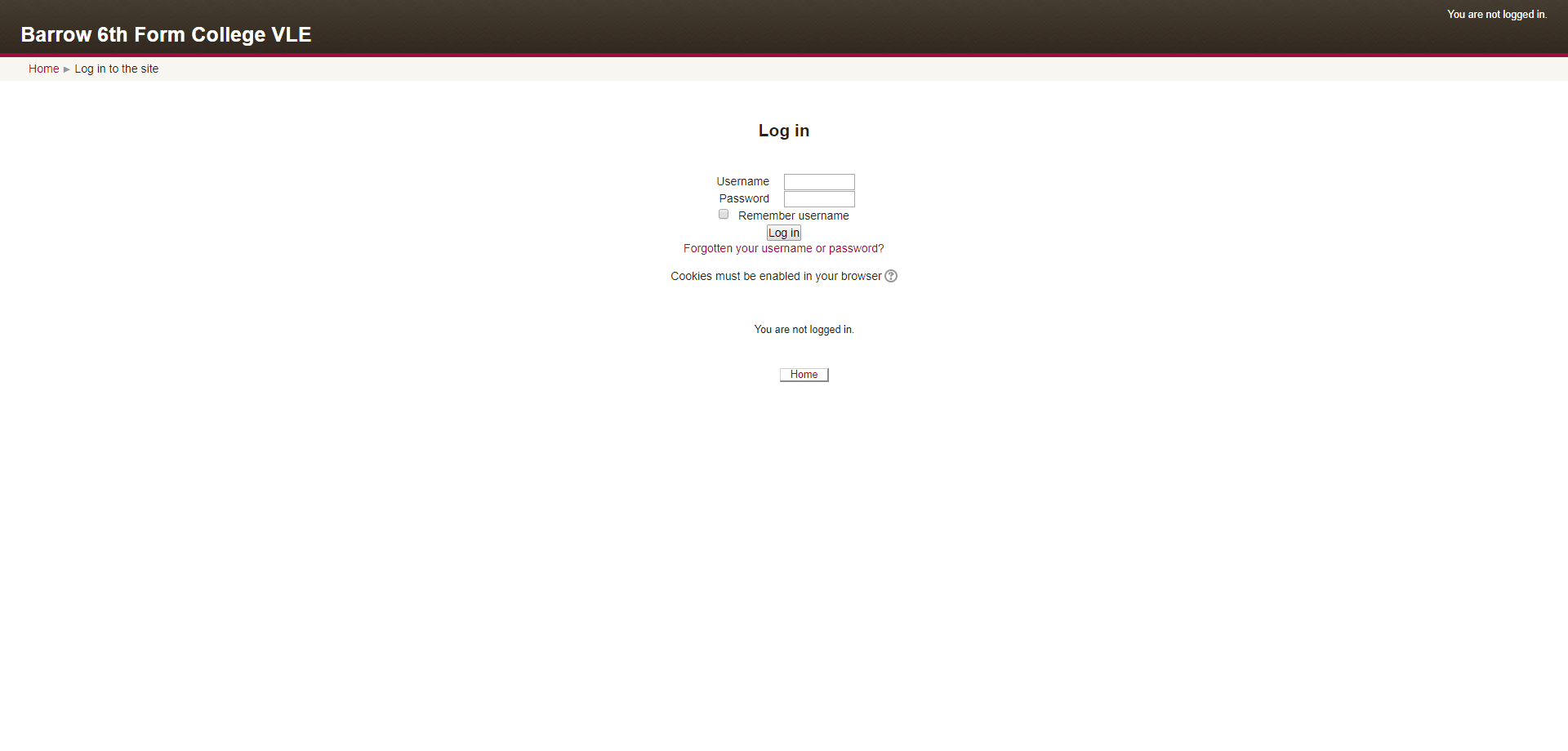
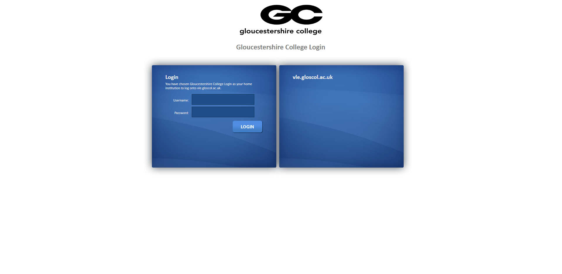
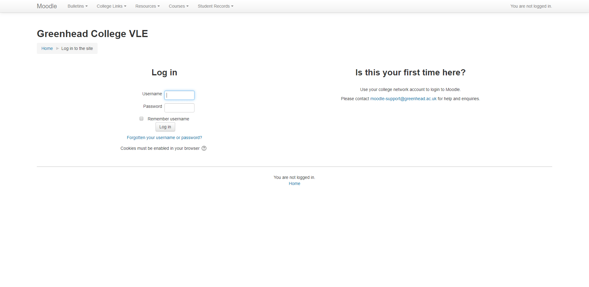
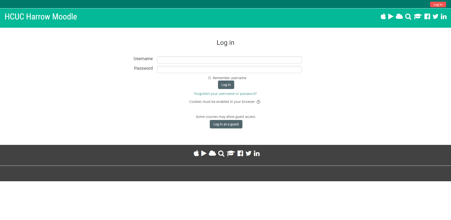
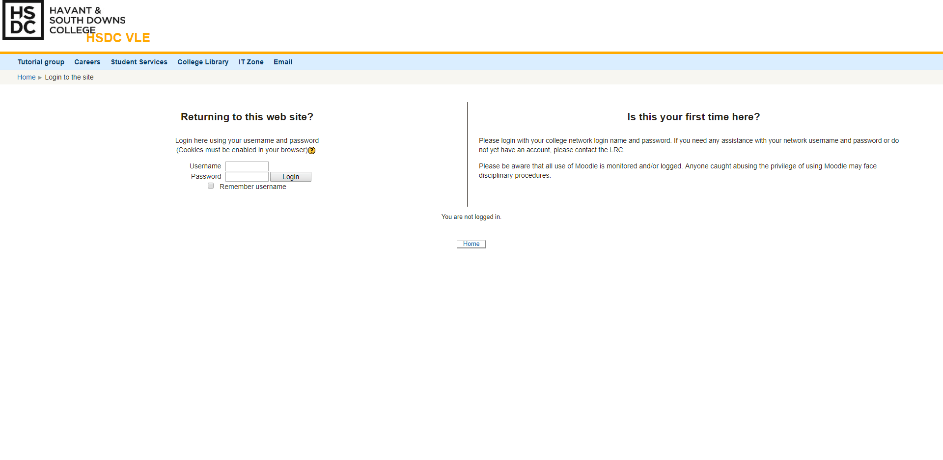
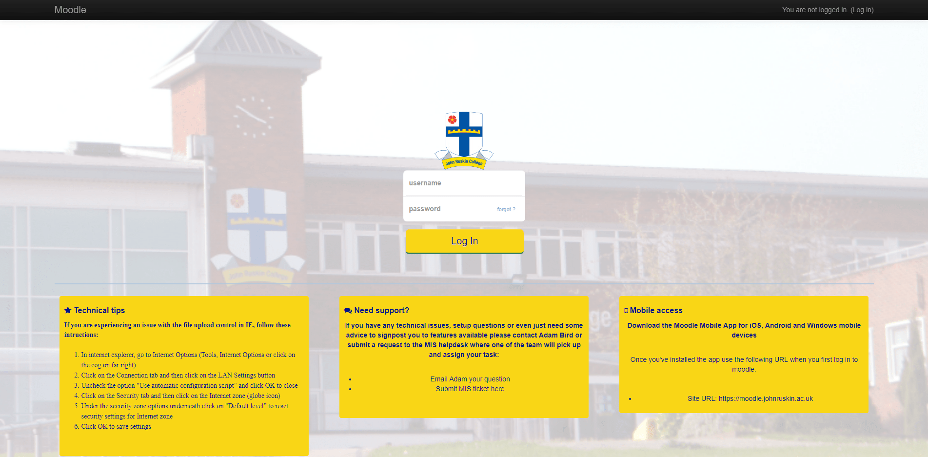
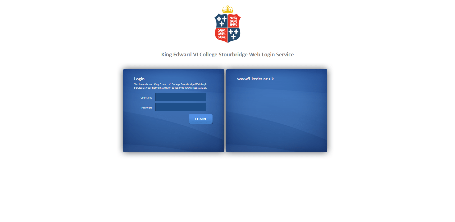
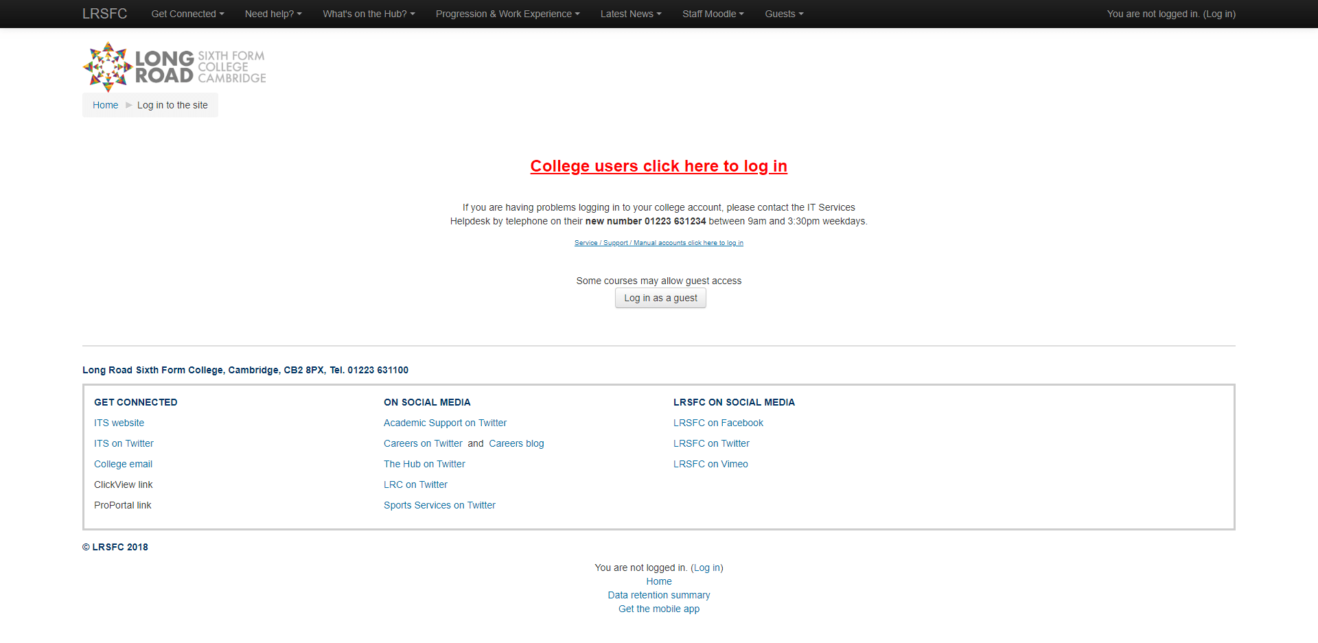
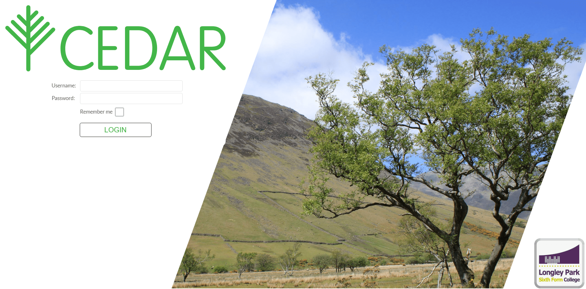
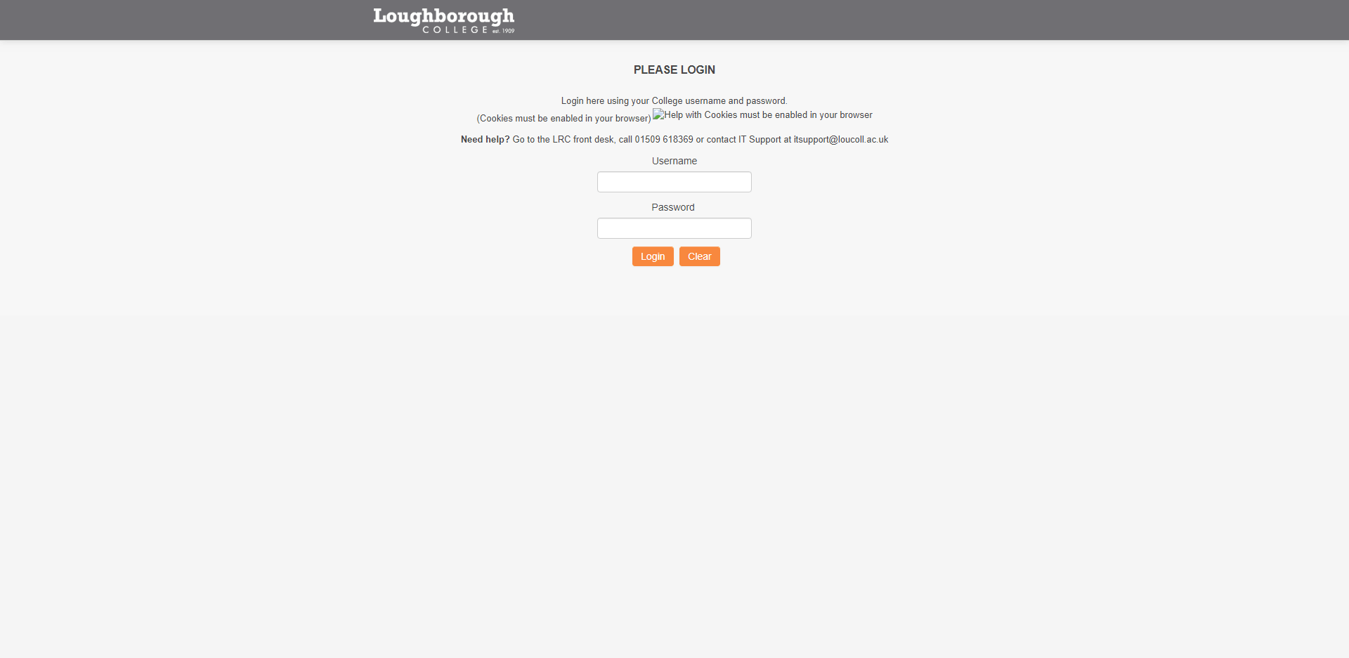
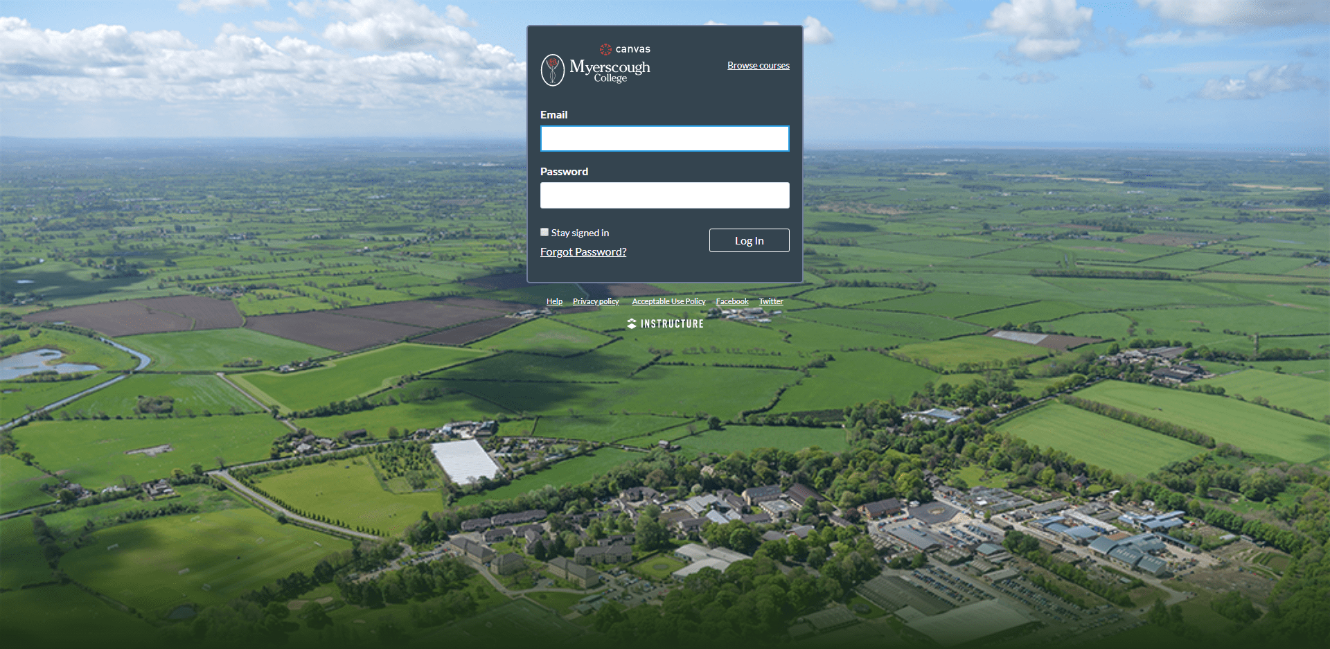
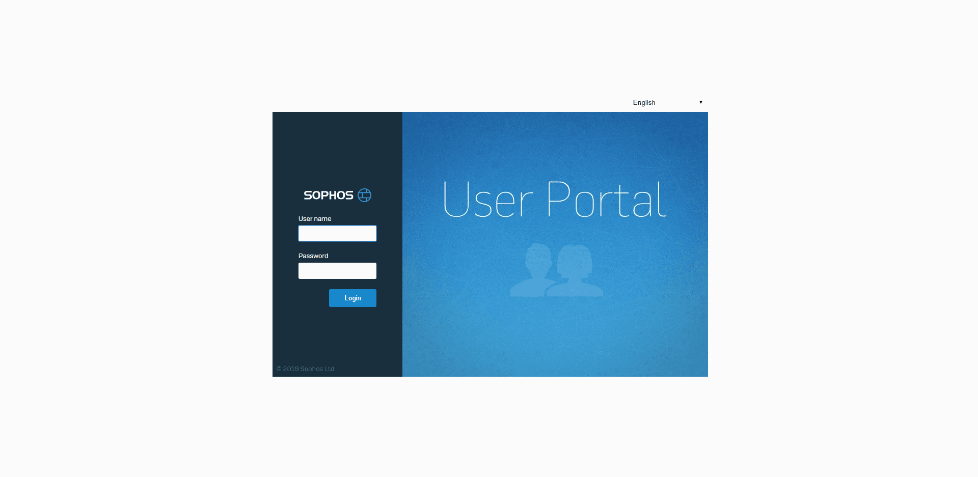
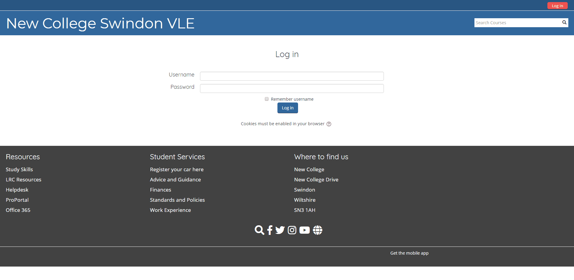
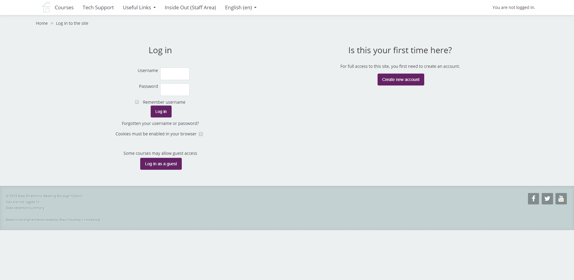
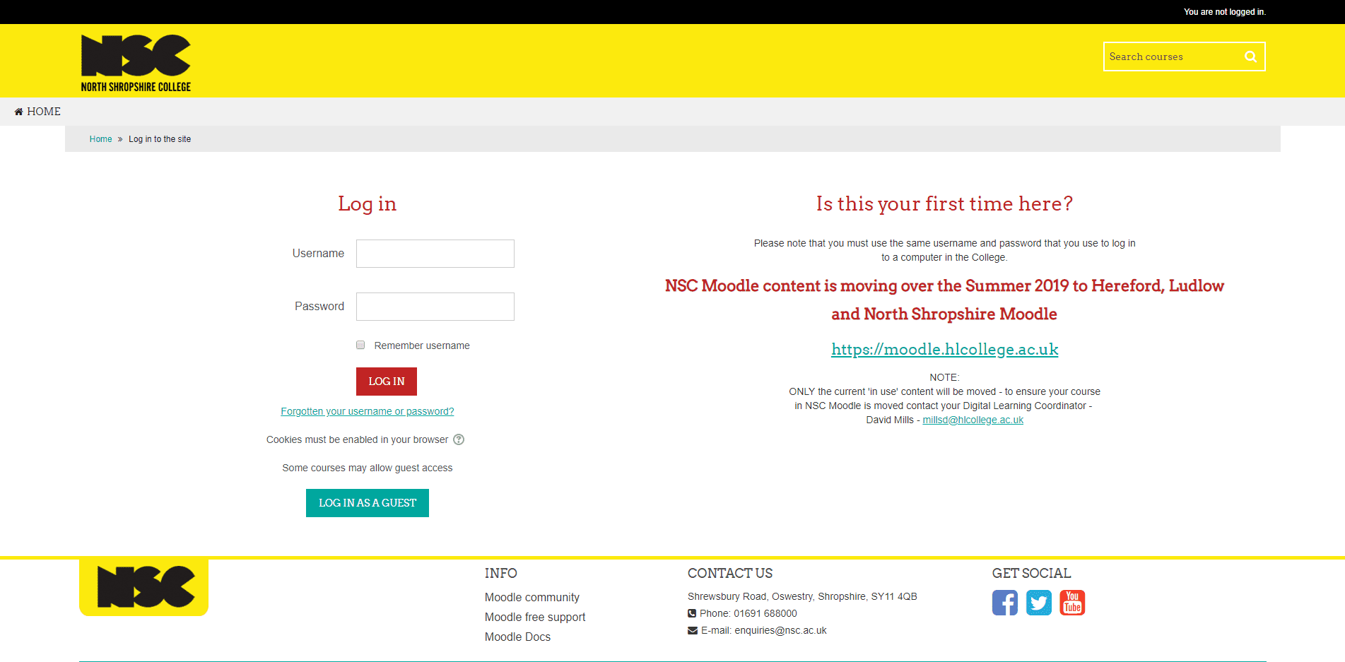
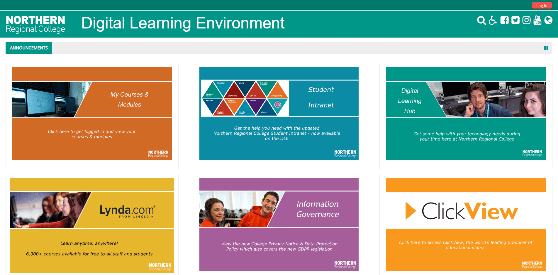
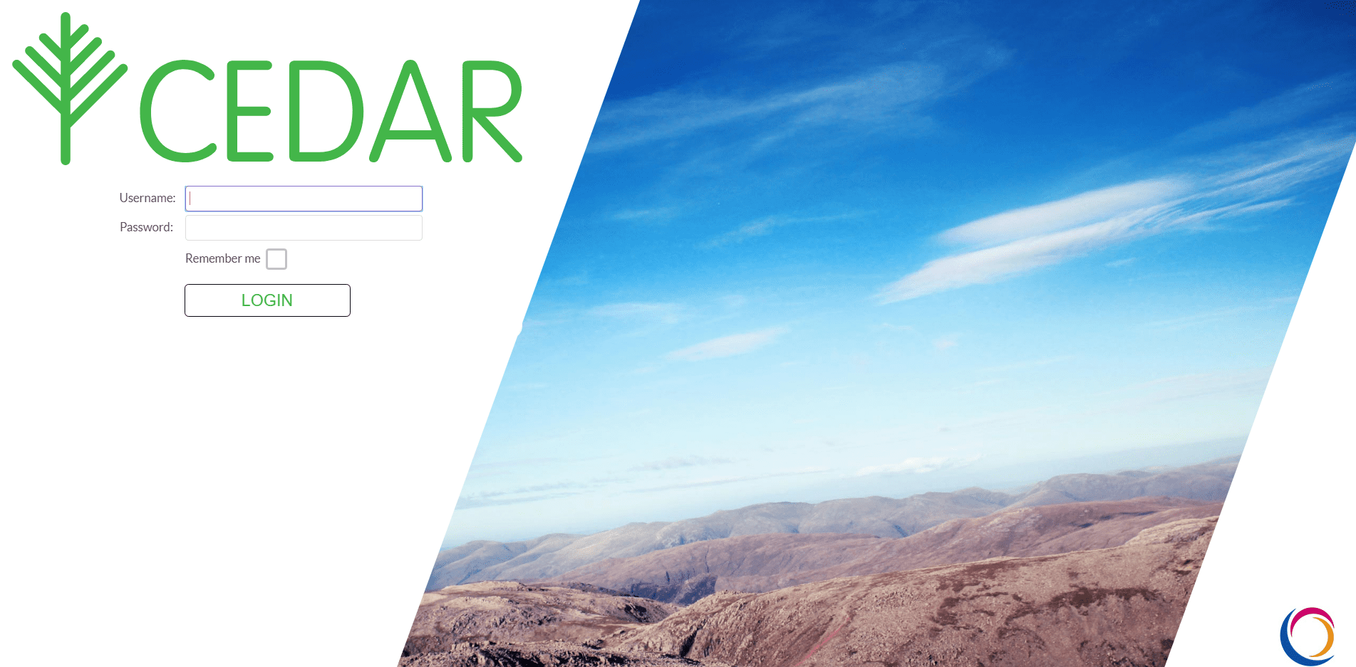
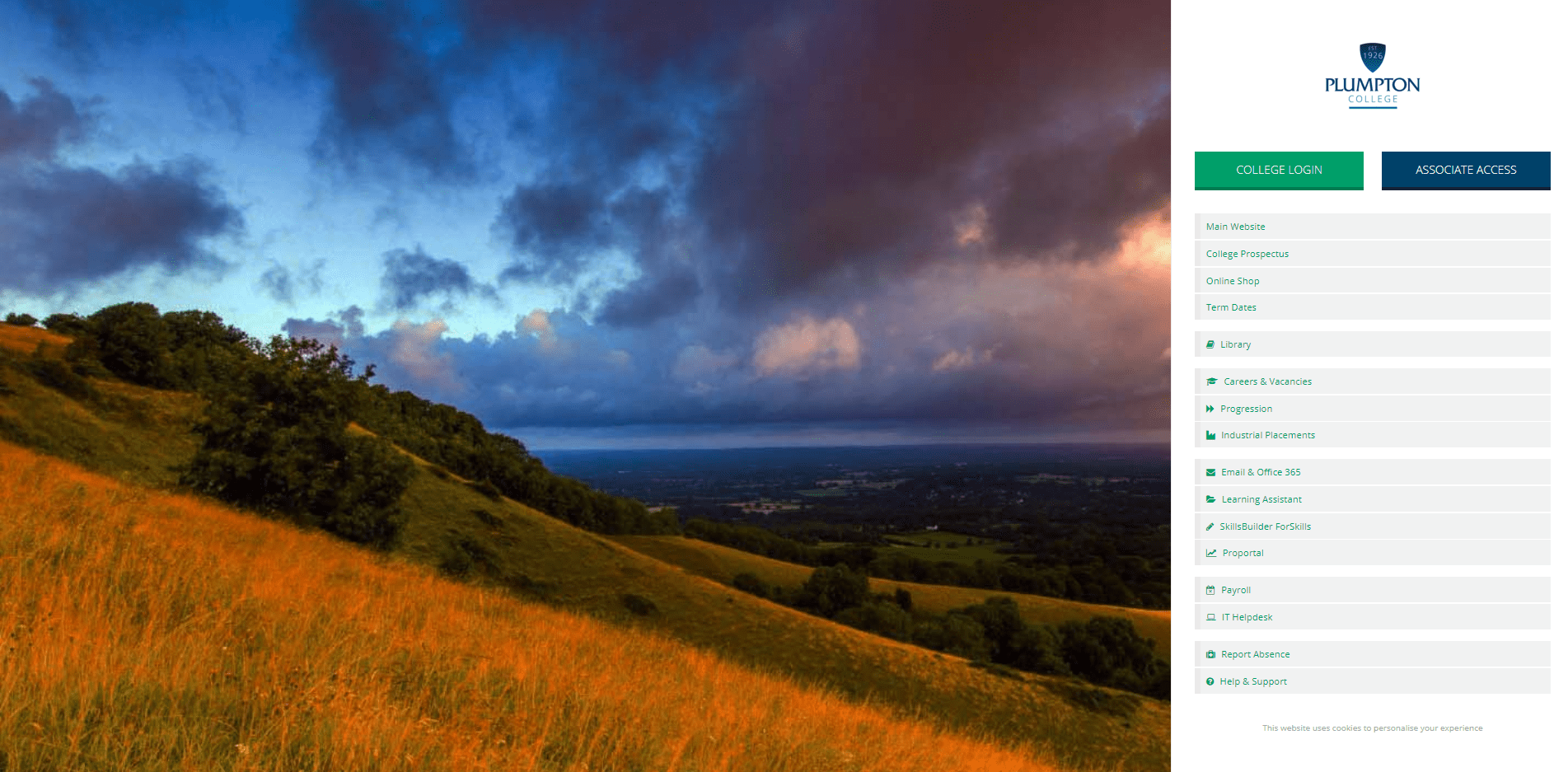
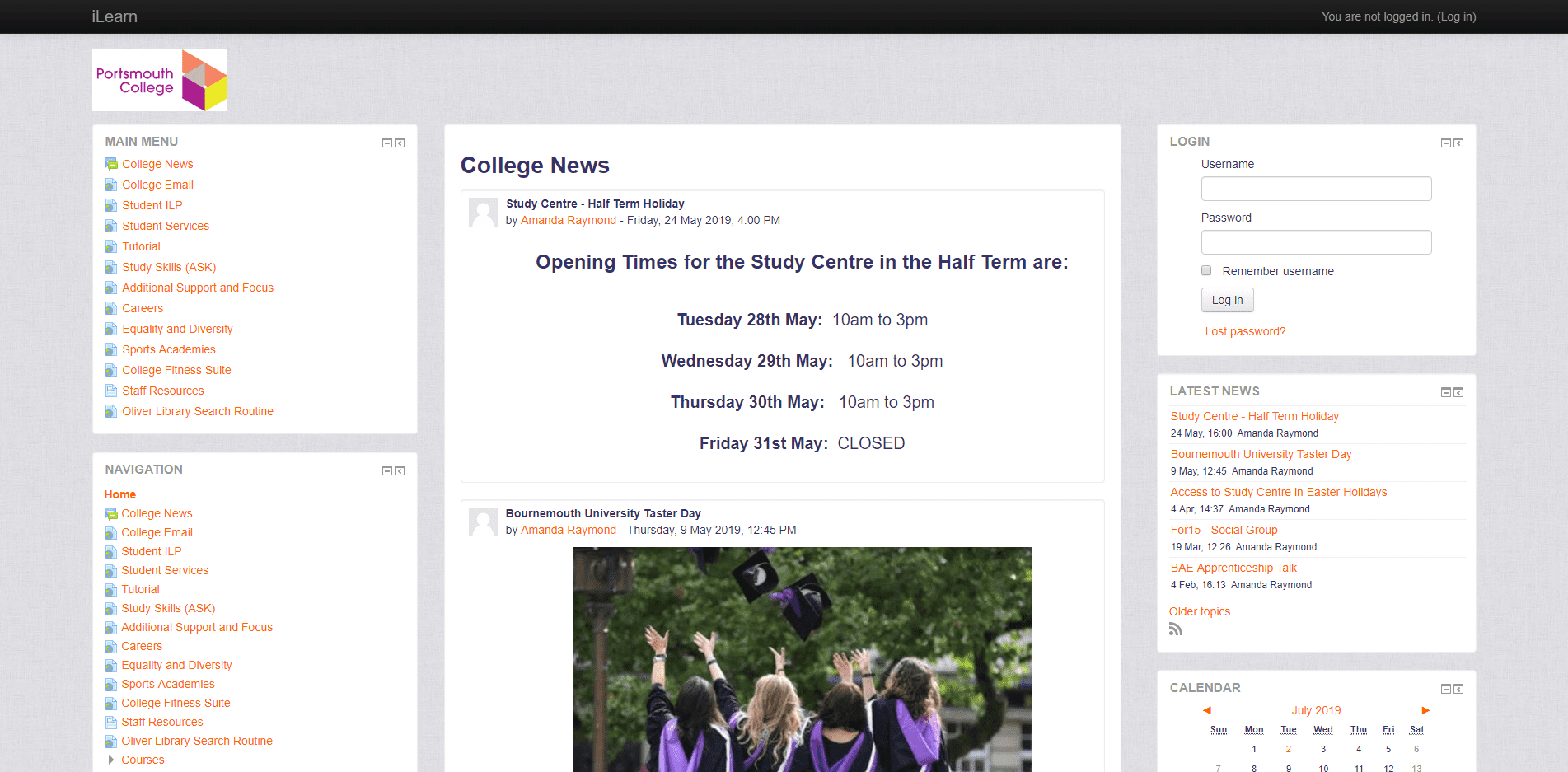
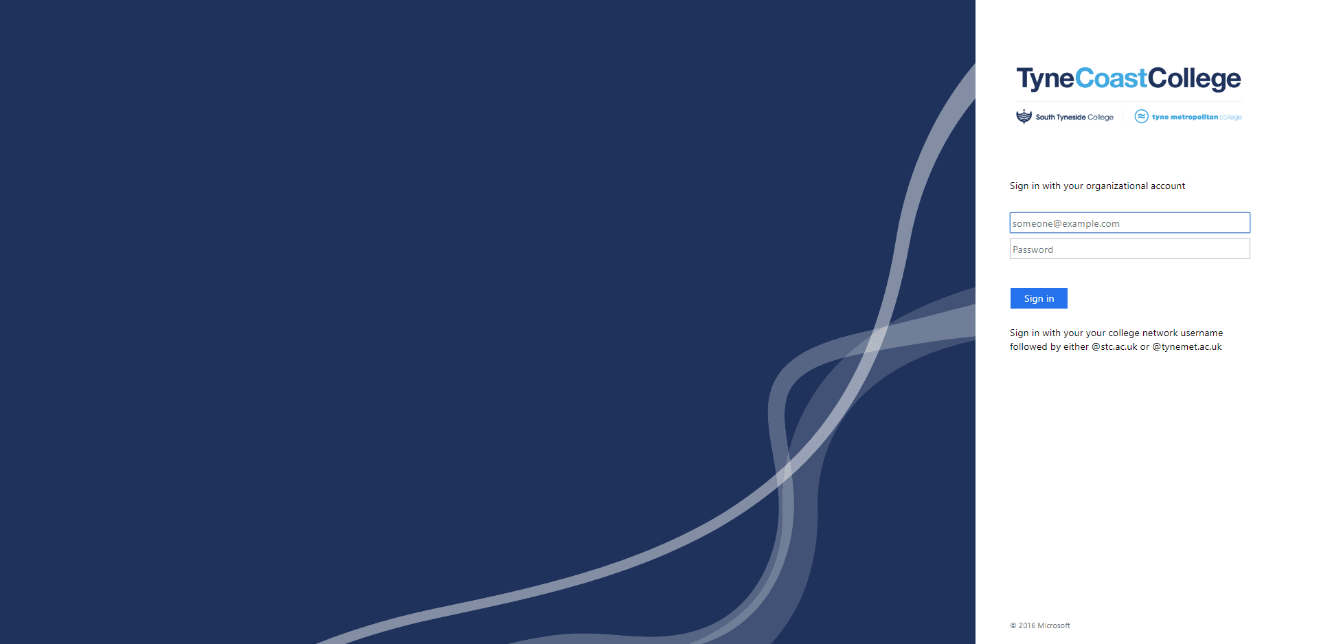
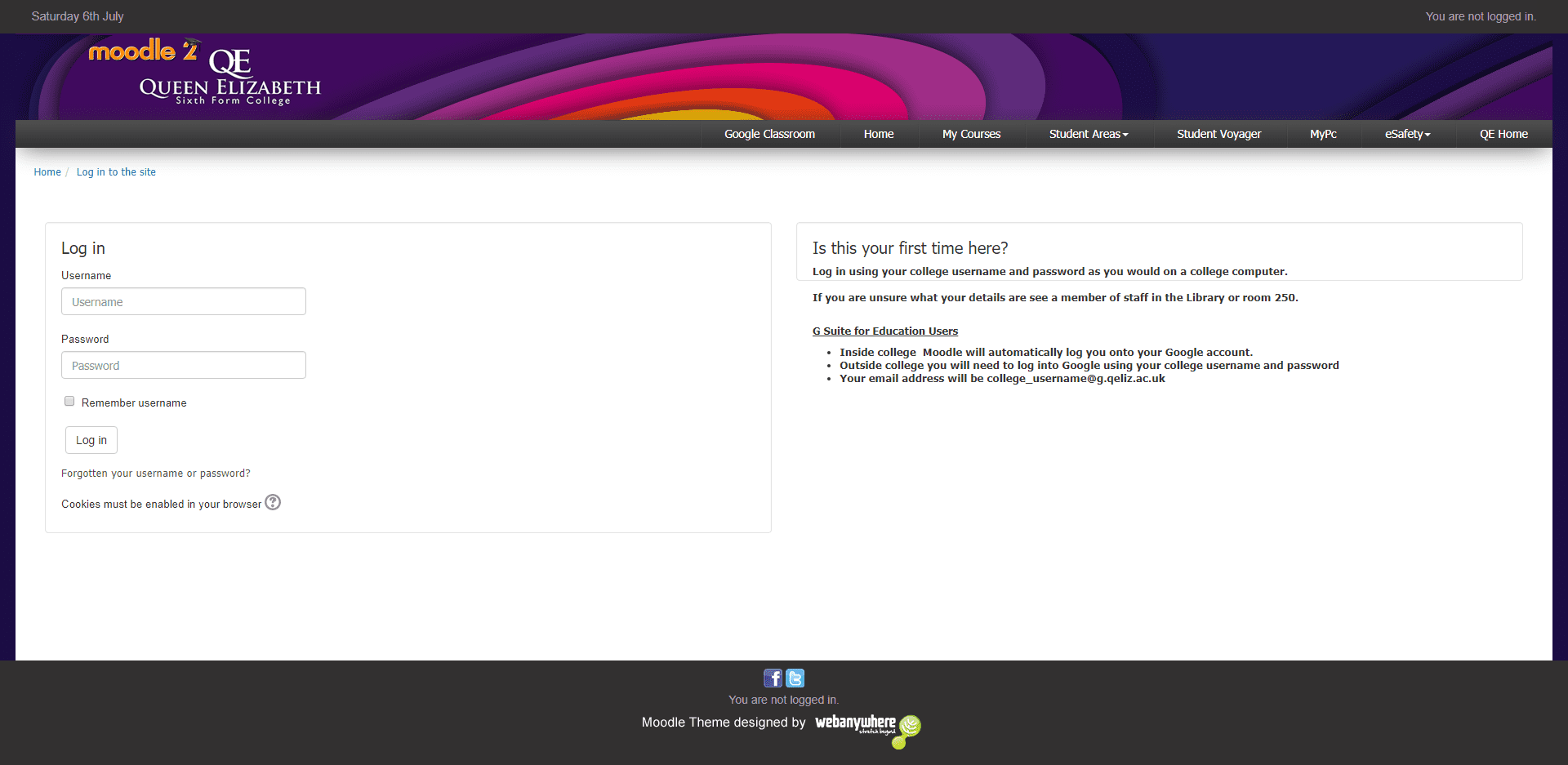
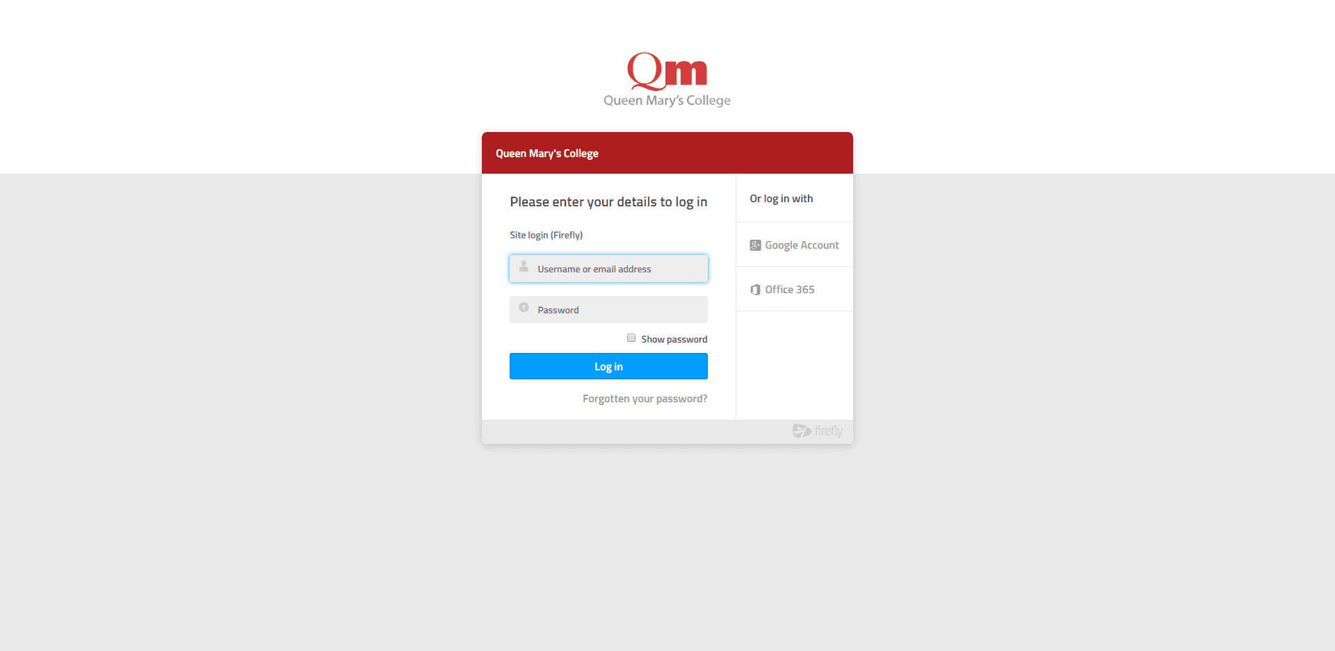
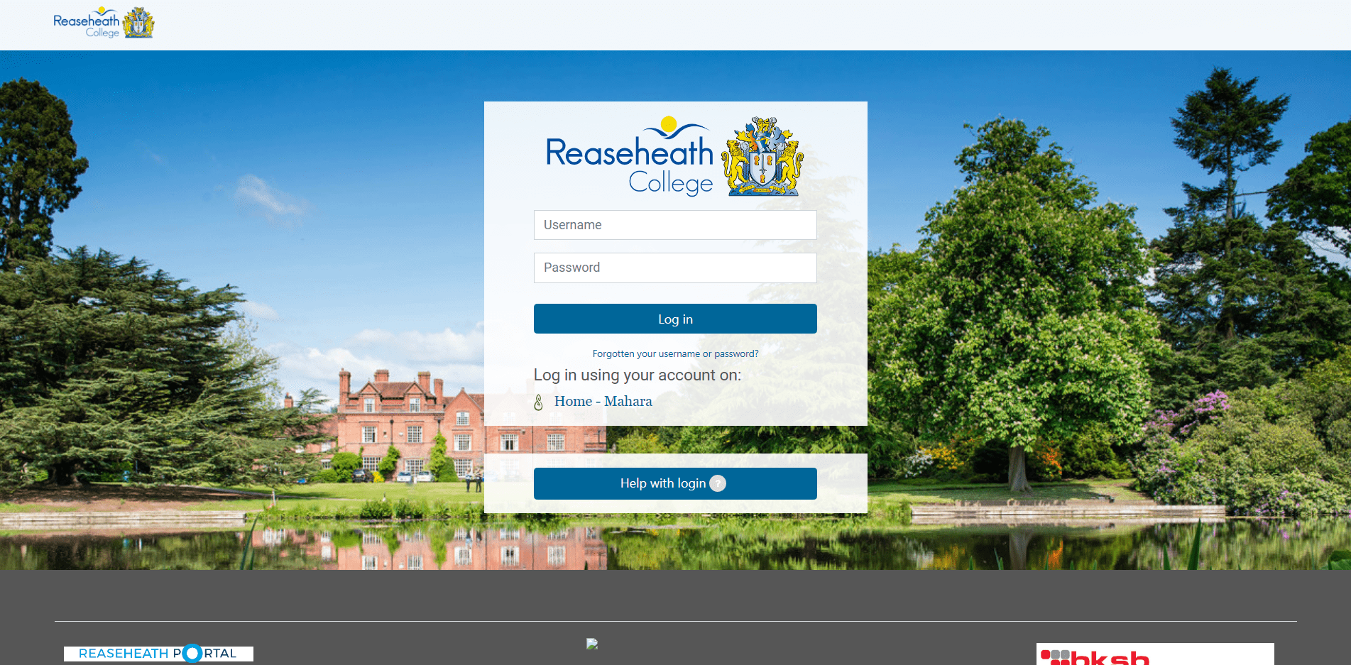
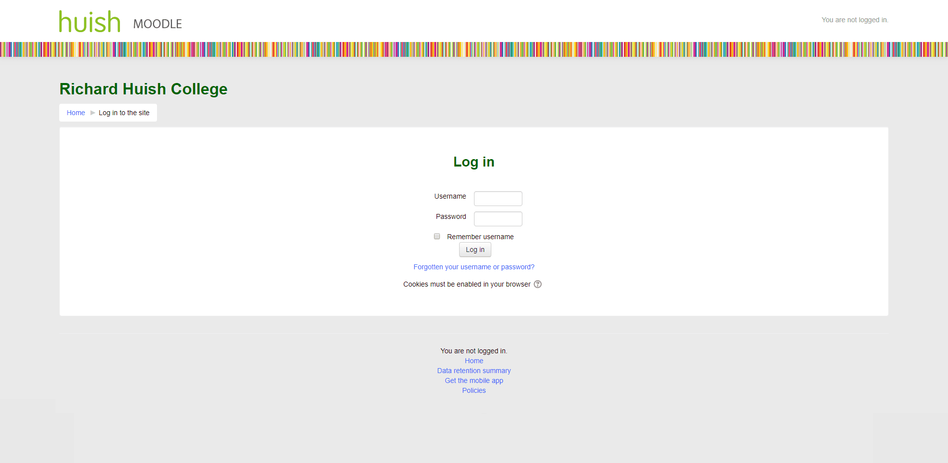
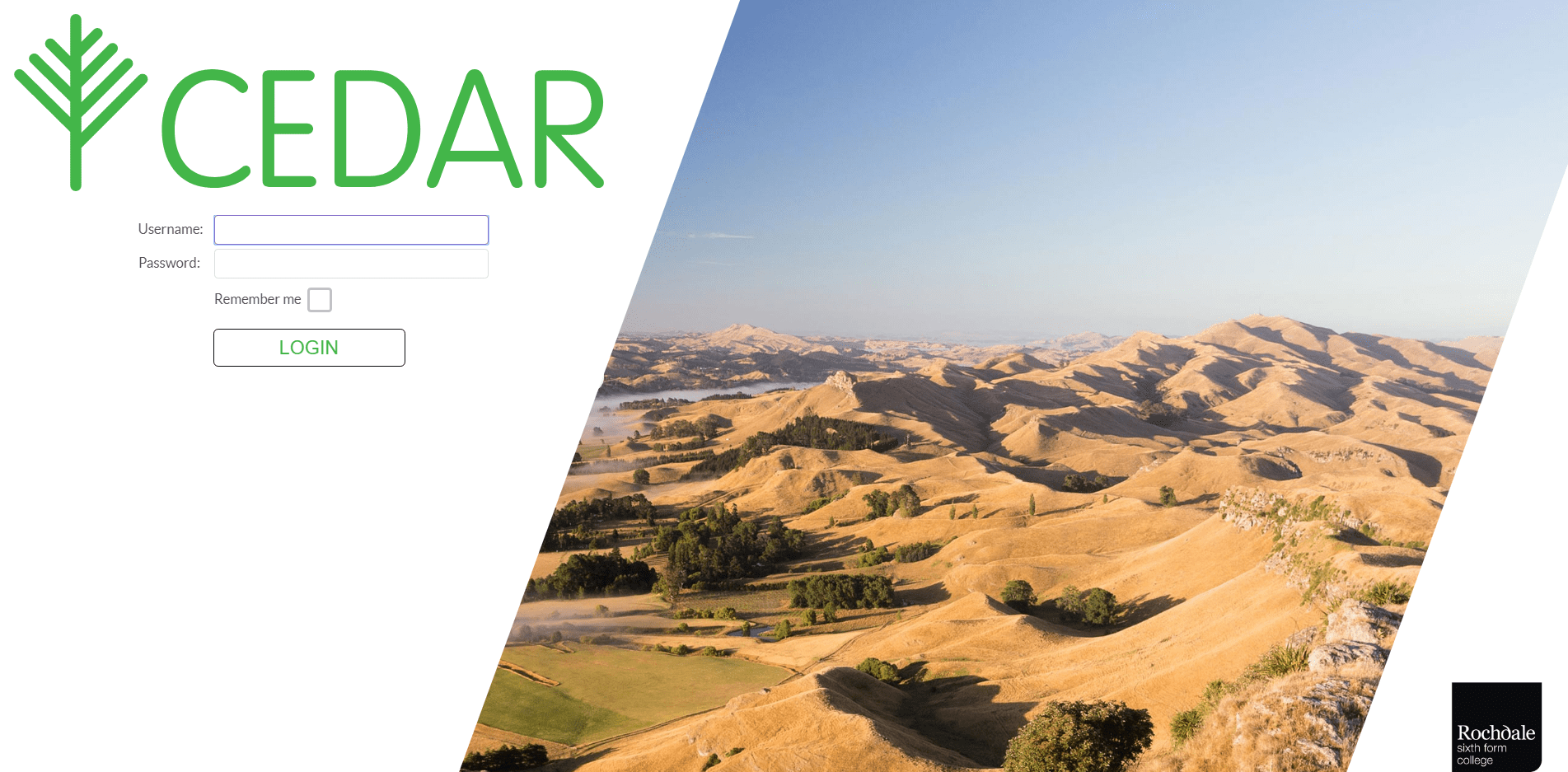
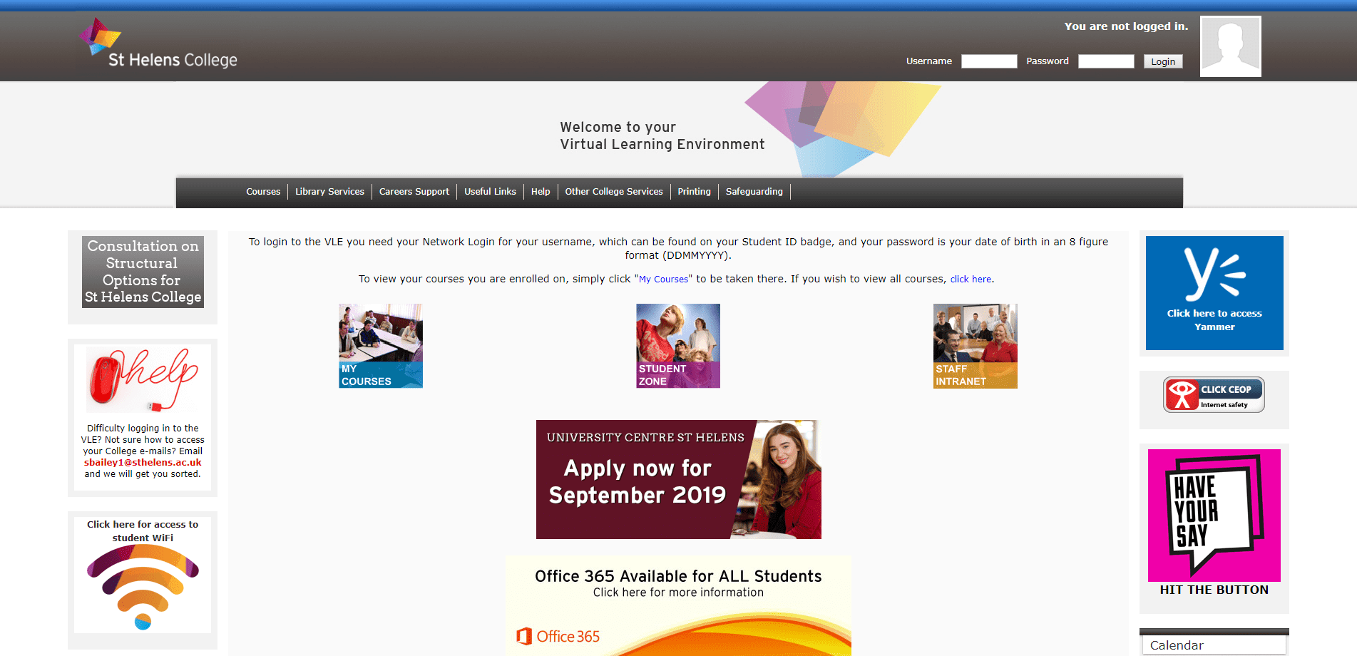
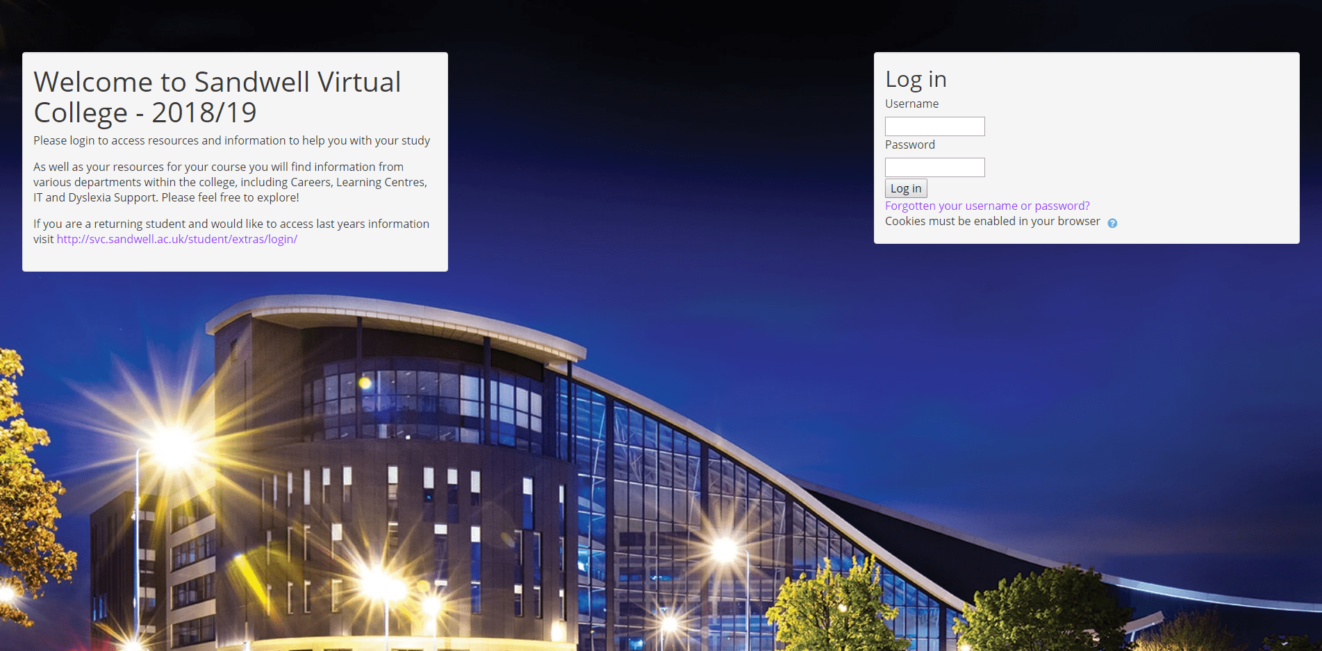
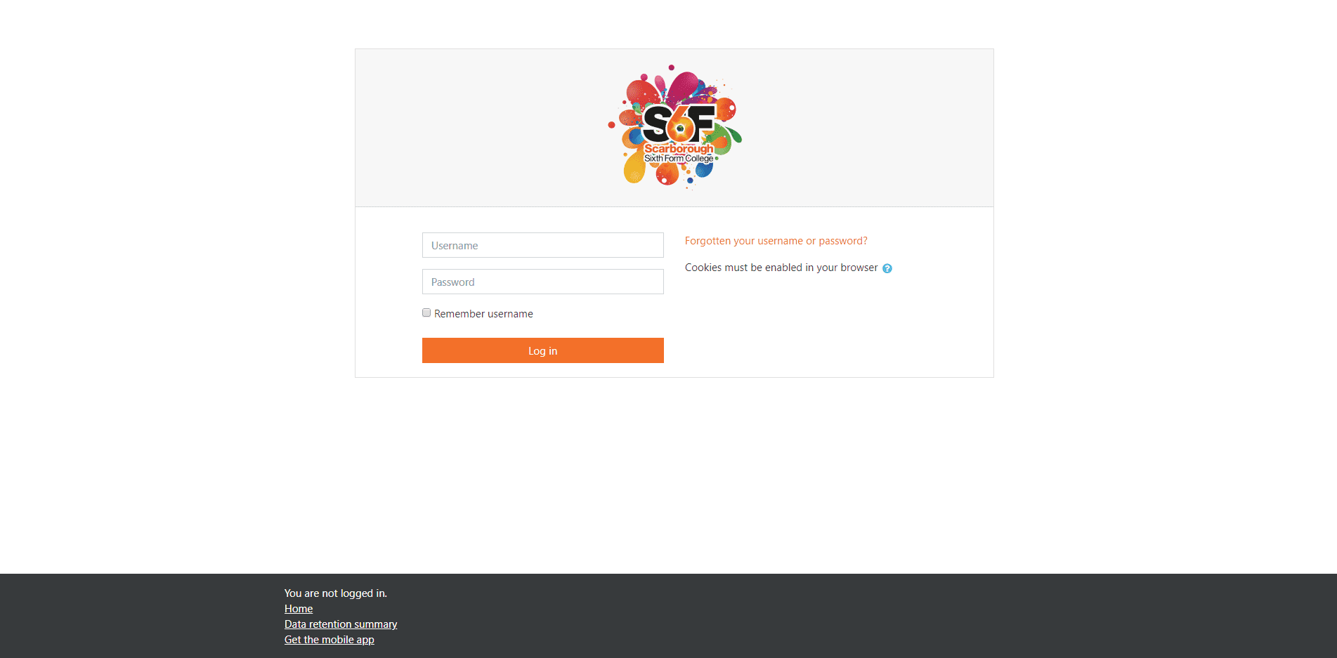
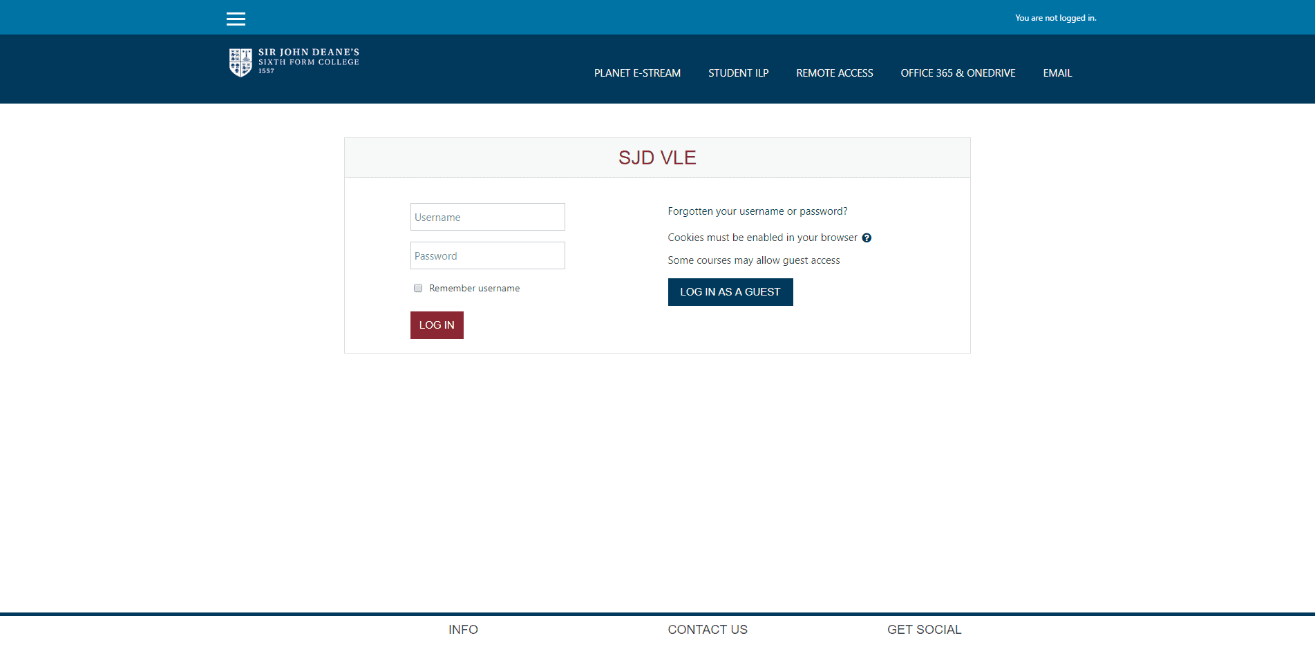
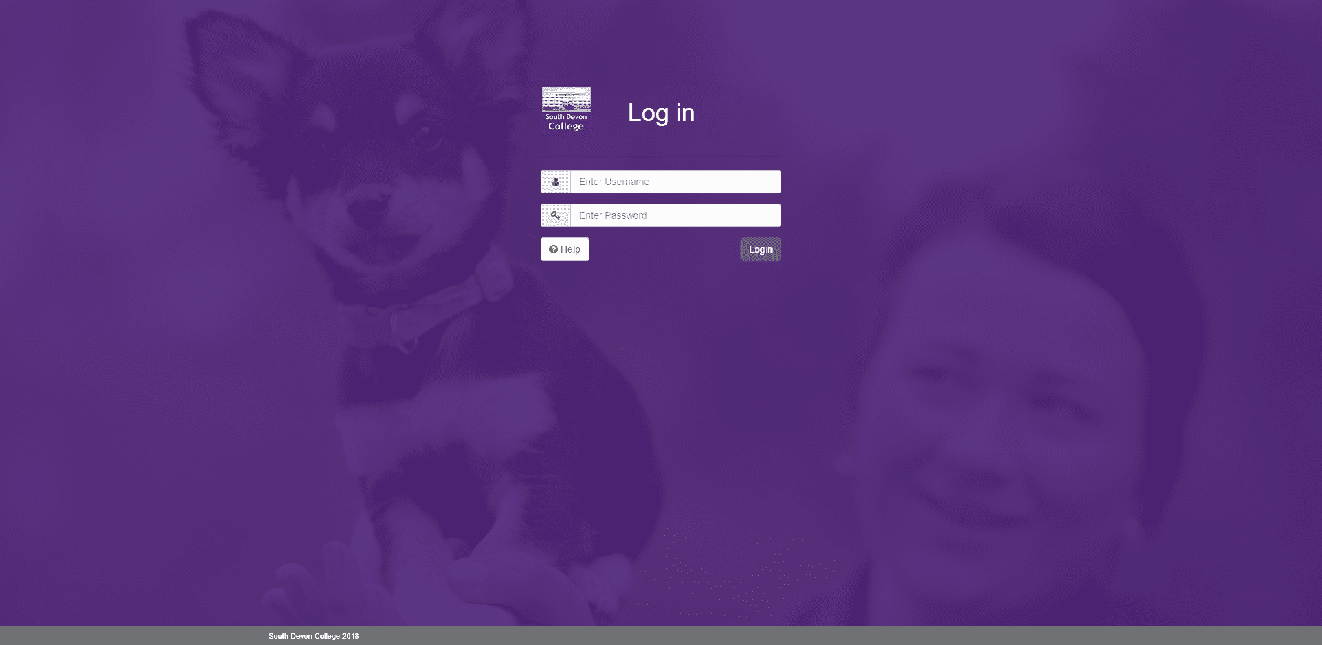
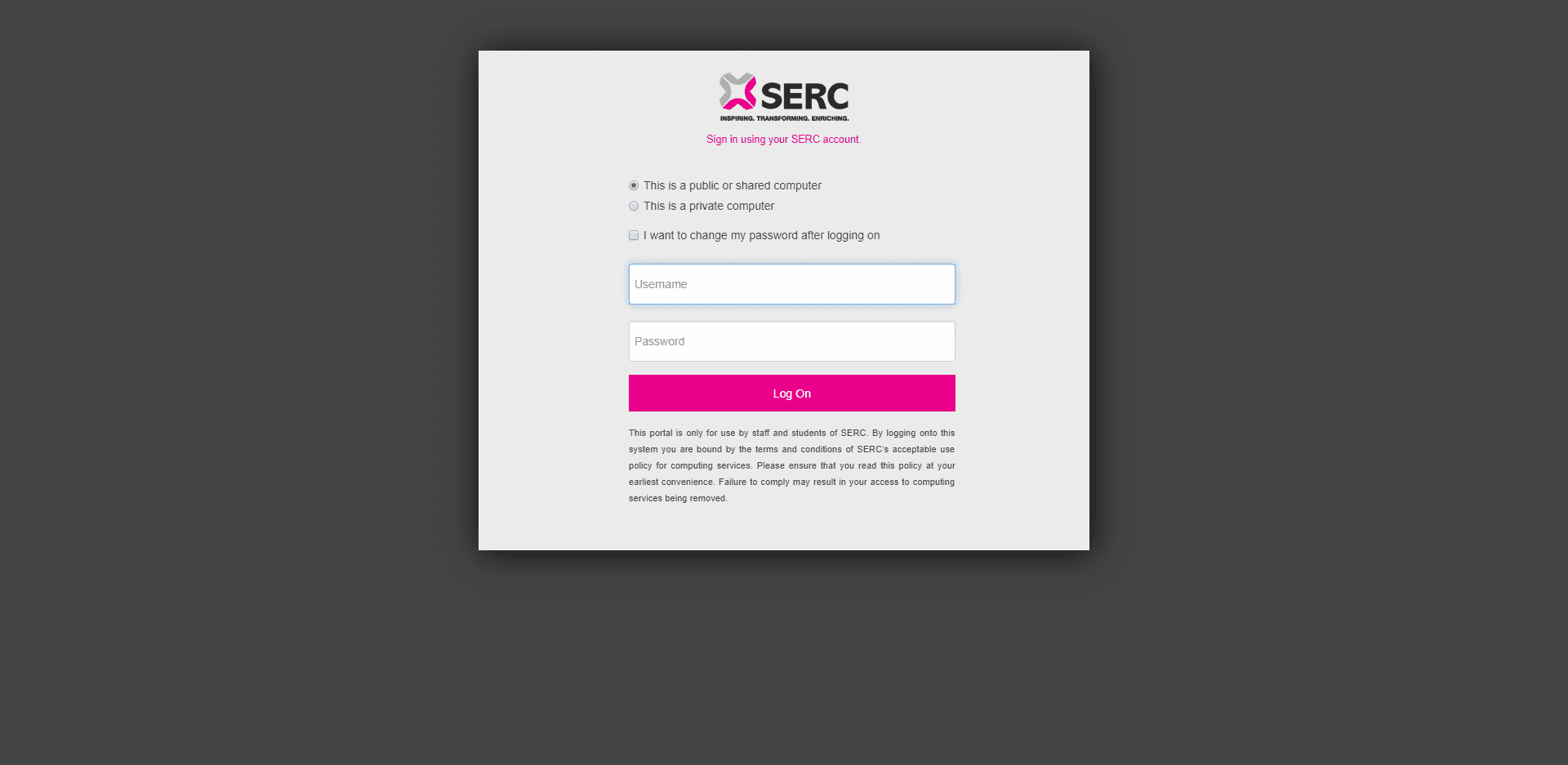
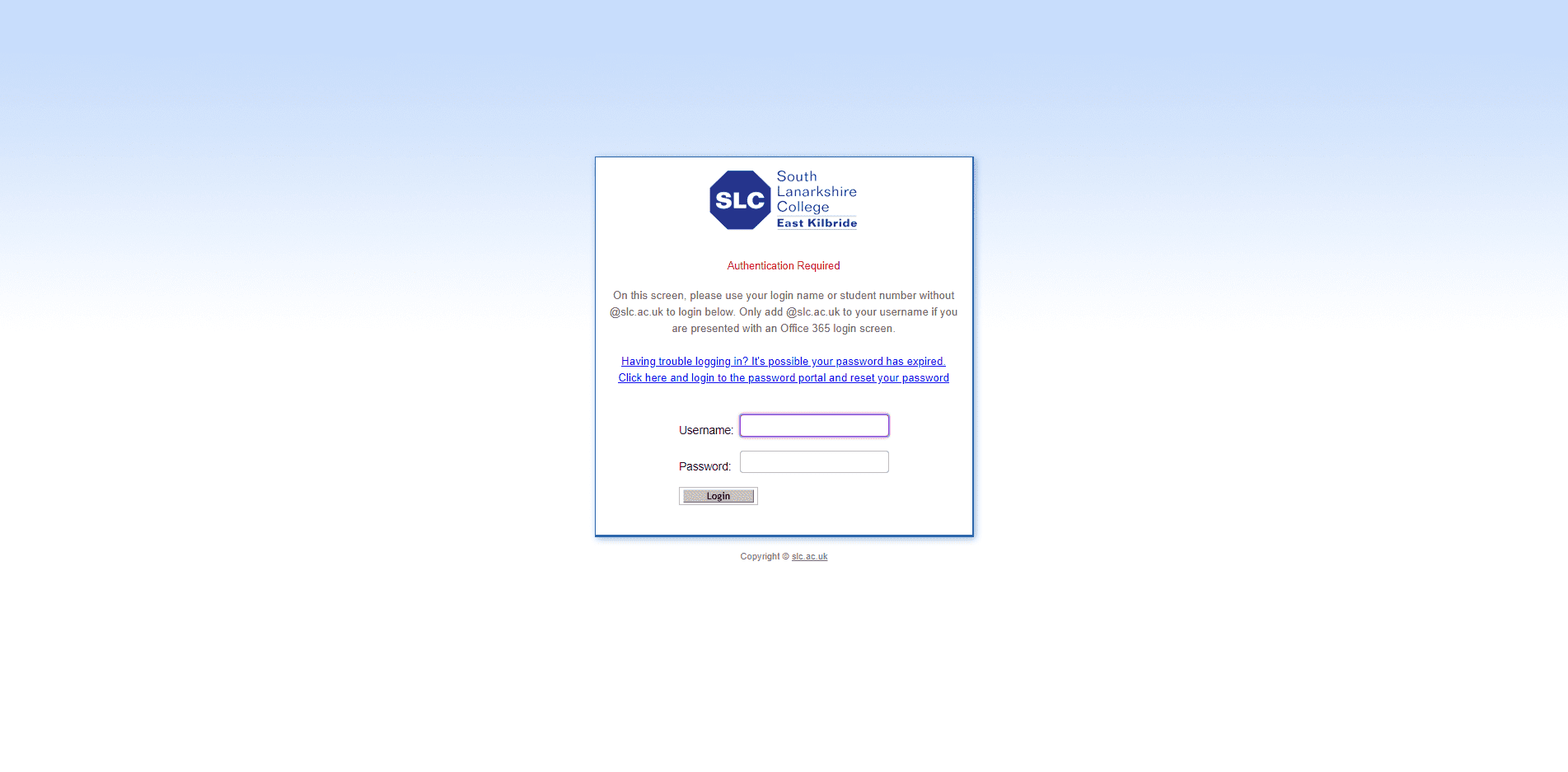
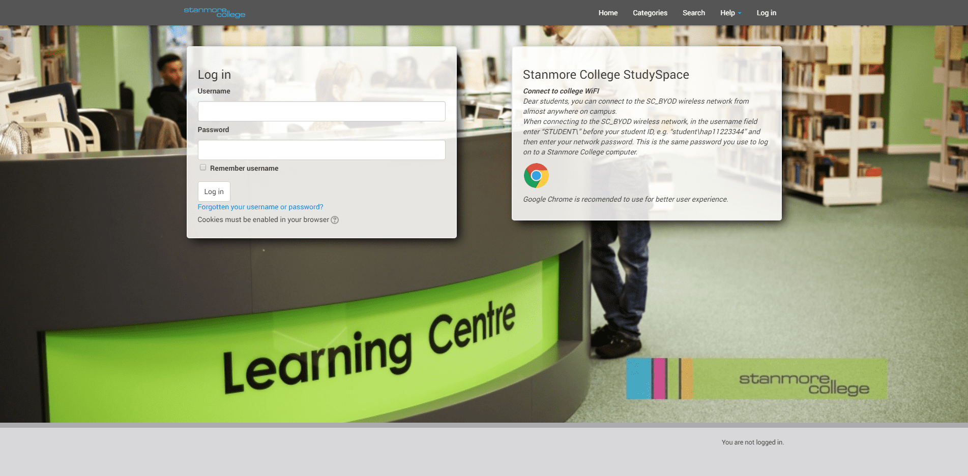
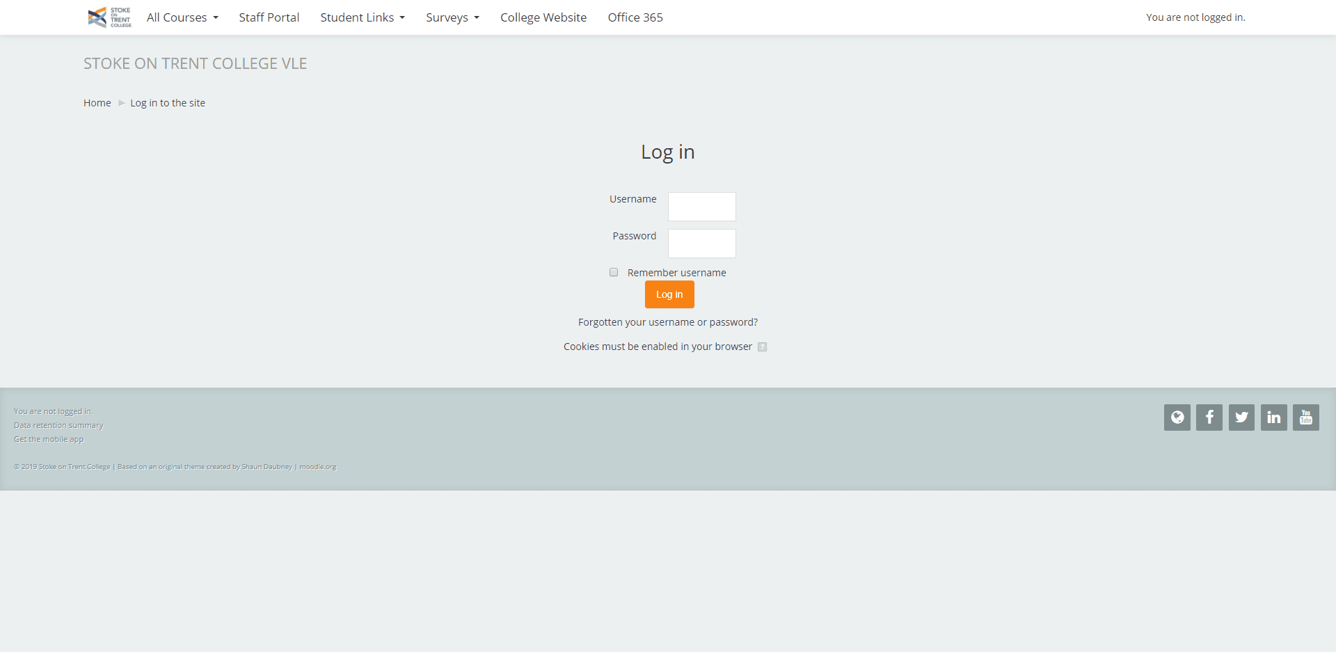
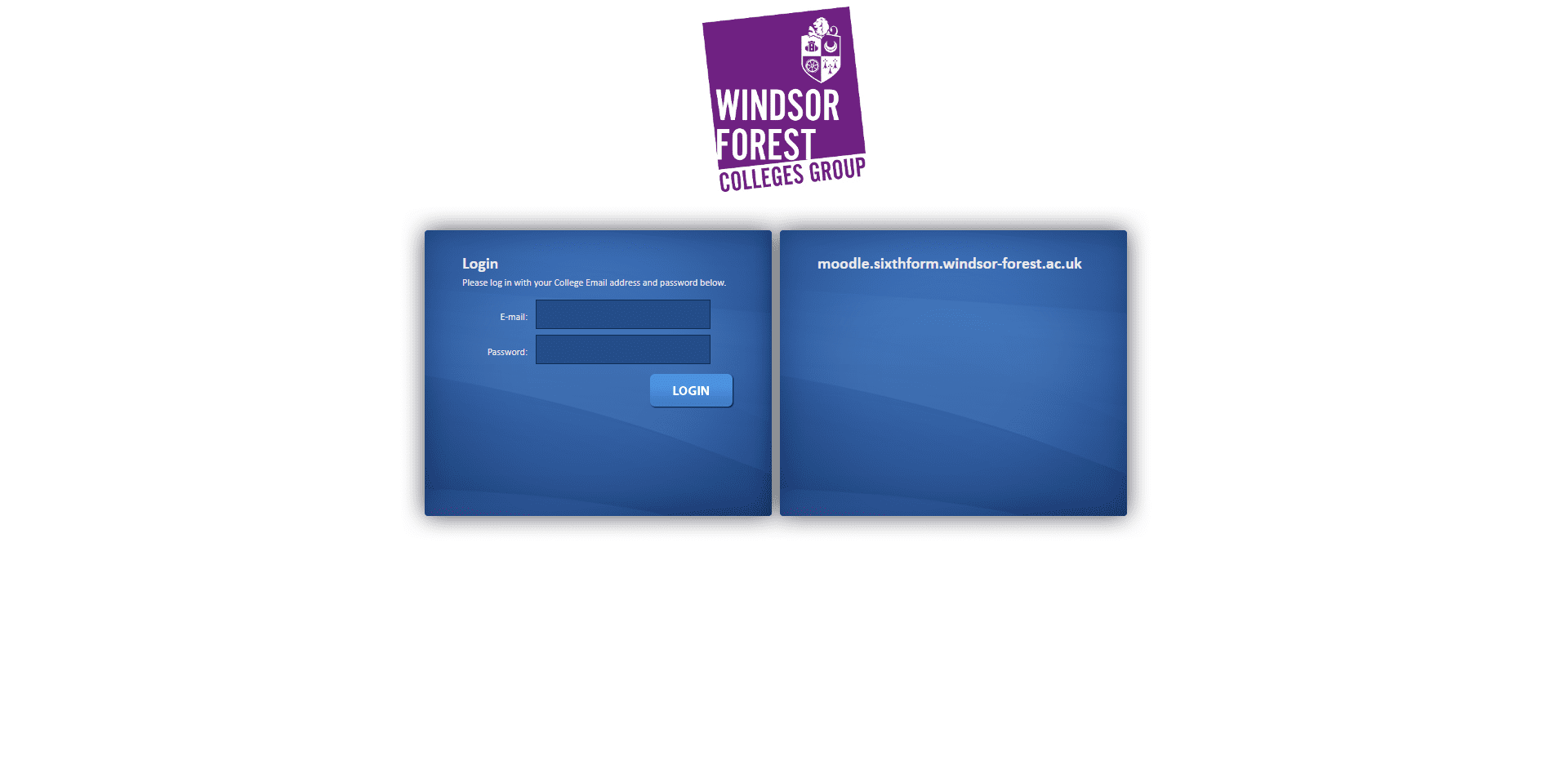
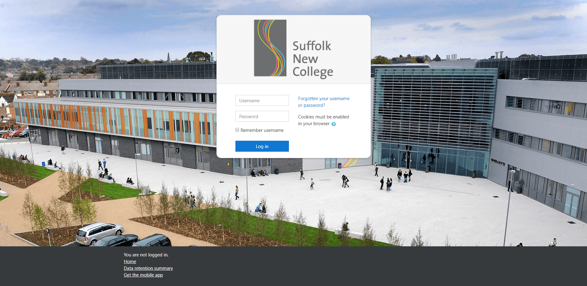
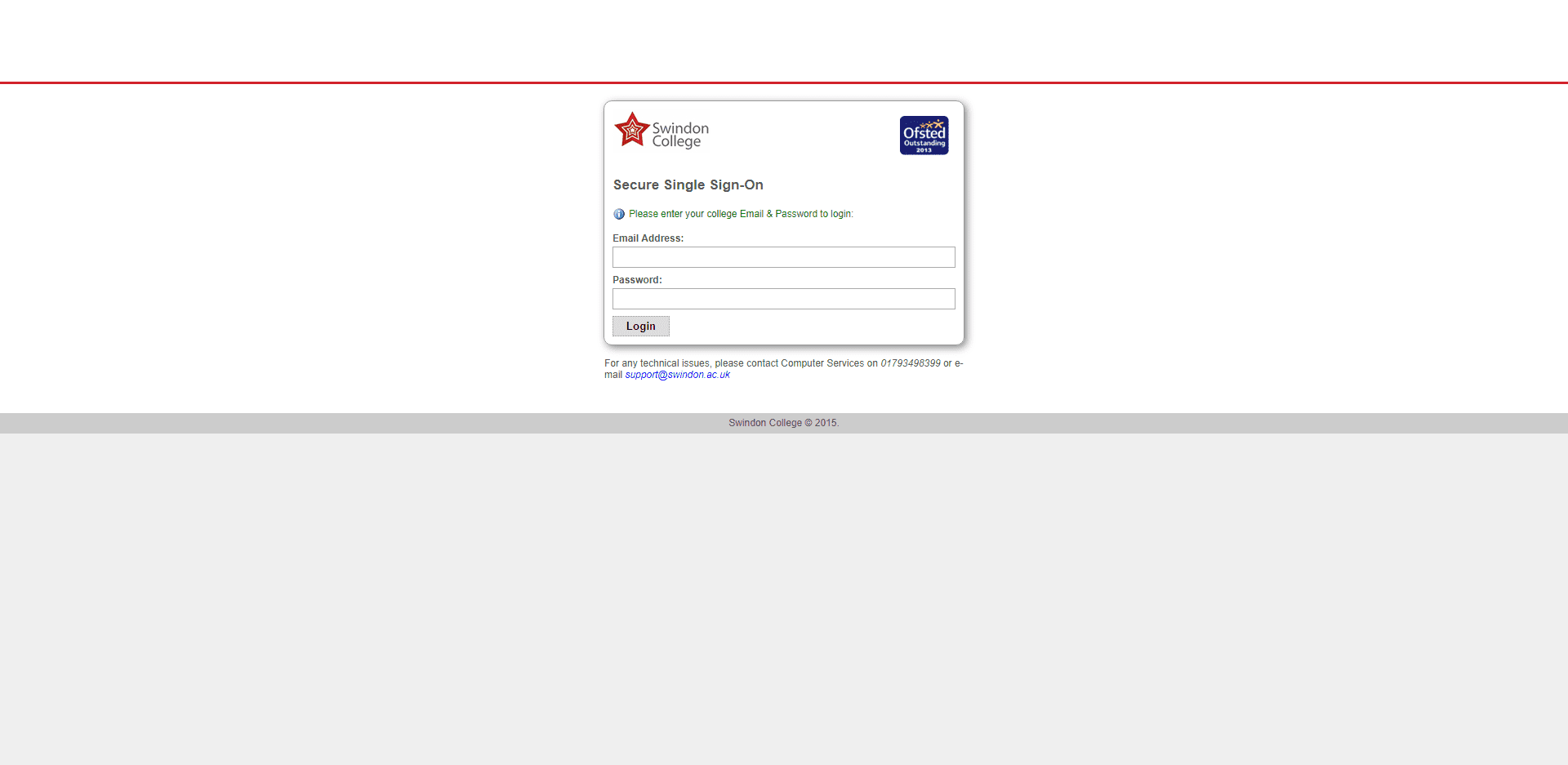
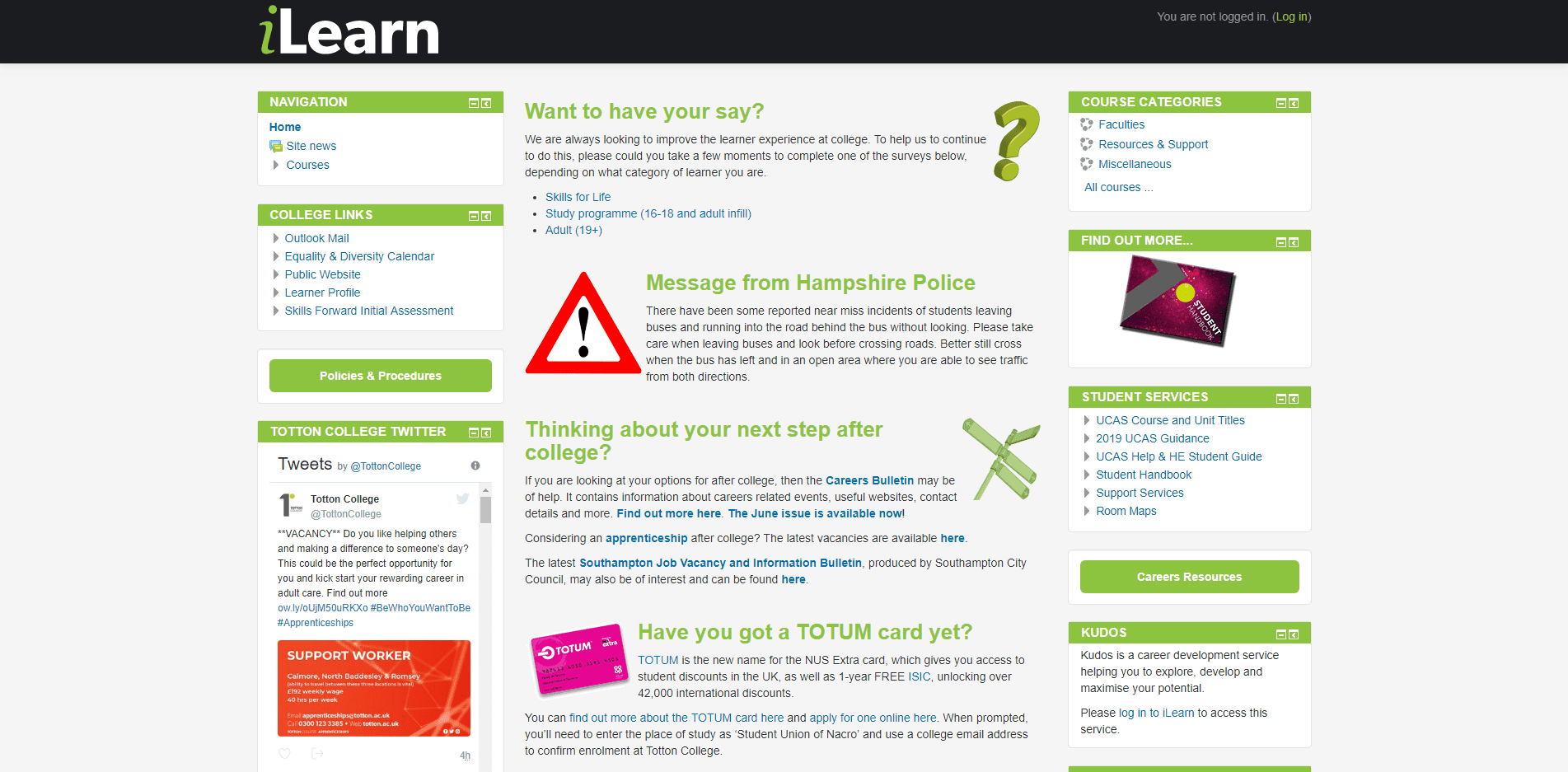
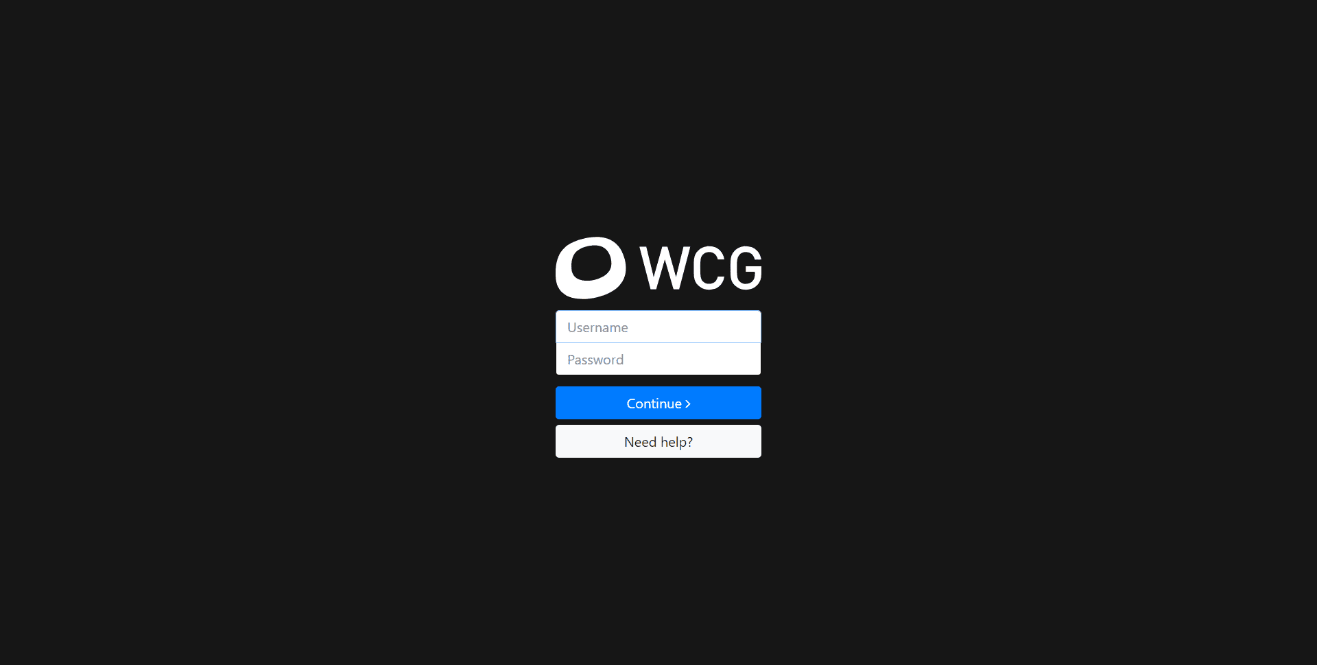
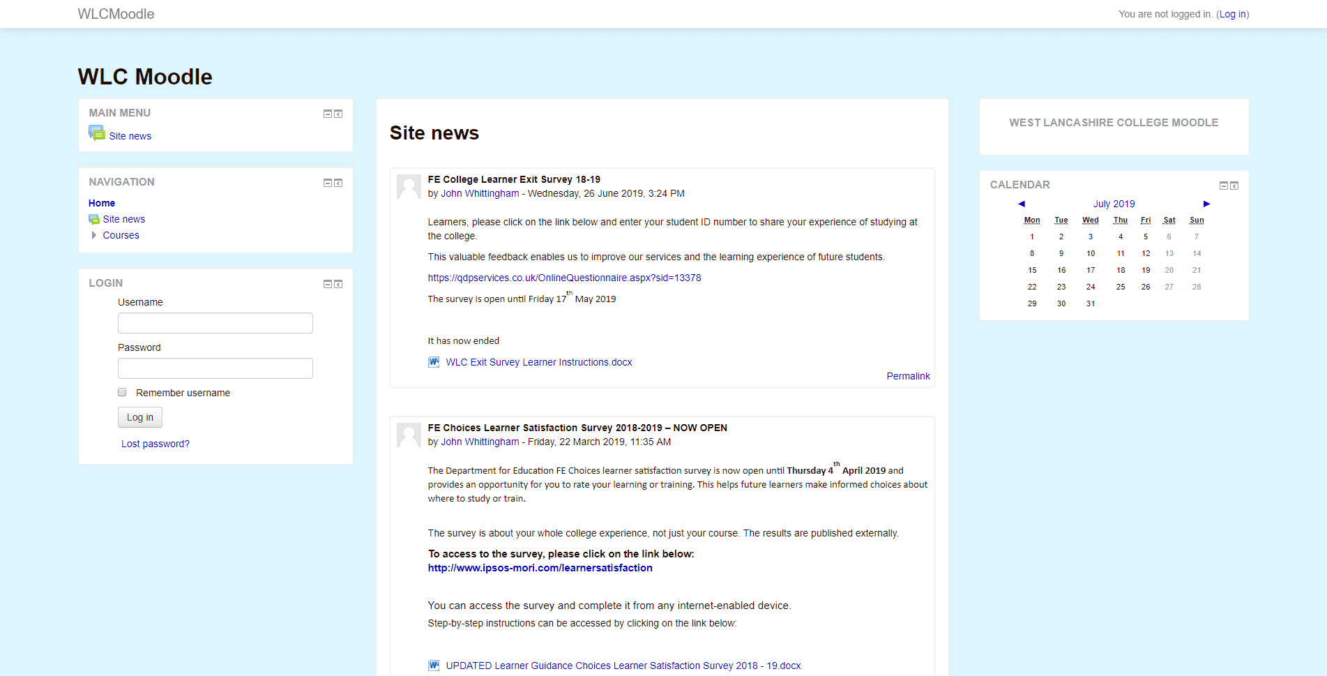
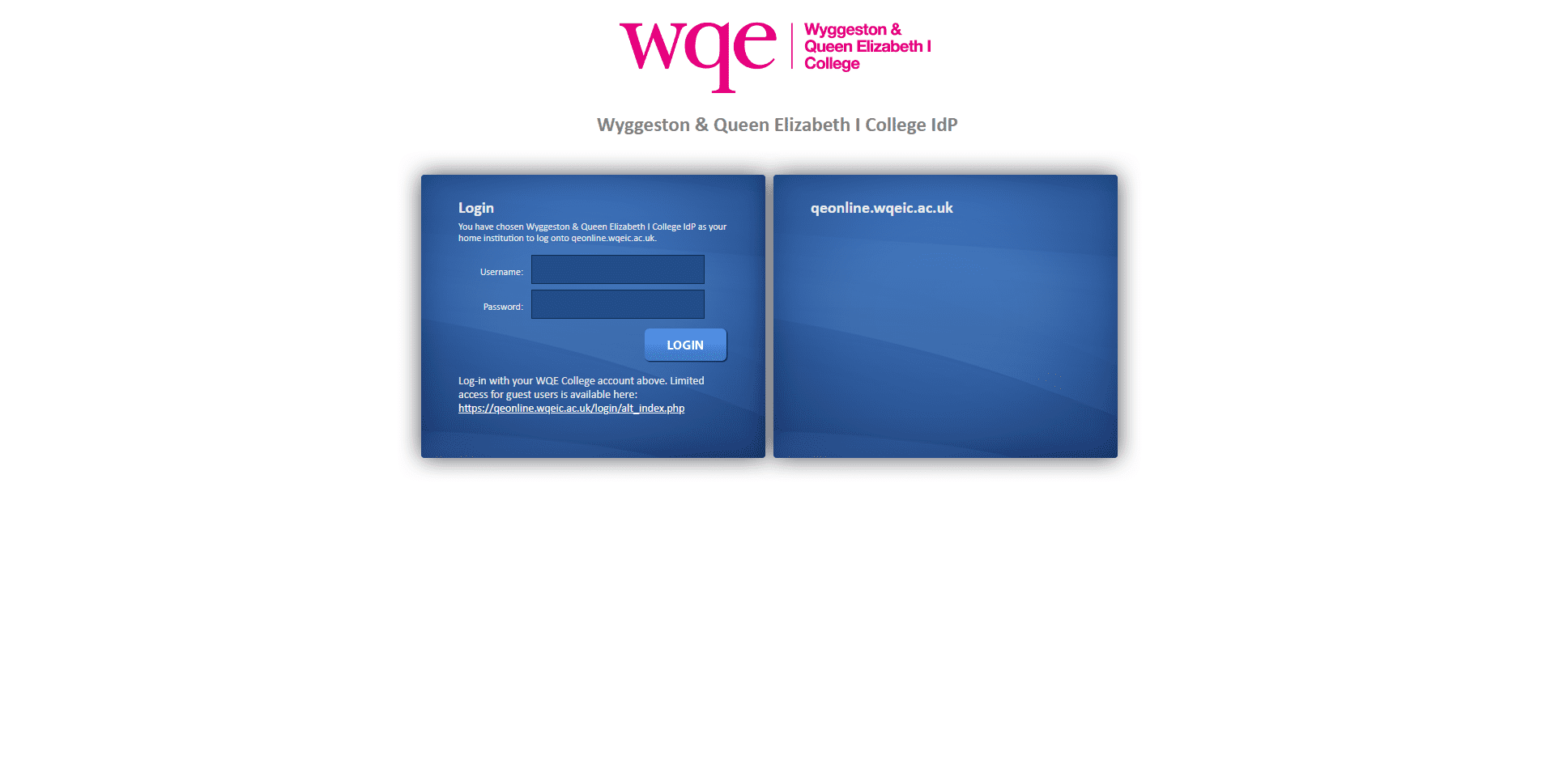
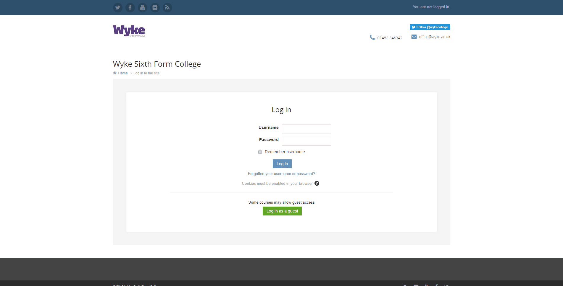
The method used to identify best practice on the design and operation of a College VLE has been to run a straightforward user assessment. This sets a test for the number of steps required achieve the purposes for visiting the VLE and the level of aesthetic and technical development of the user interface. Of the 406 VLEs tested, the first issue to present is a home page hidden behind a login interface and that this does not present the VLE Helpdesk contact details or even any College branding. This first of four technical and aesthetic design issues are shown here:
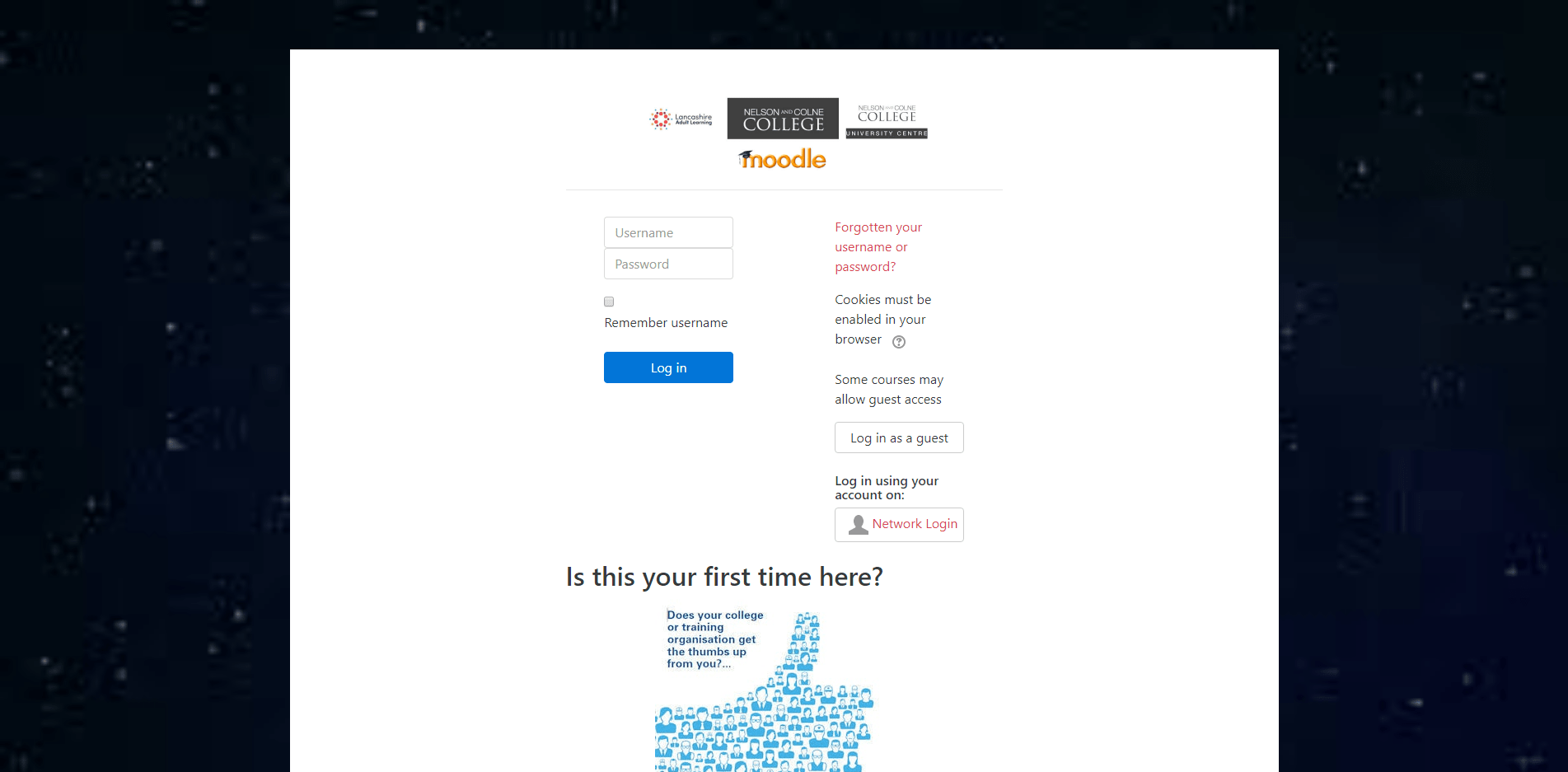
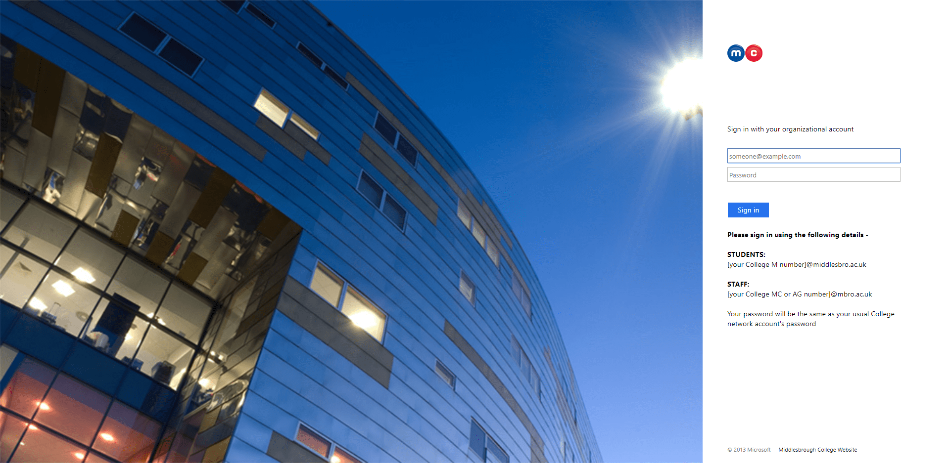
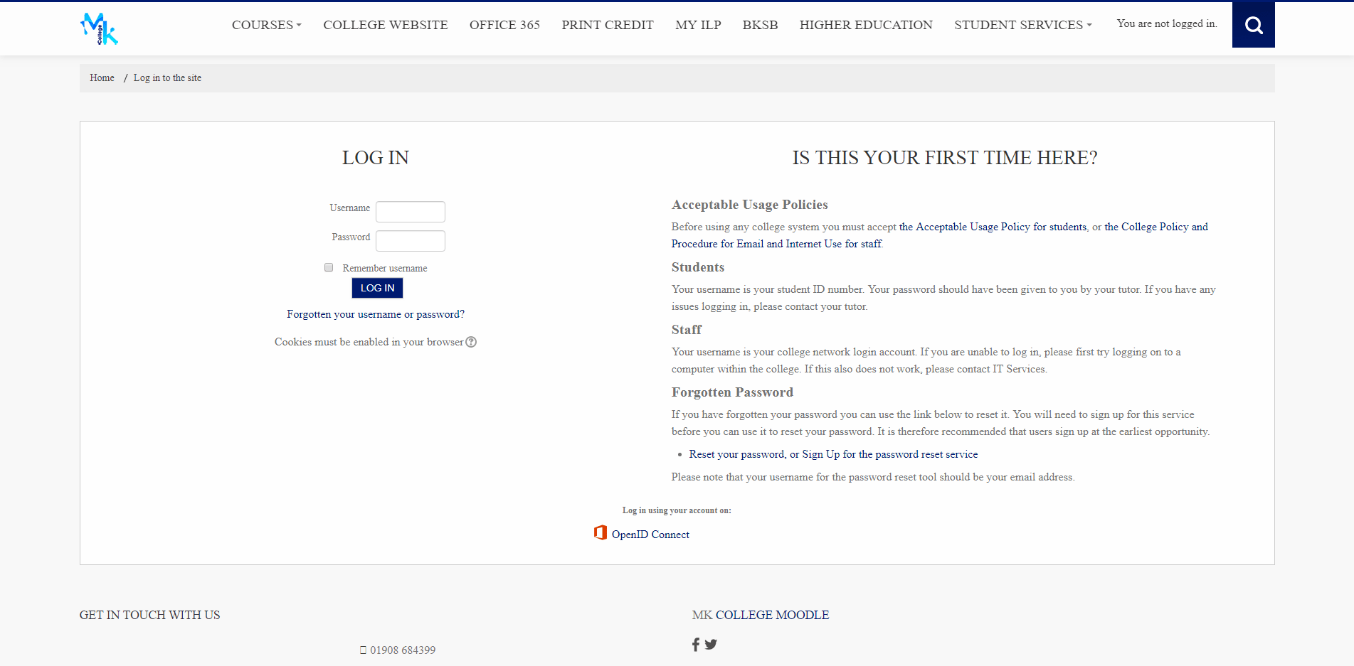
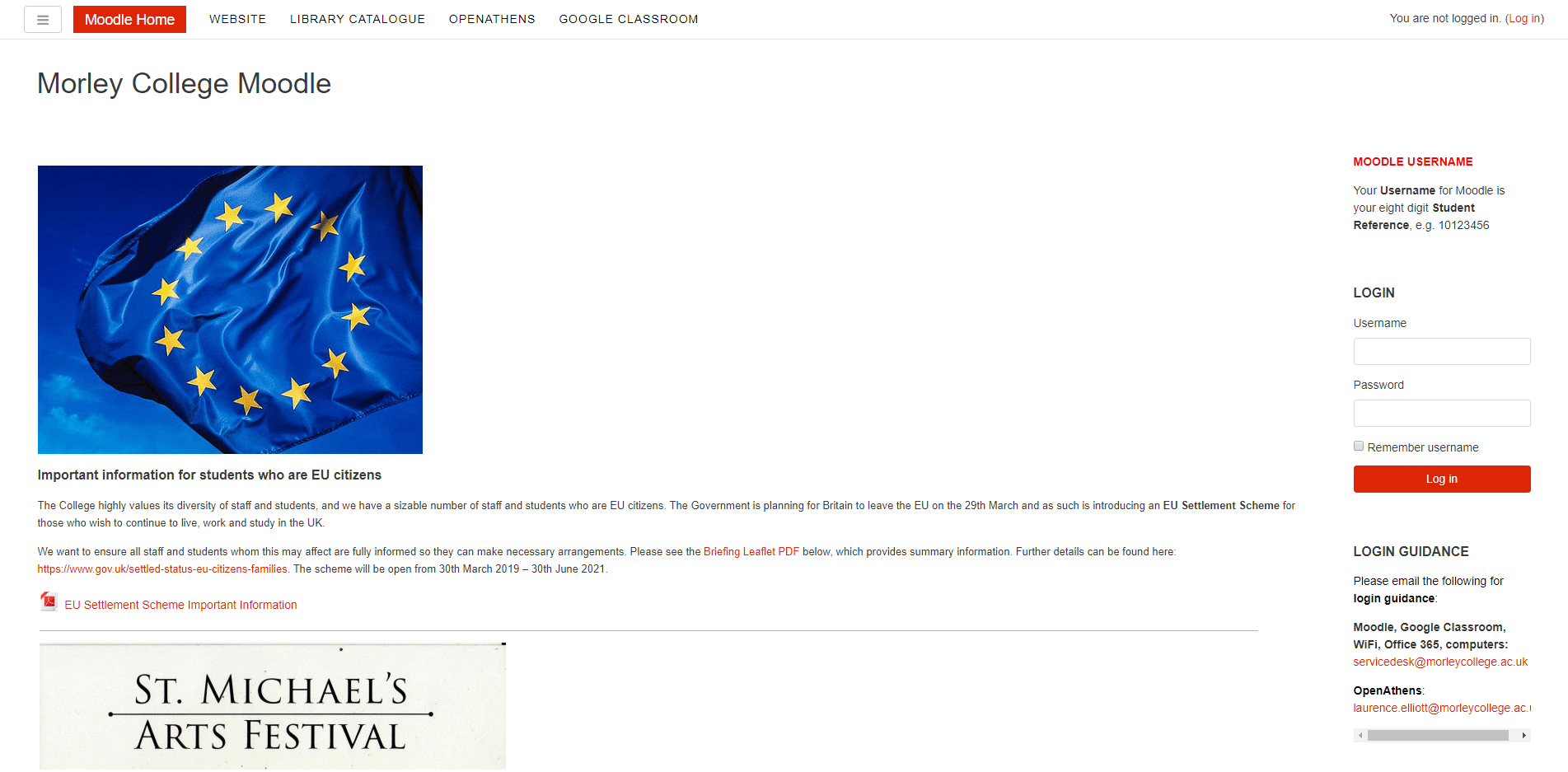
No Public Home Page
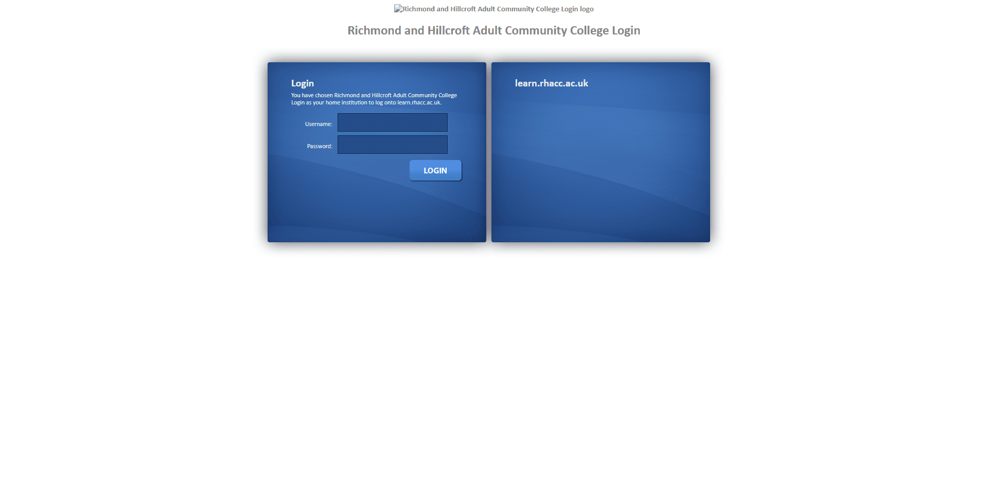
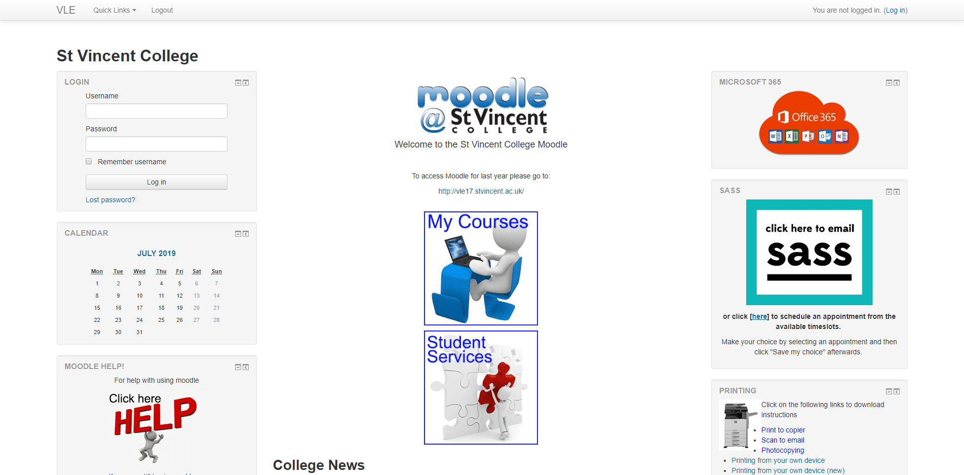
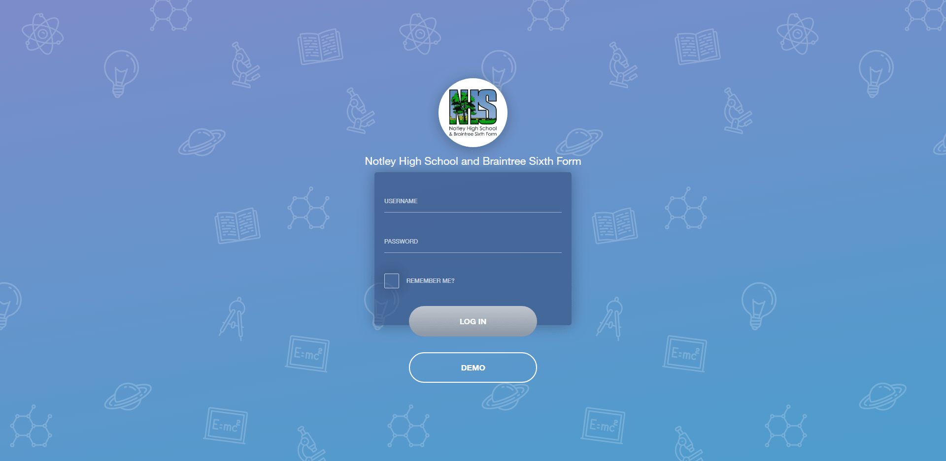
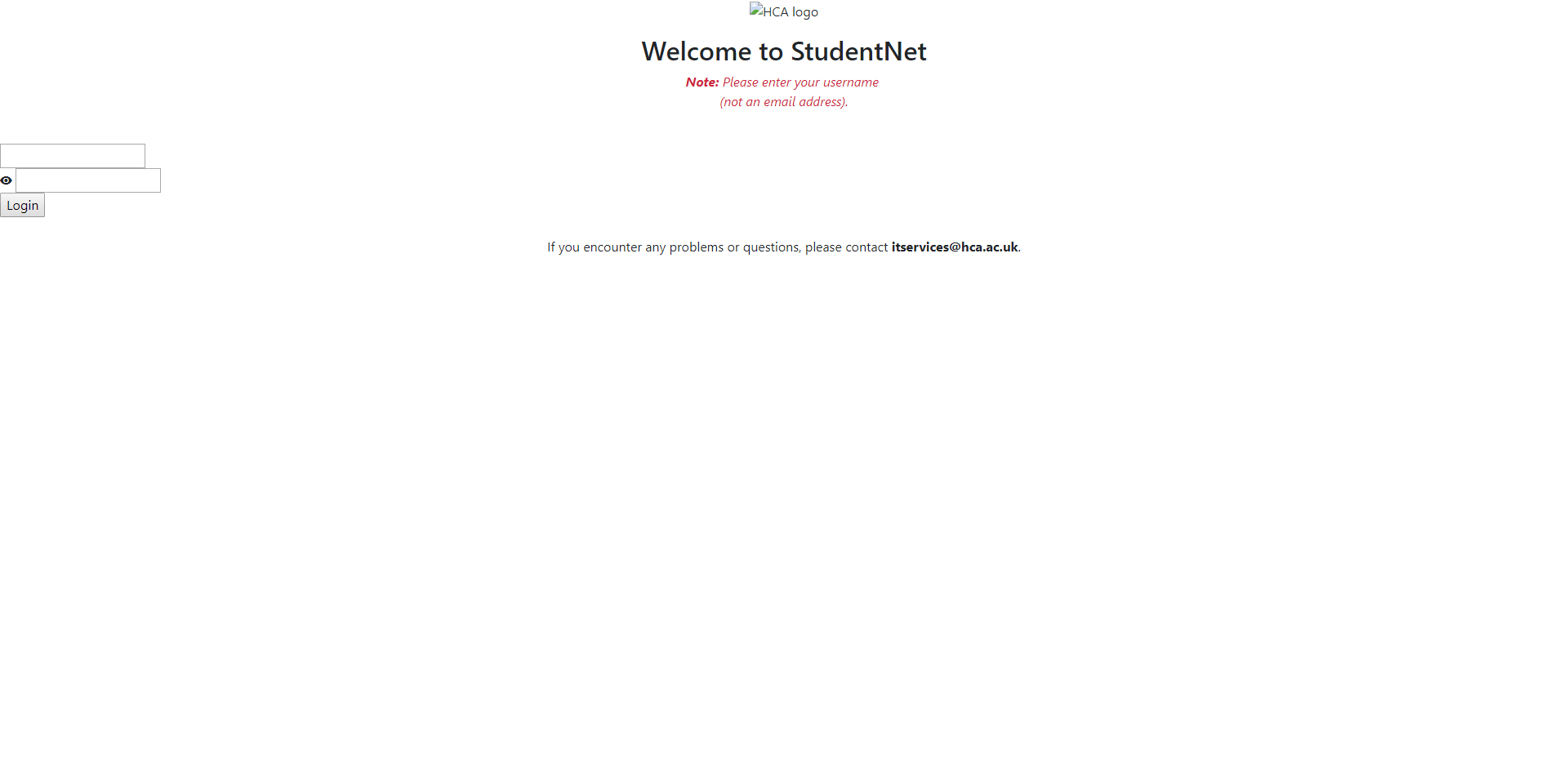
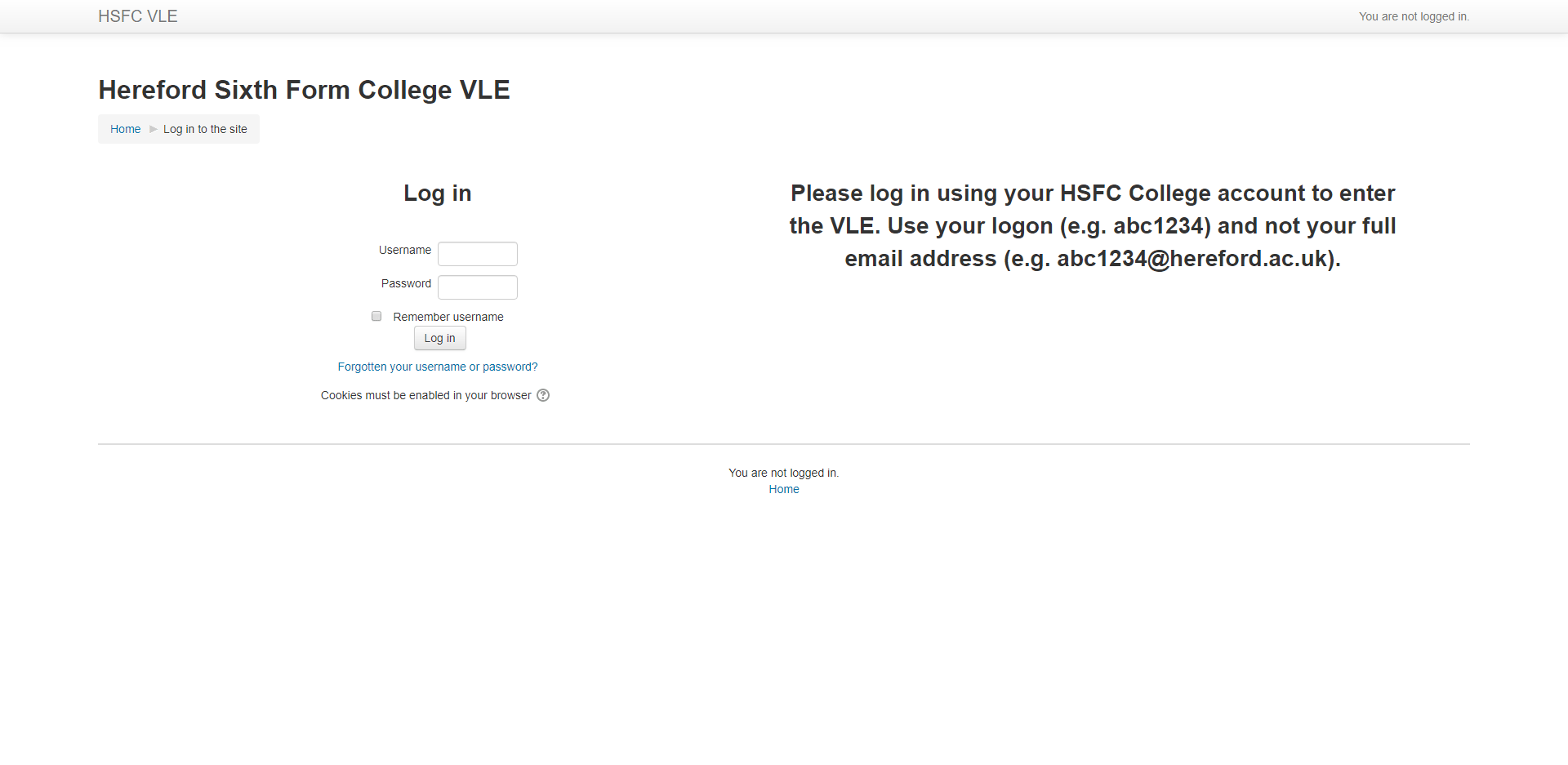
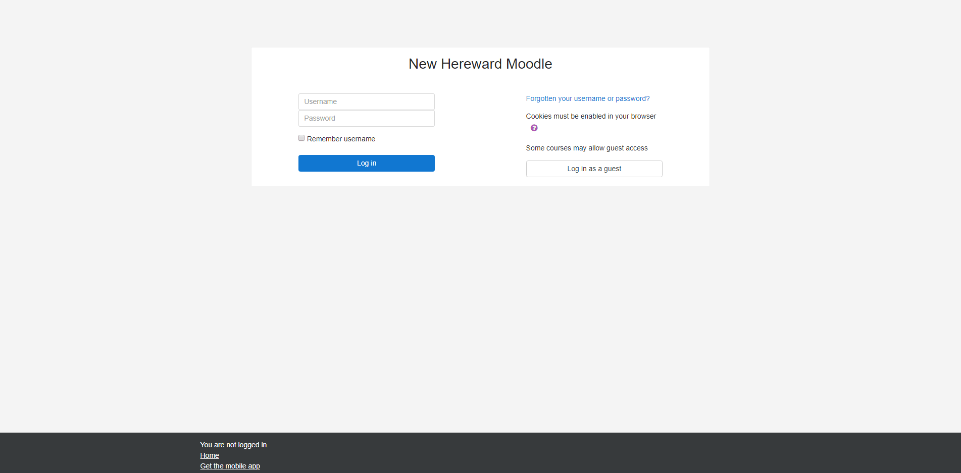
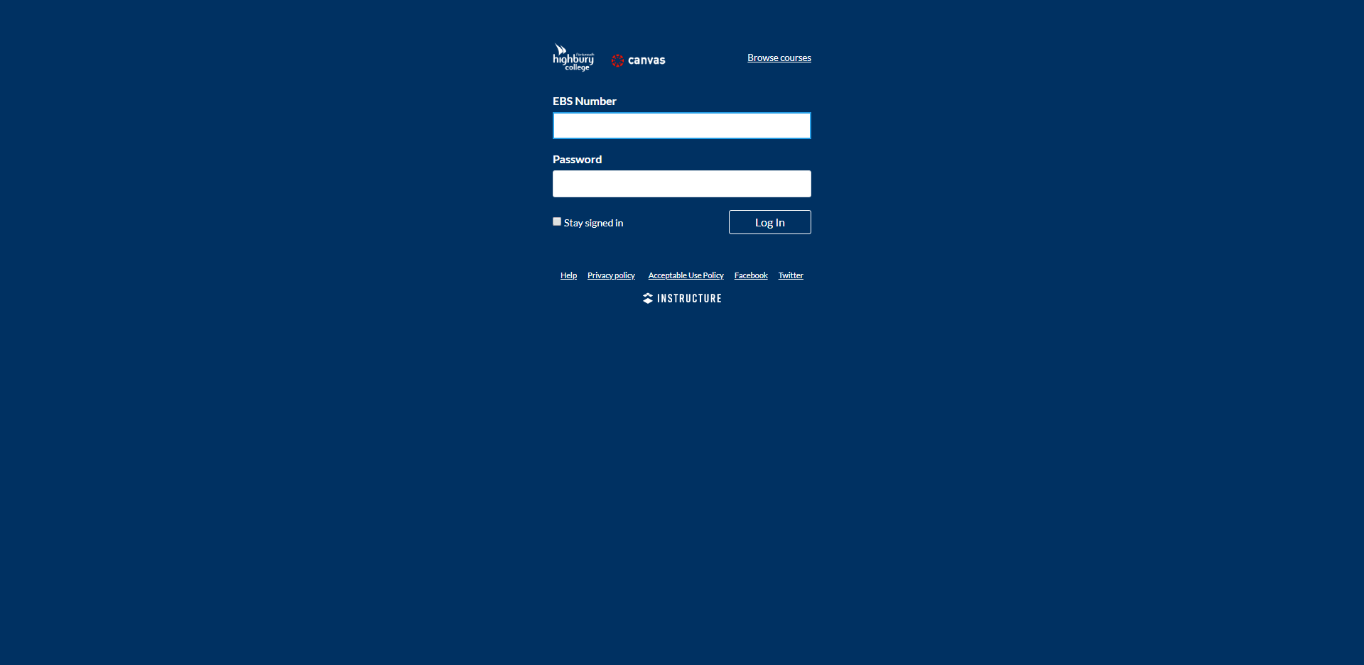
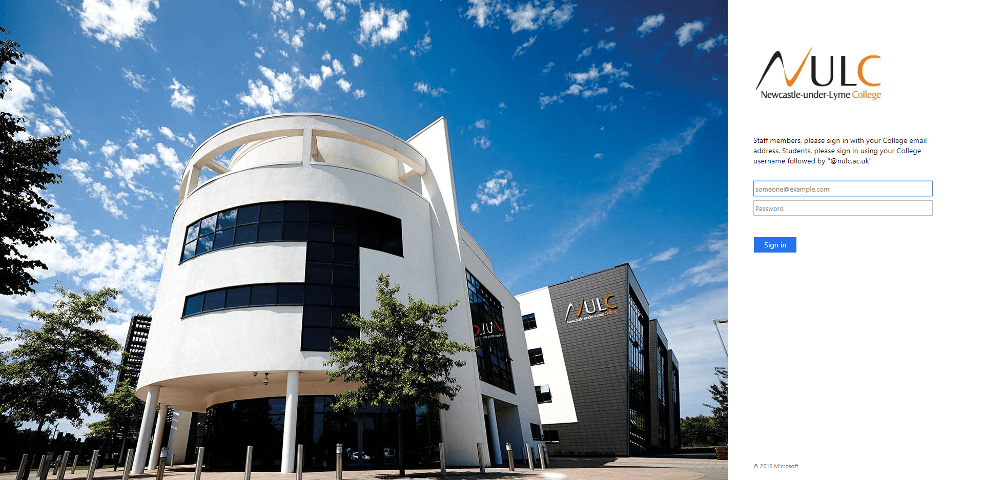
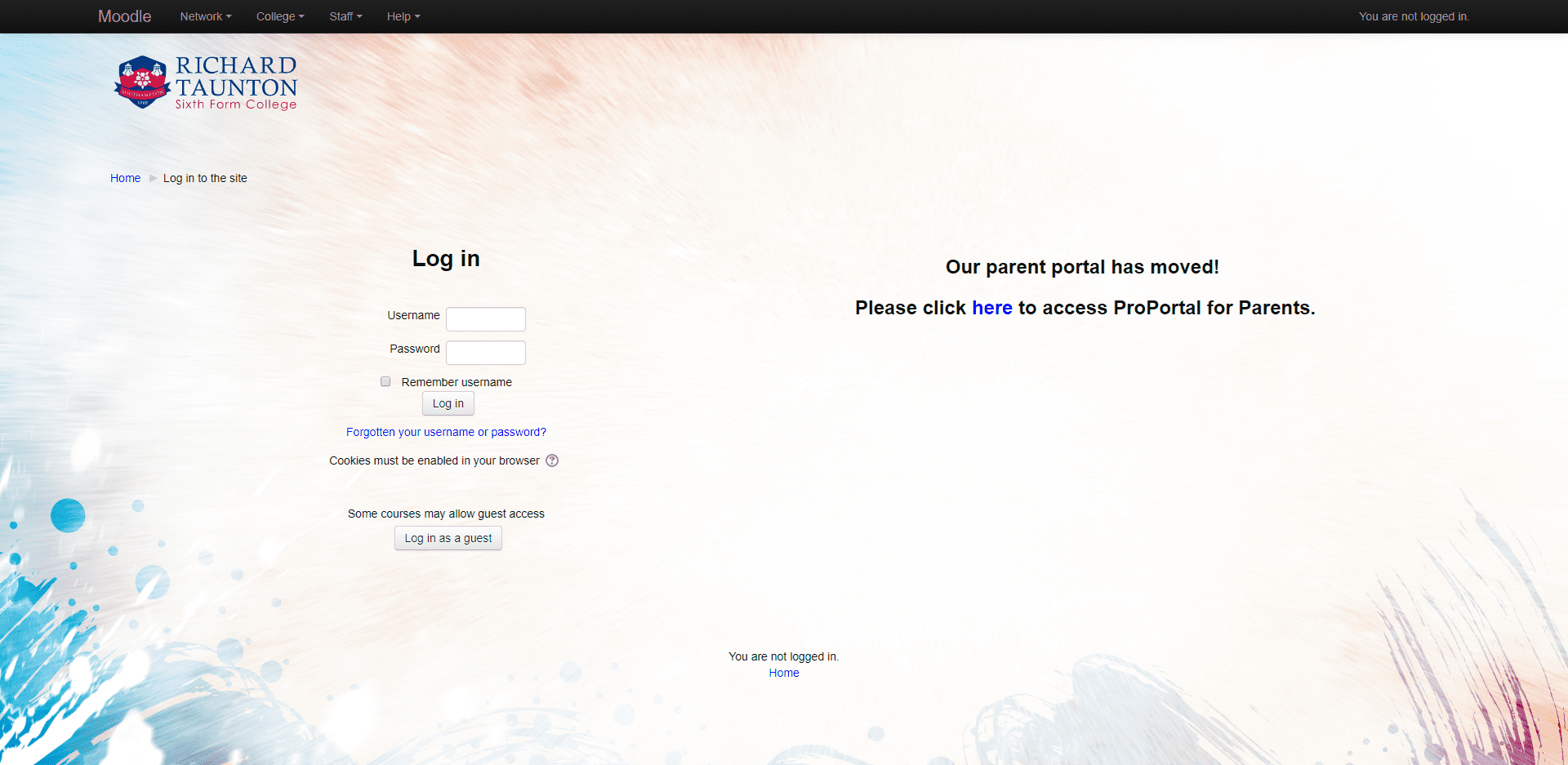
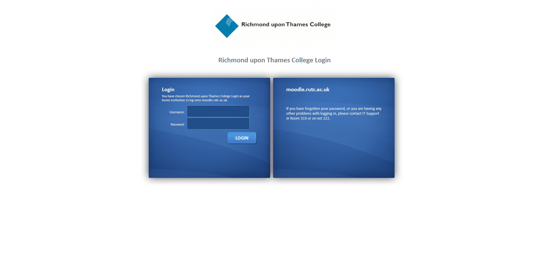
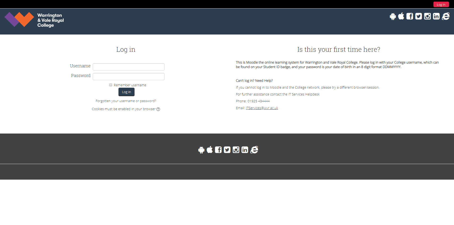
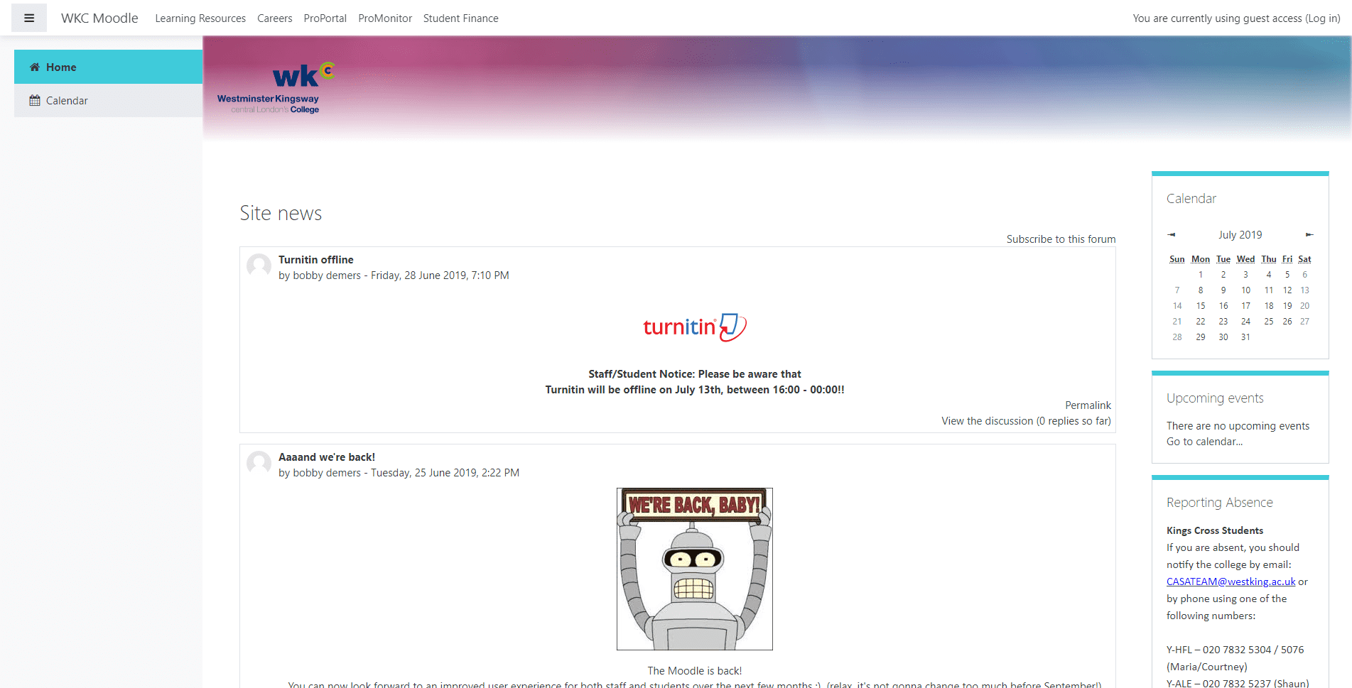
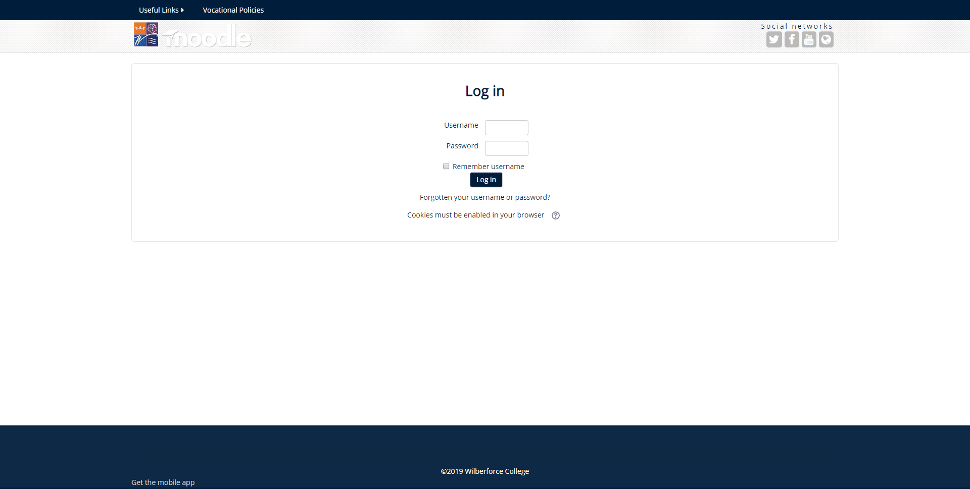
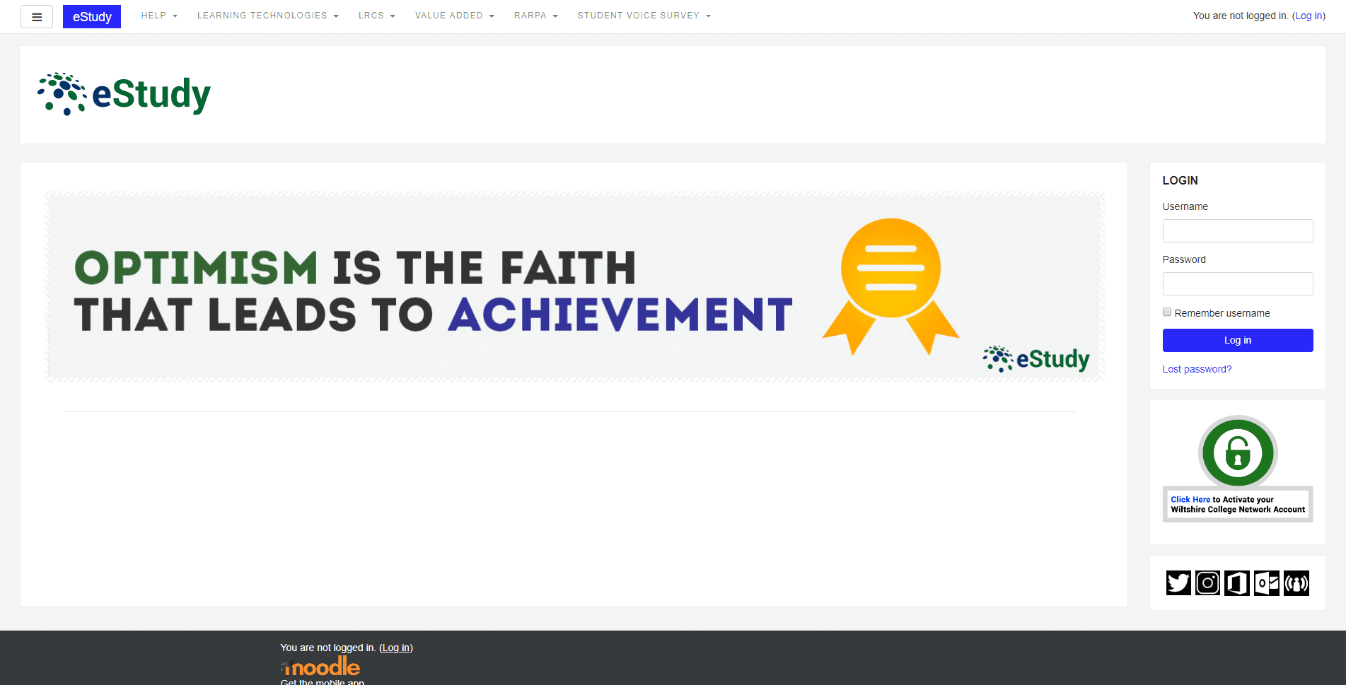
The first of four serious issues is that 60% (244) of VLEs block their home pages behind a login interface. Some login pages are better than others, but only an handful also show the VLE Helpdesk contact details. Two College VLEs go on step worse than hiding their VLE home page behind a login interface and actually add additional steps to the process by showing 'Click this text to log in using your username and password' and 'College users [sic] click here to log in'.
NB Click on any of the thumbnail screengrabs in this report to view the high definition version.
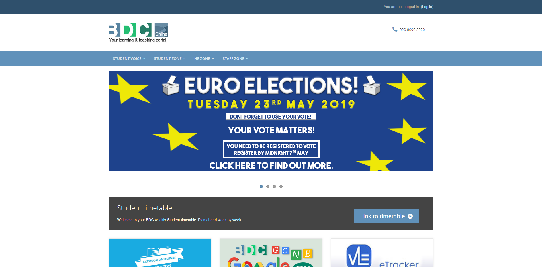
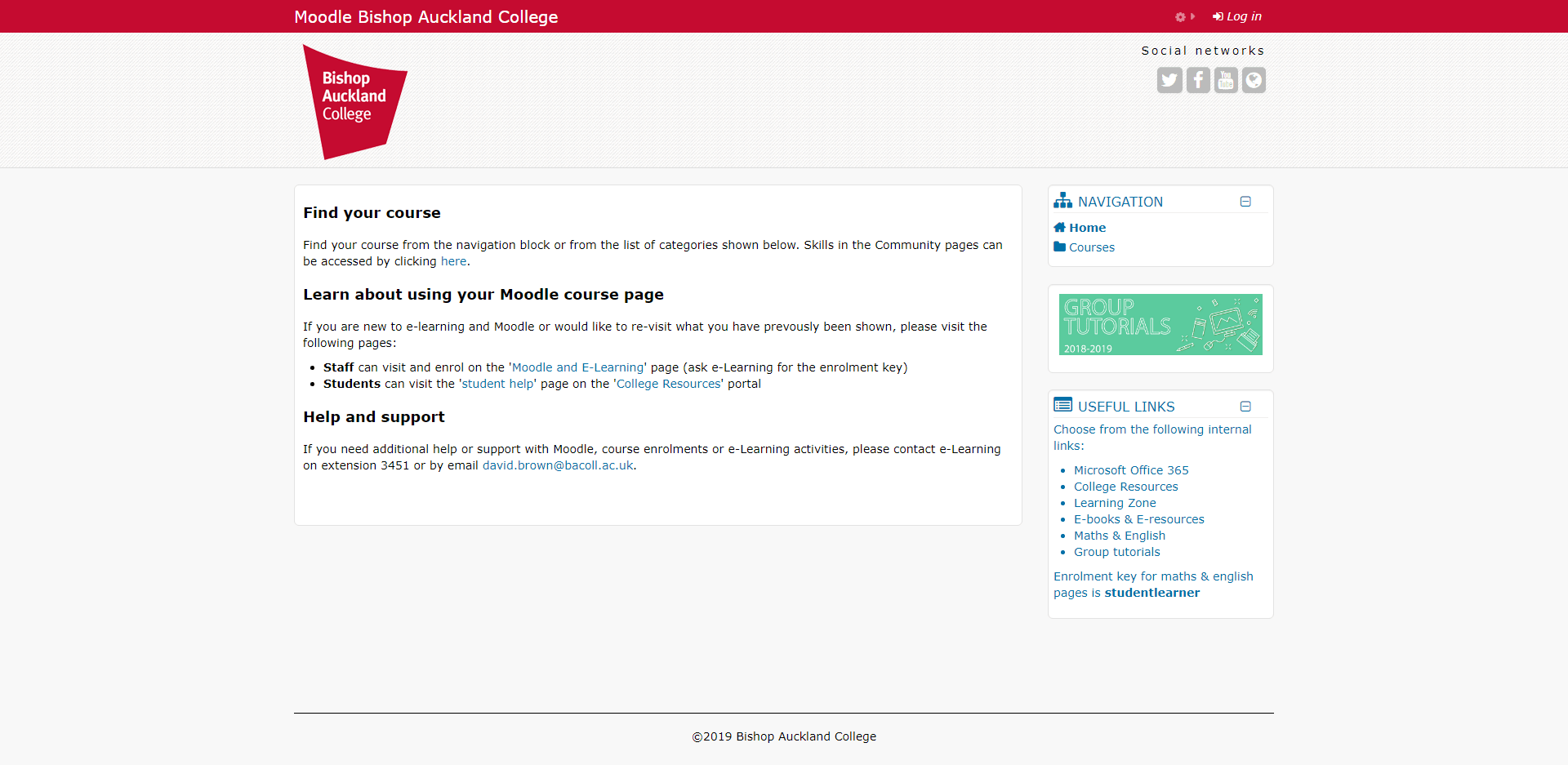
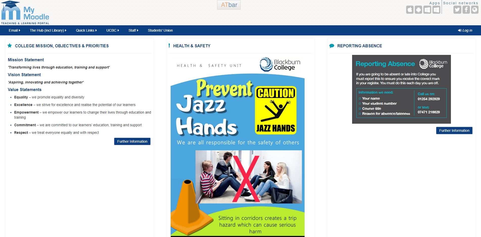
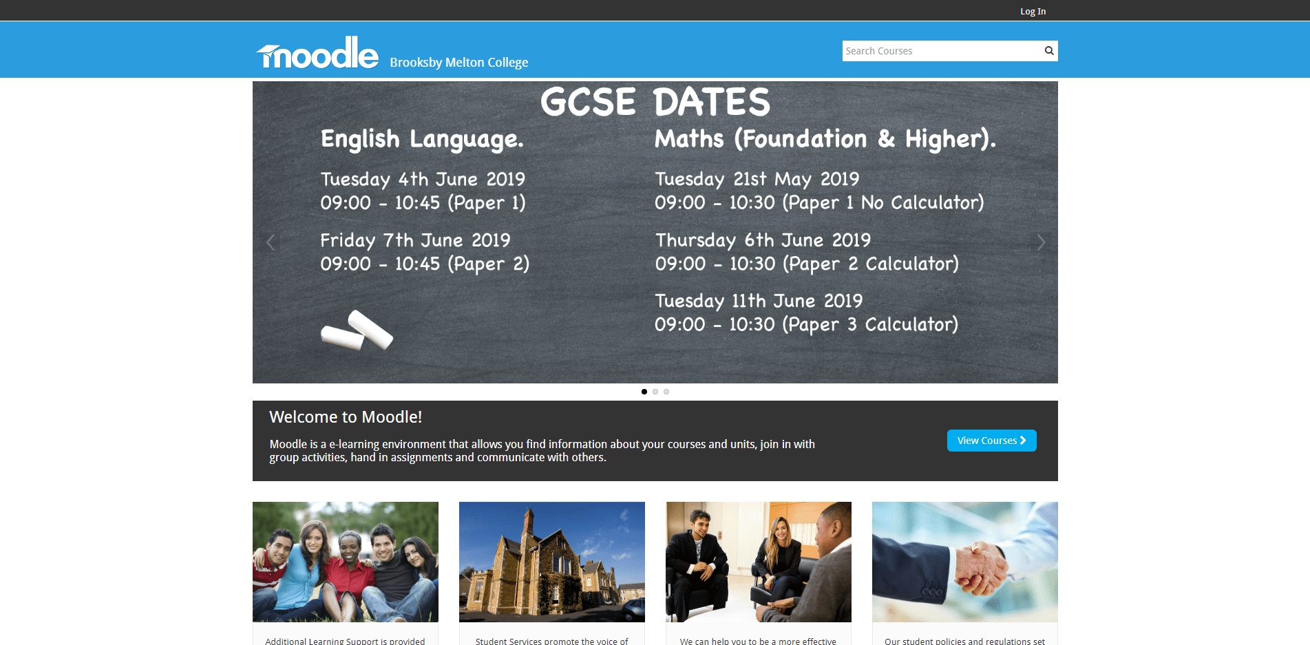
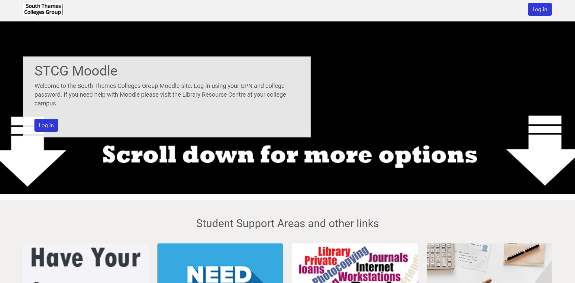
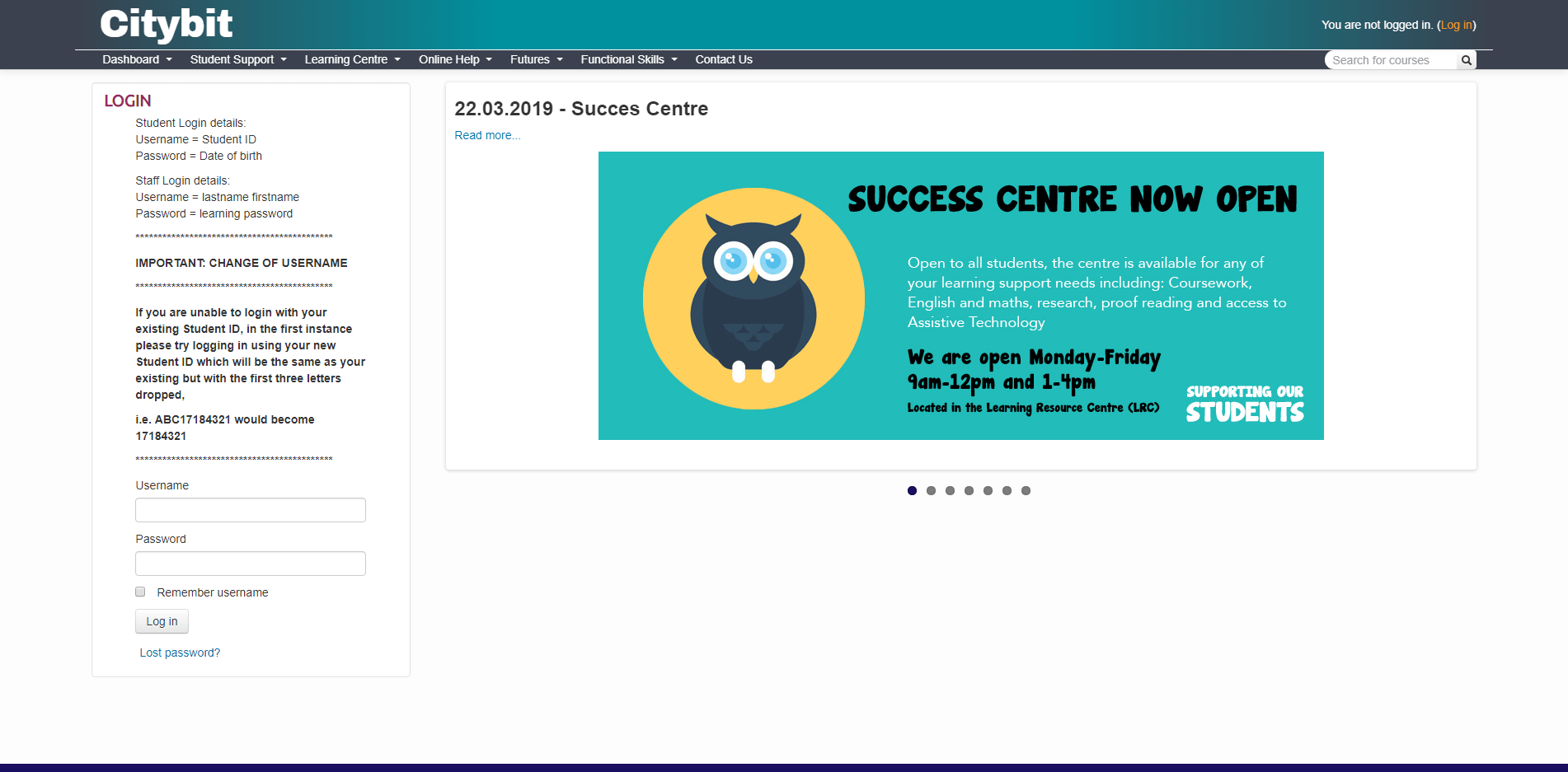
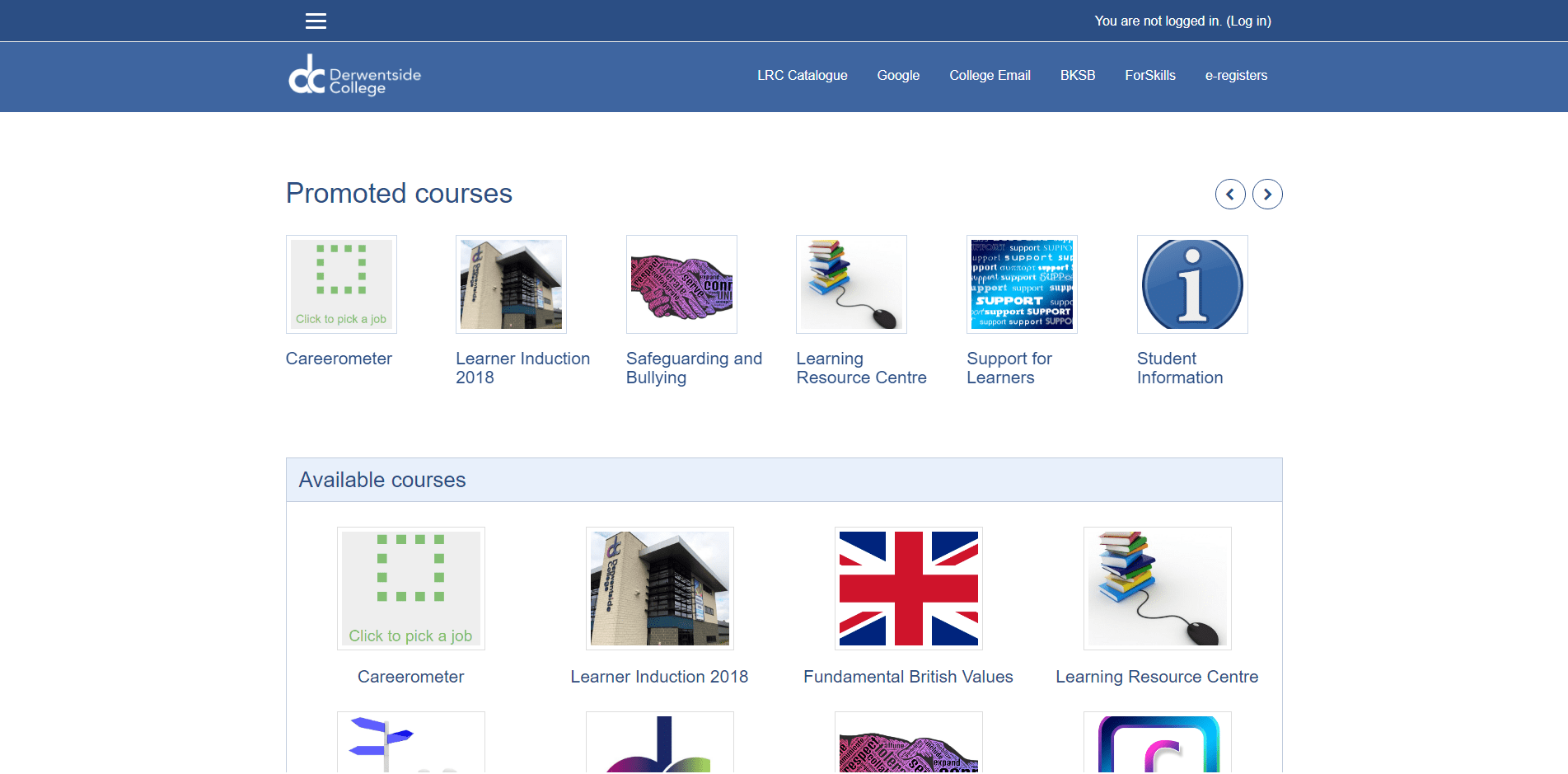
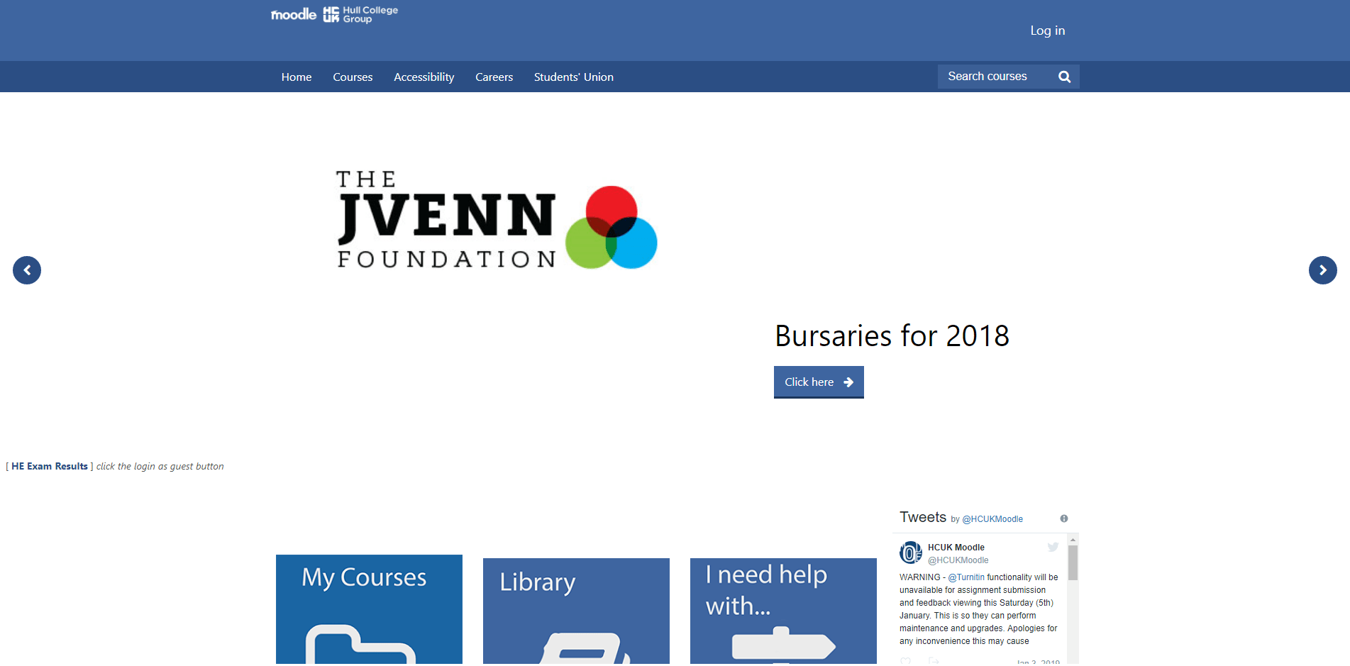
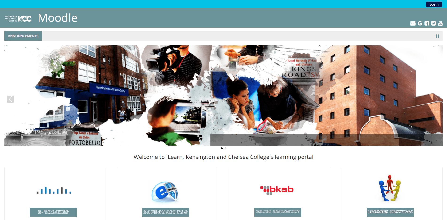
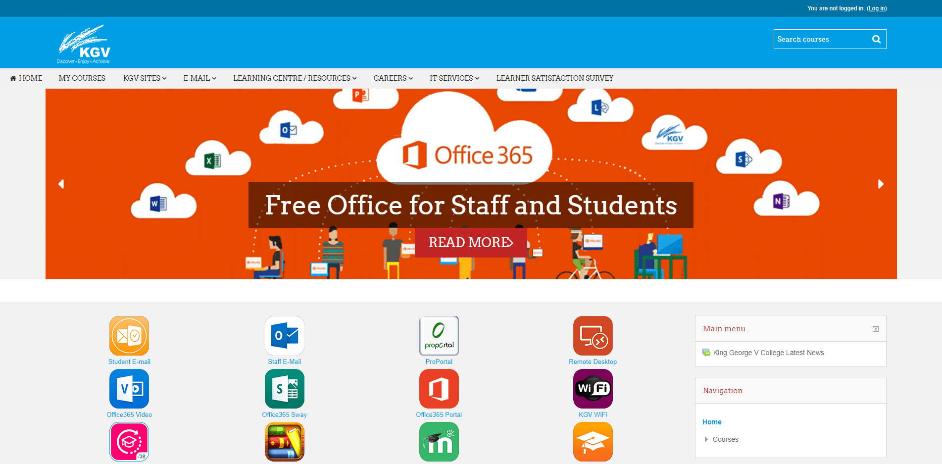
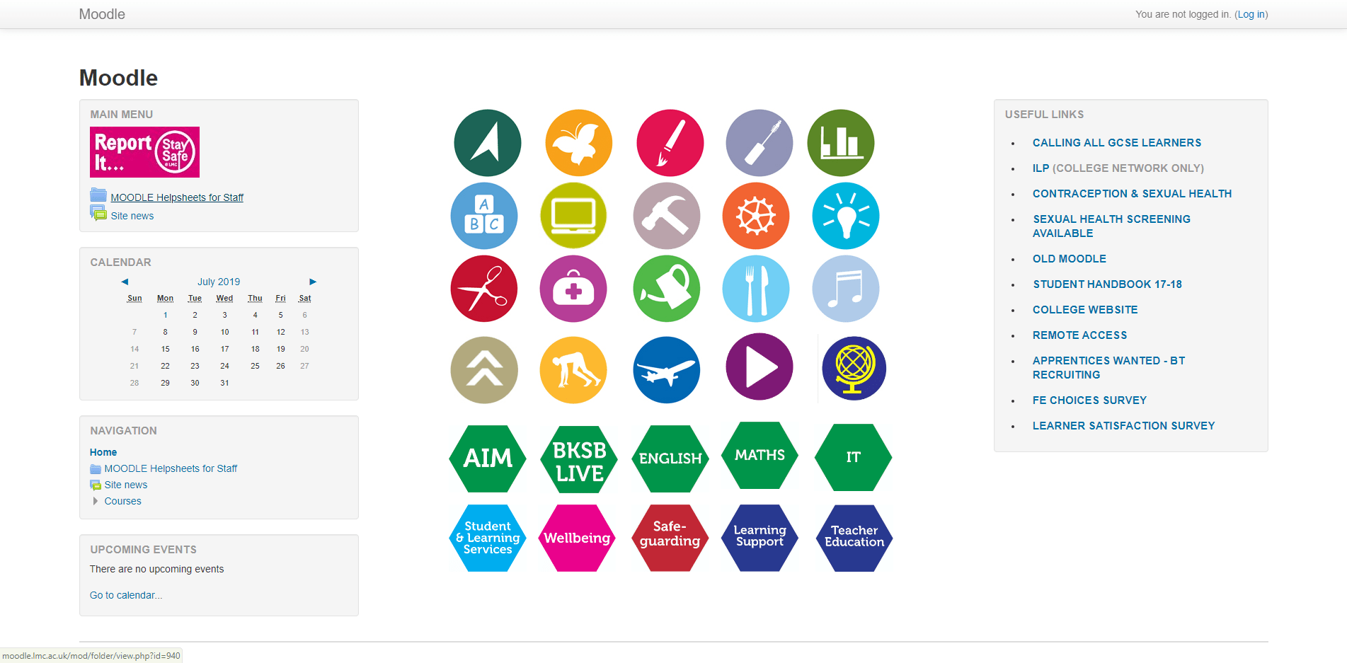
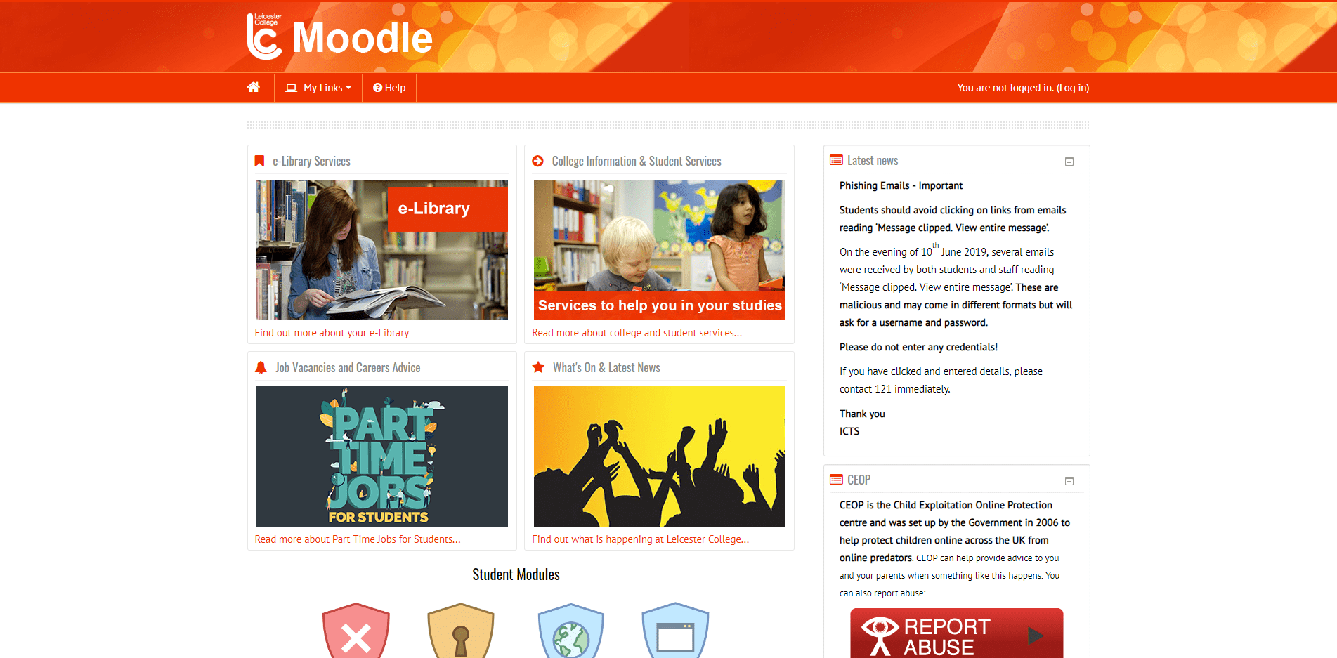
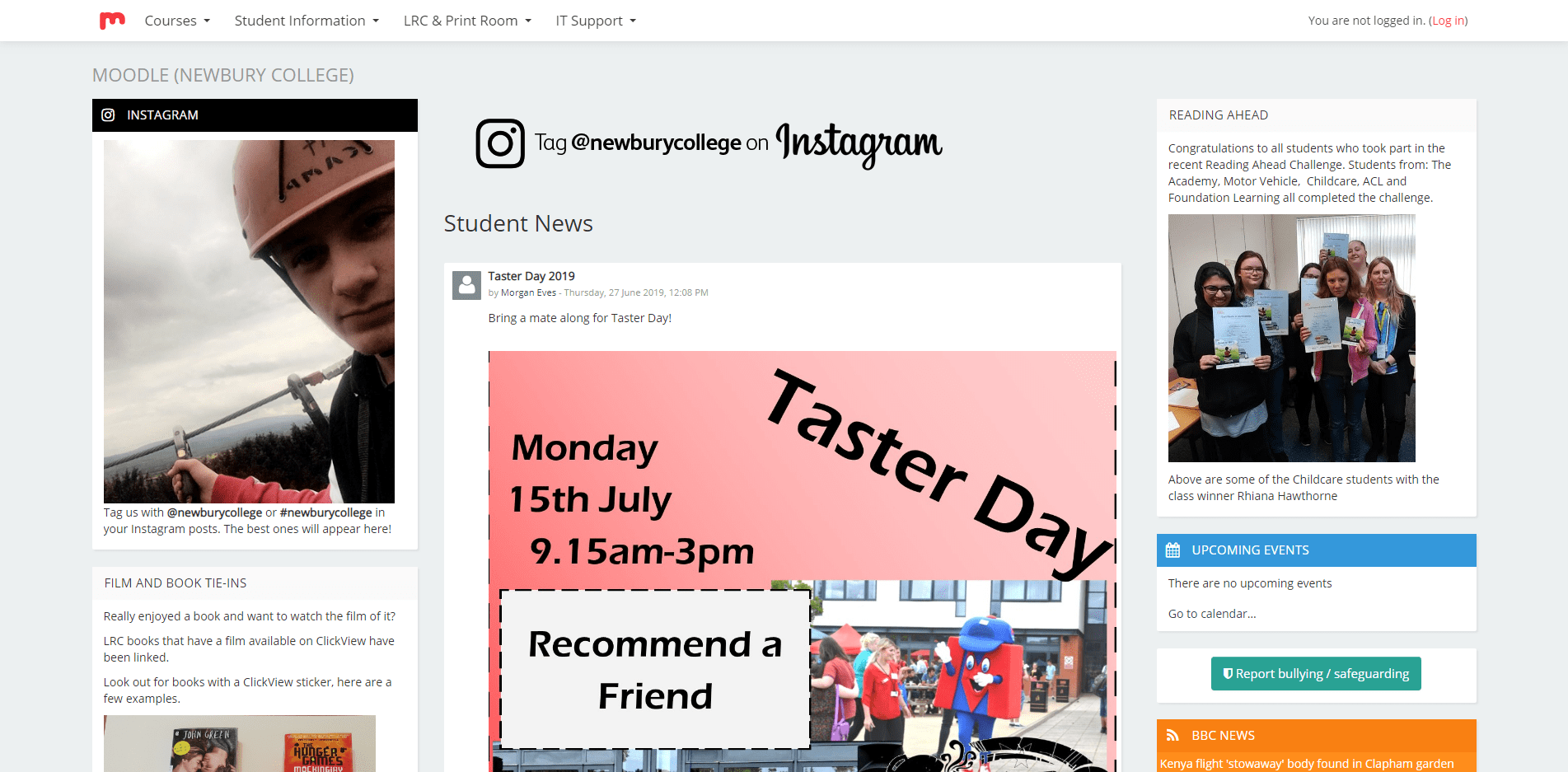
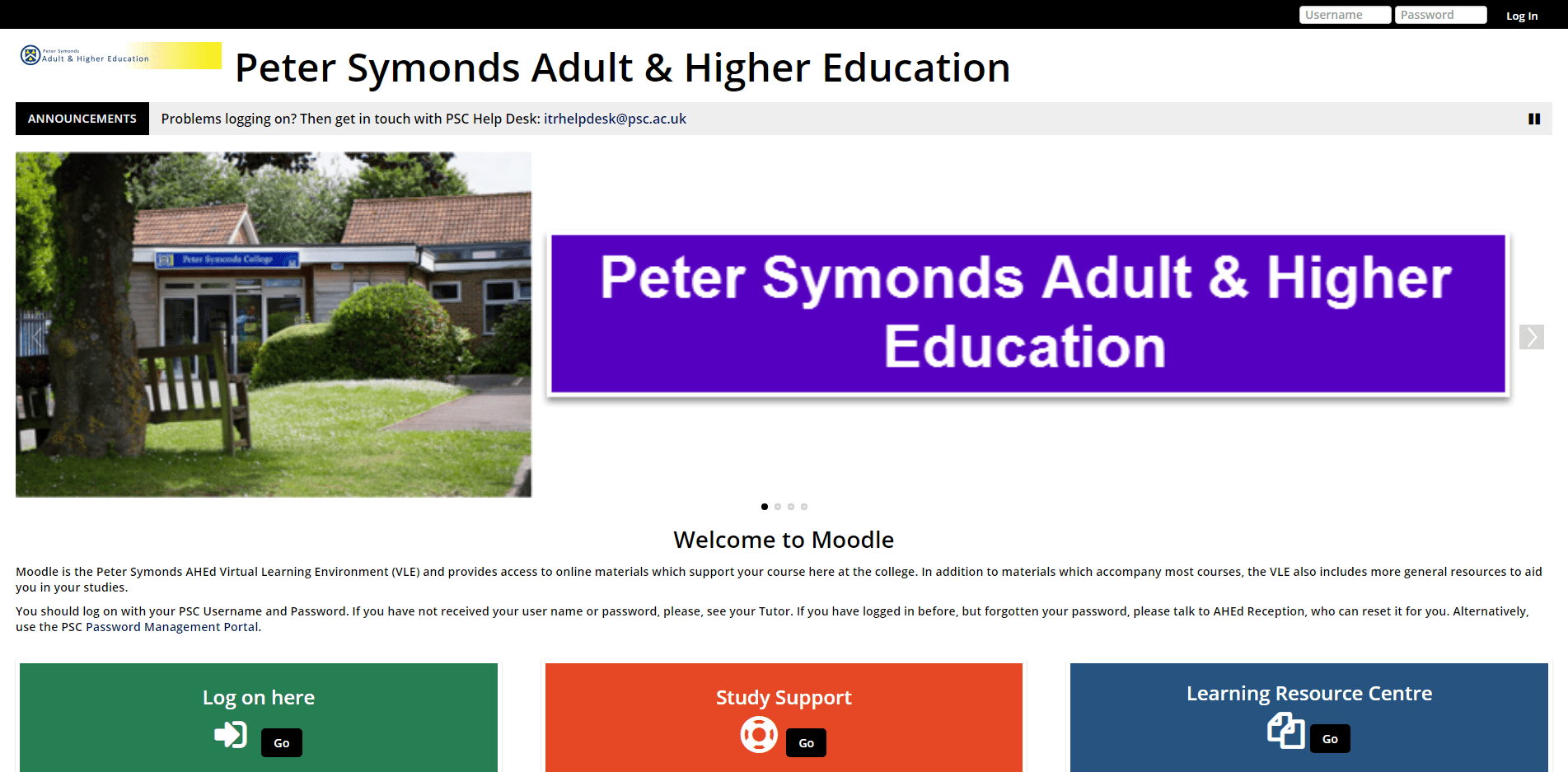
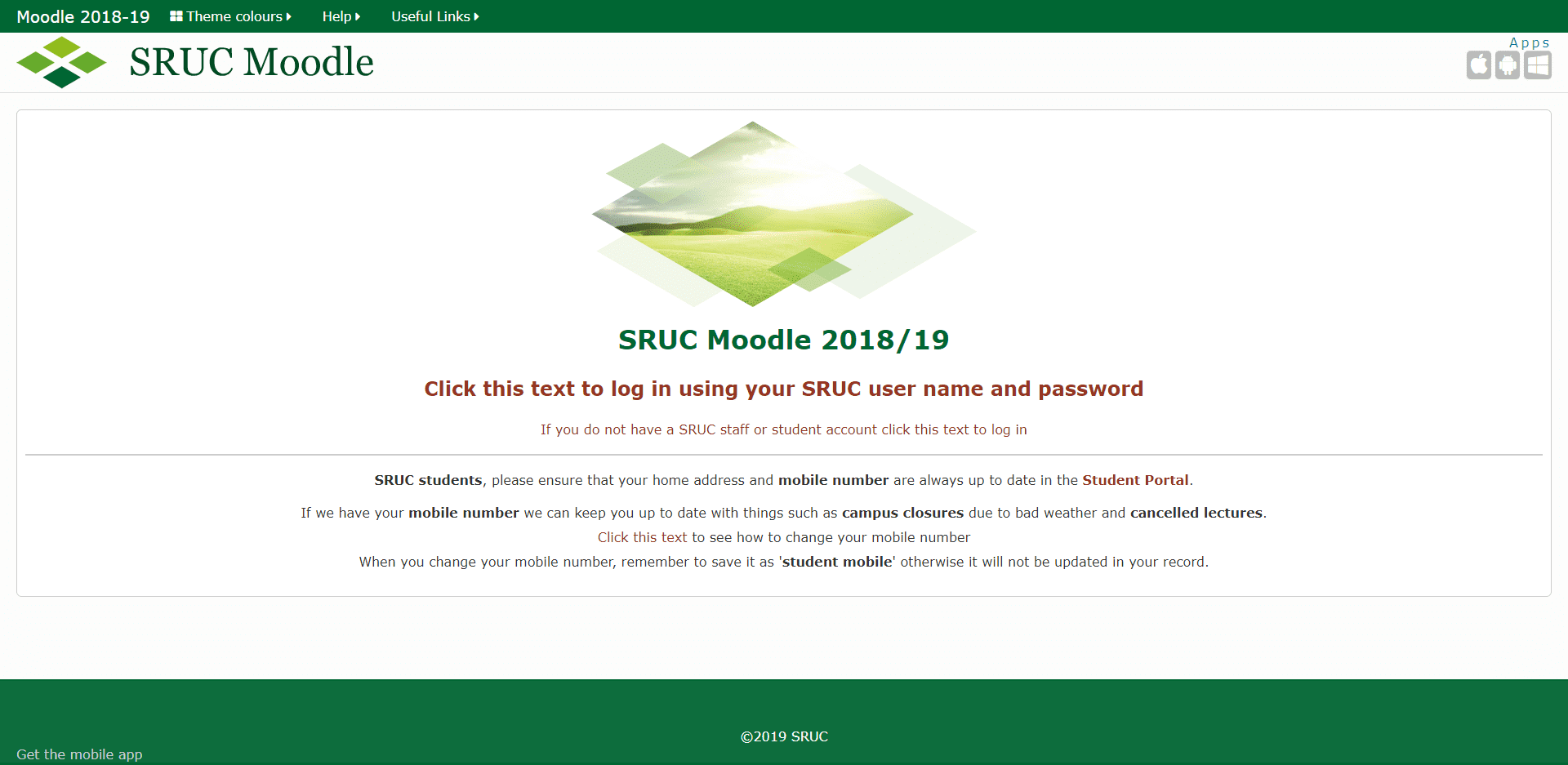
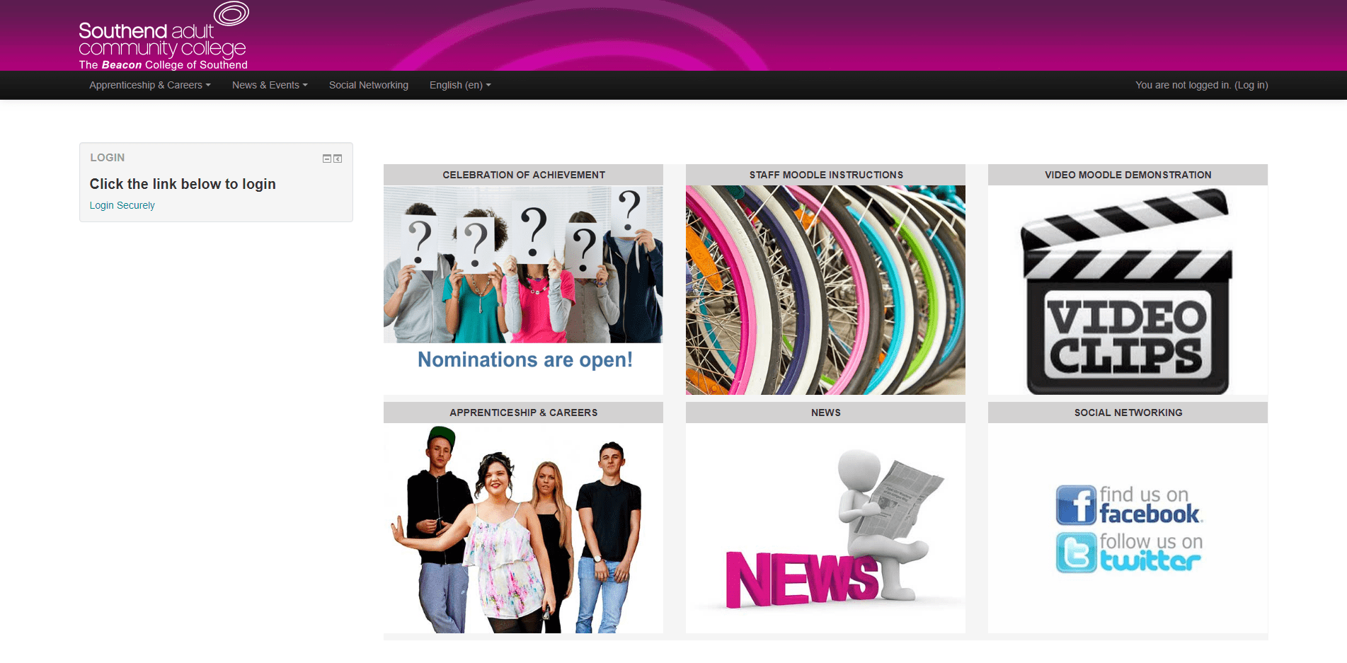
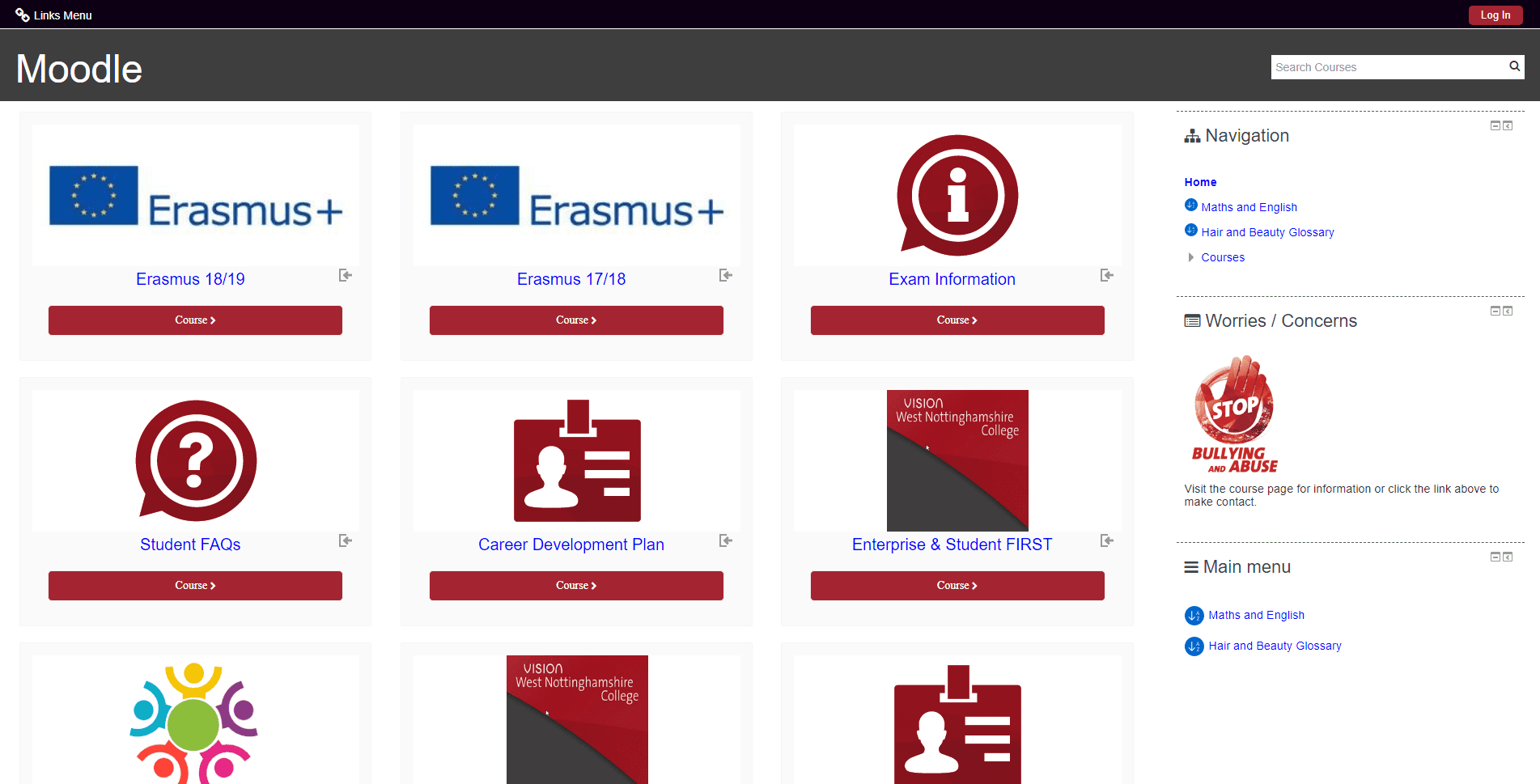
An Underdeveloped Offer
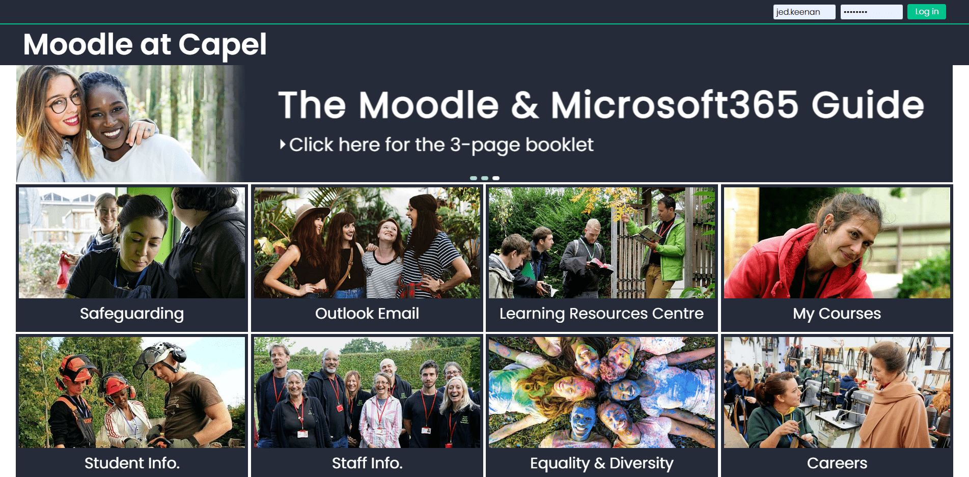
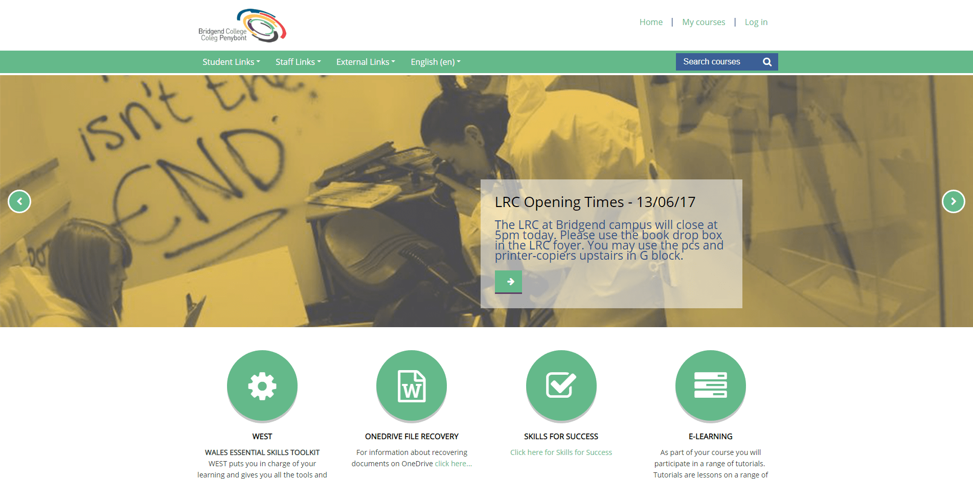
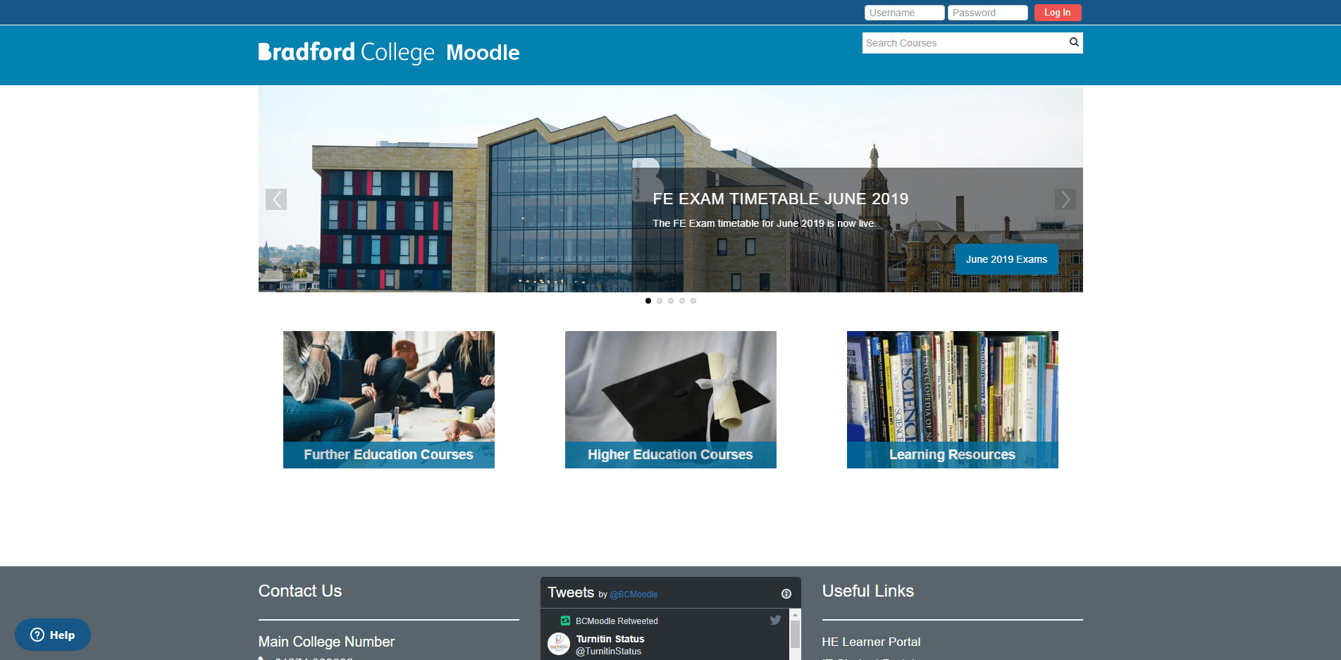
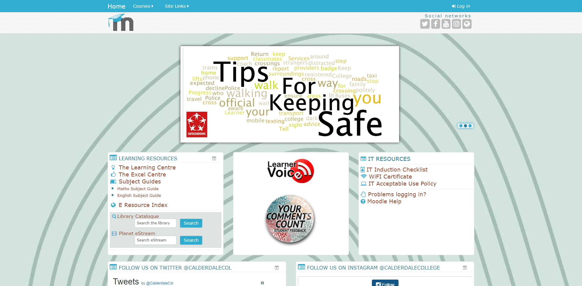
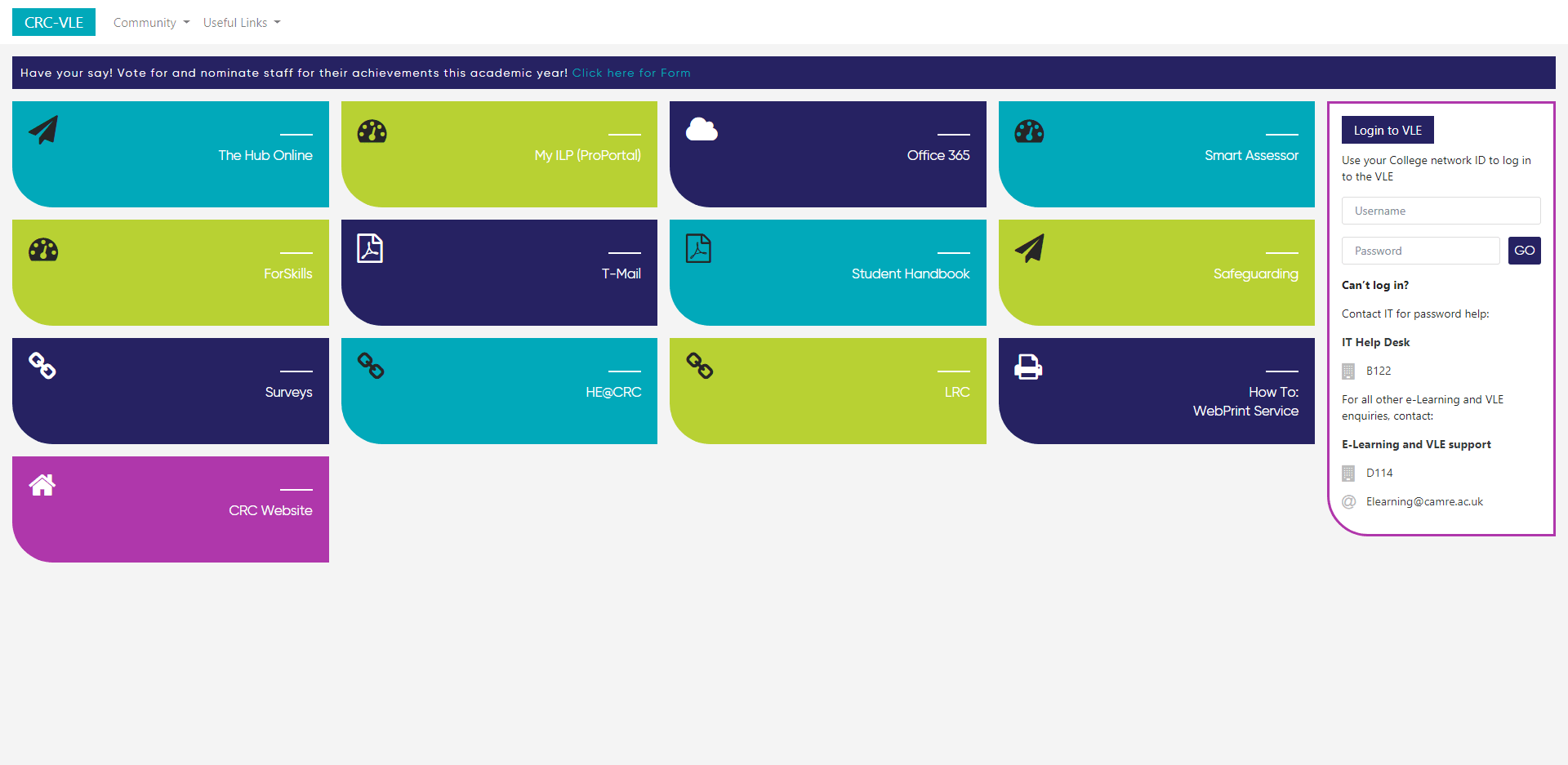
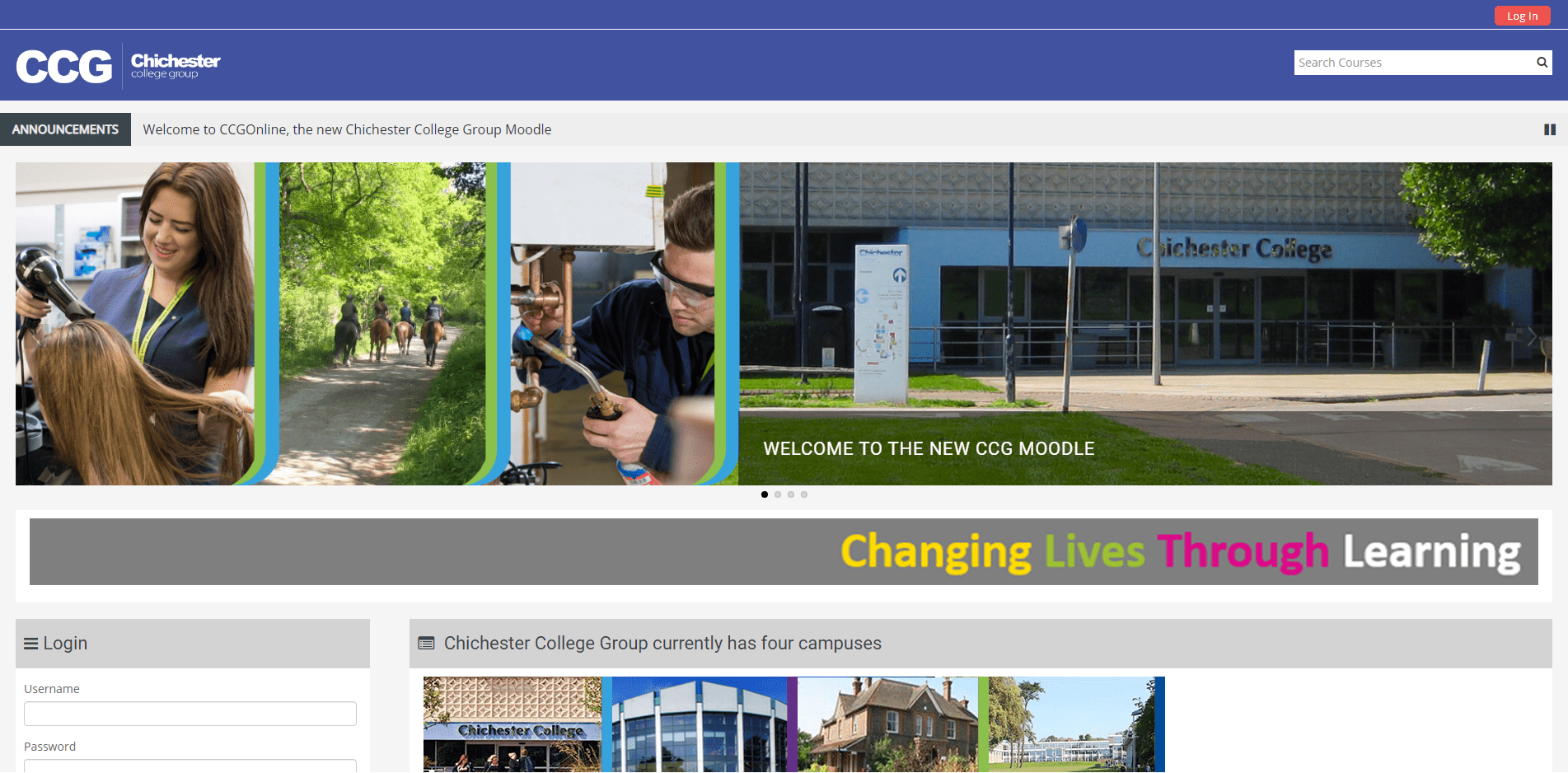
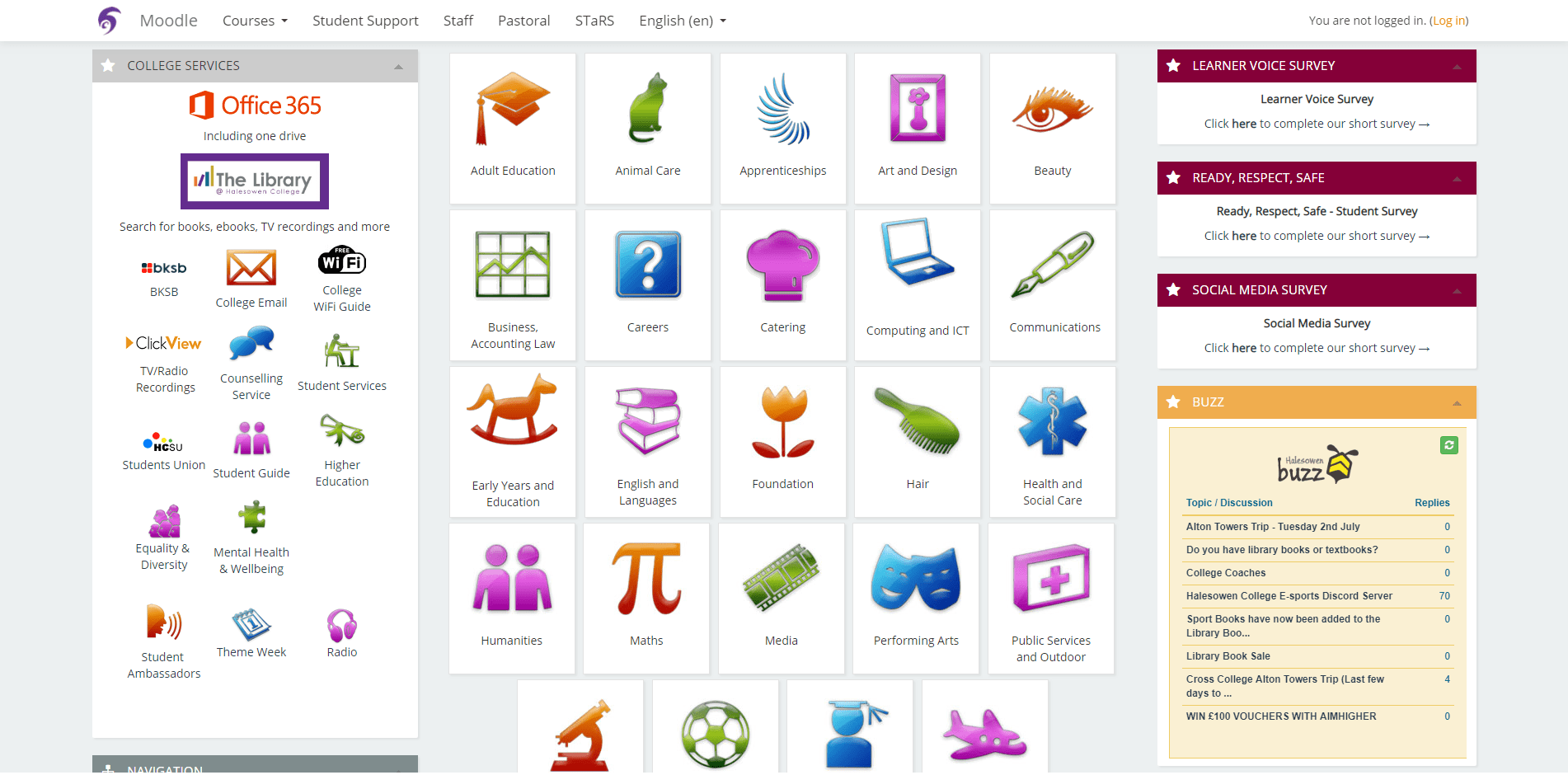
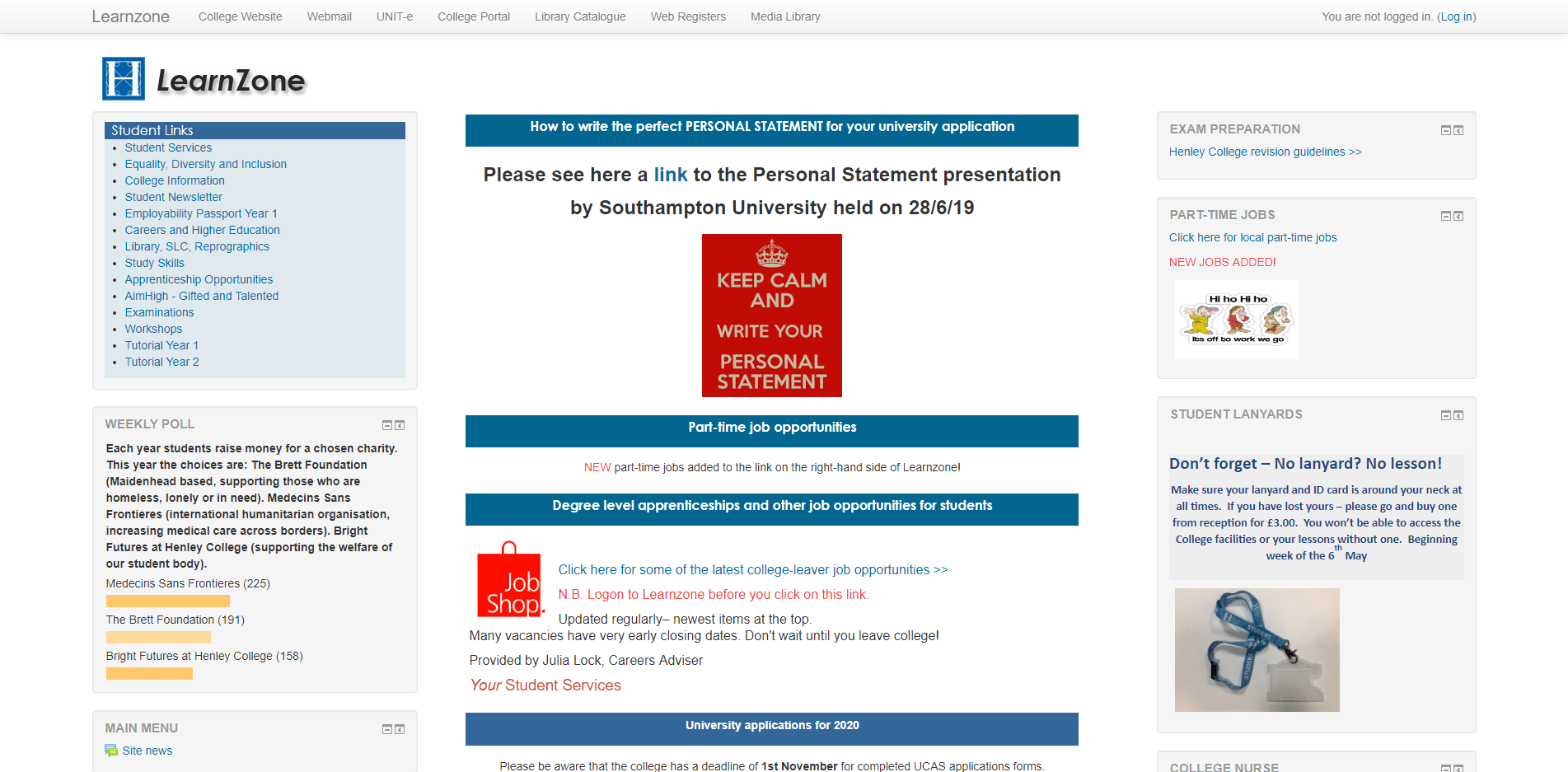
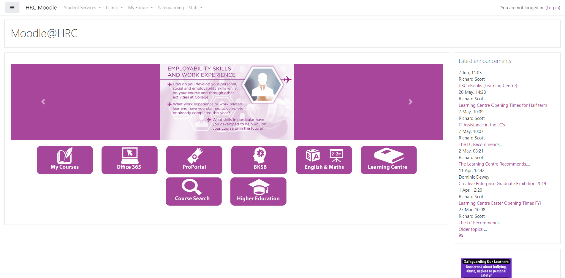
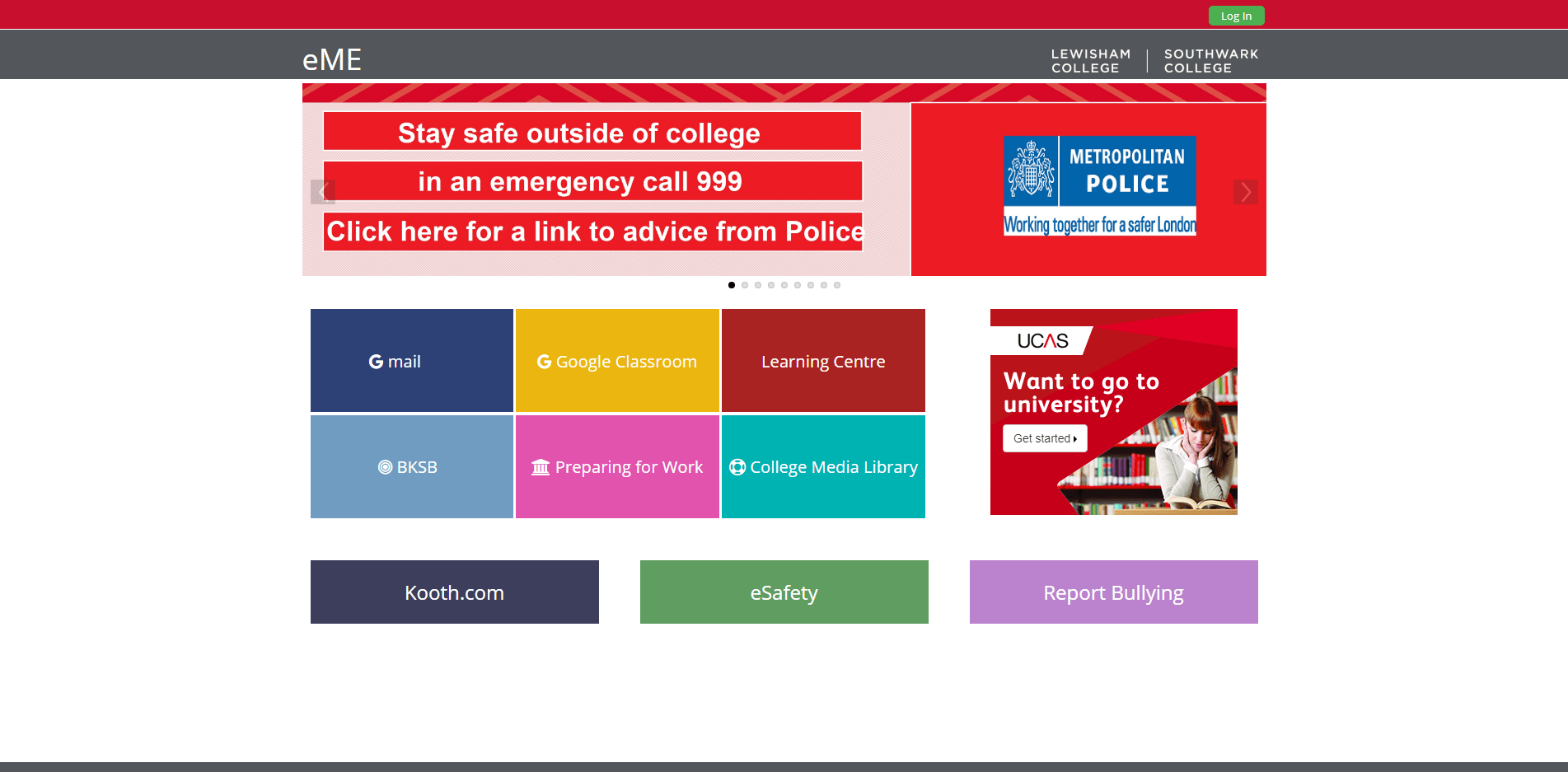
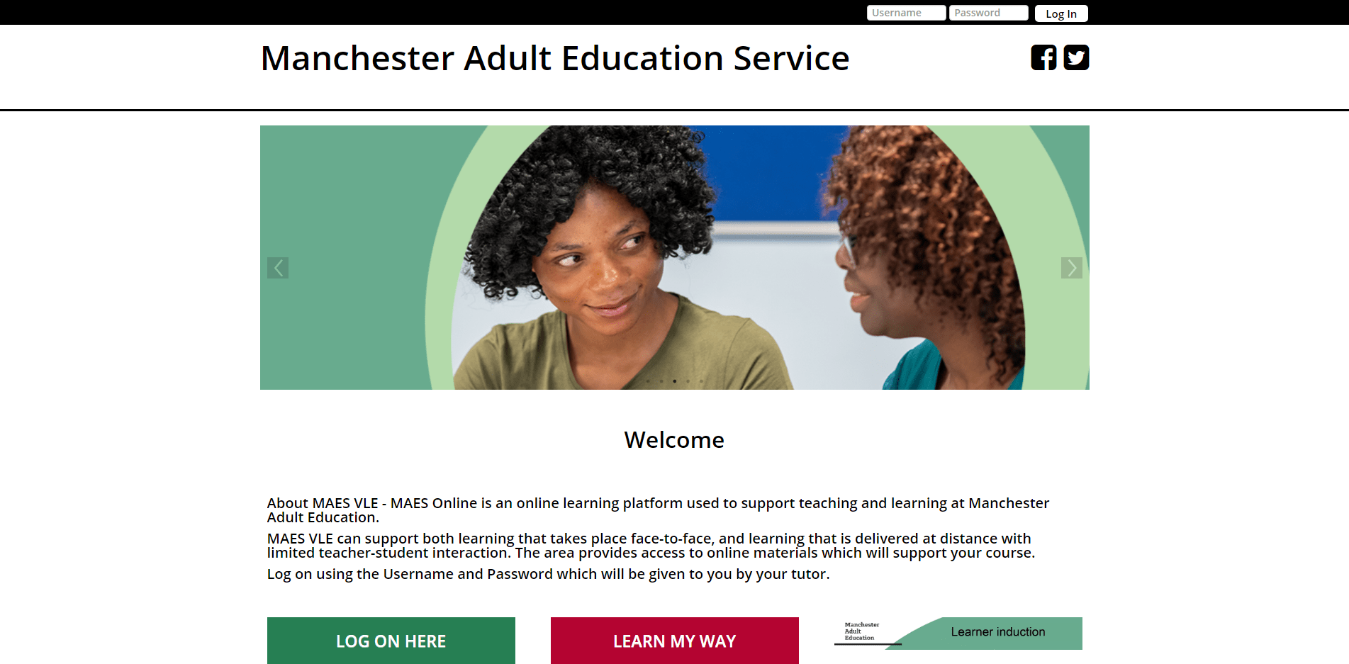
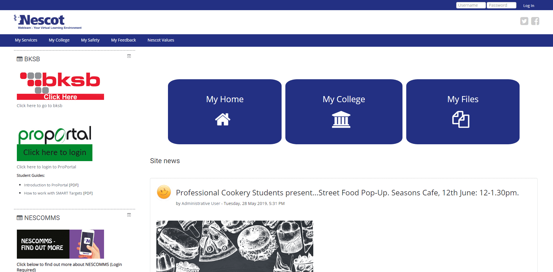
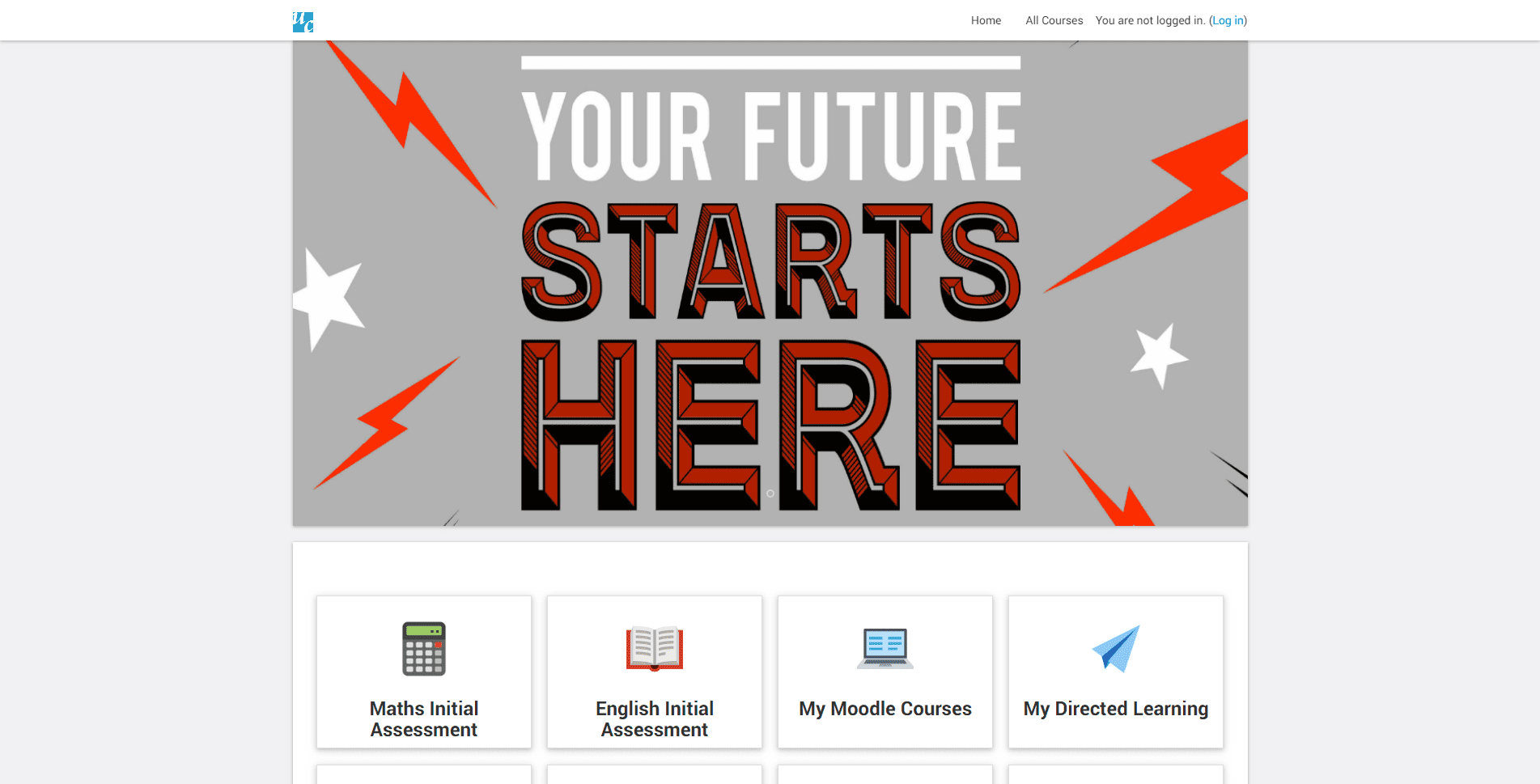
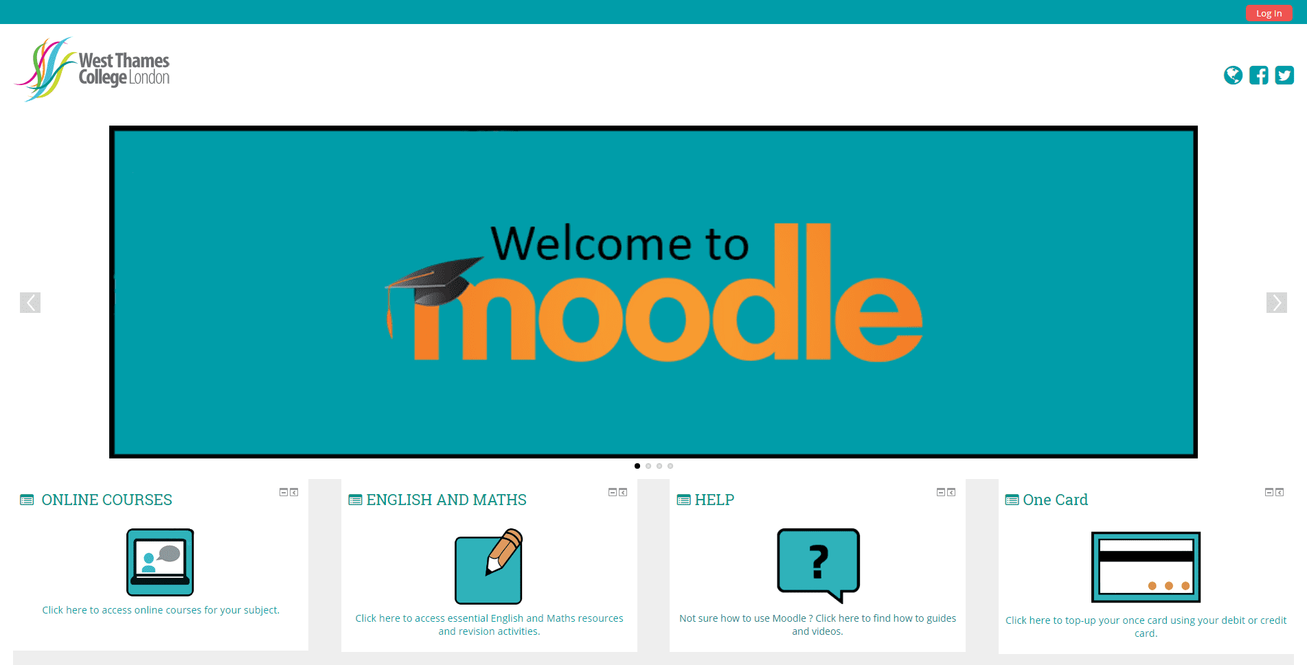
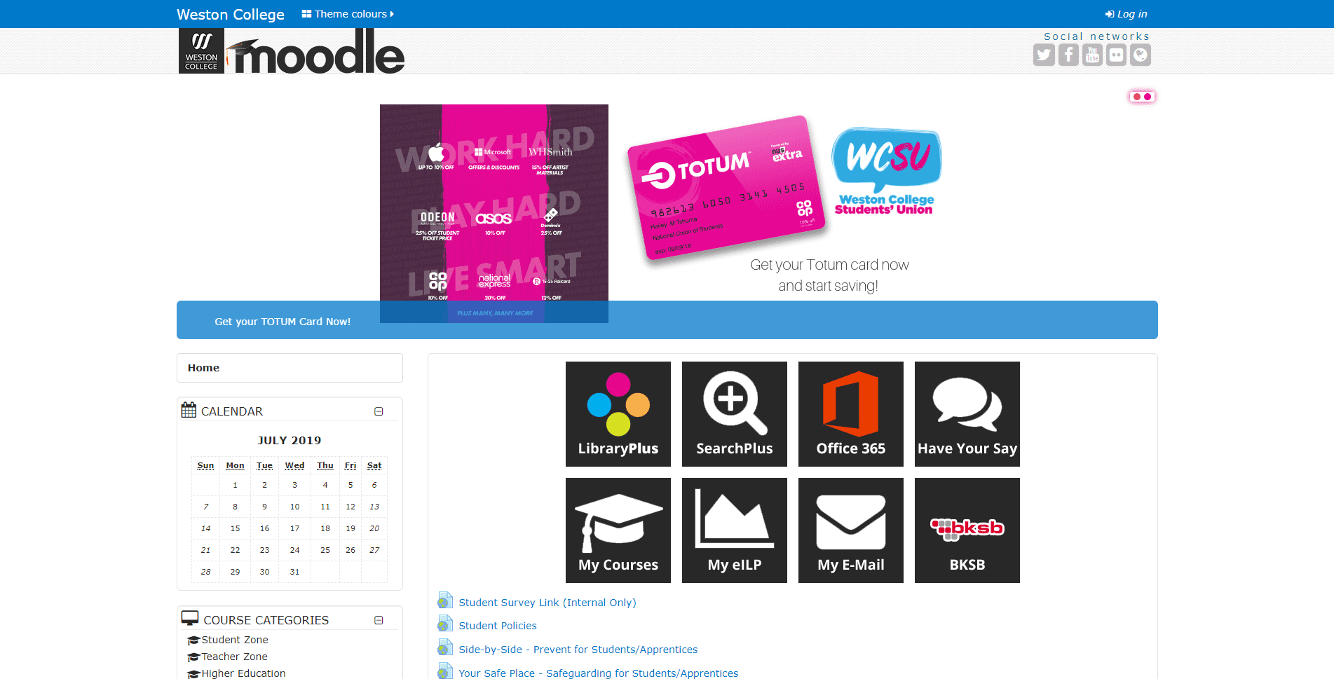
The second serious issue is the glaringly obvious underdevelopment of College VLEs. This underdevelopment is expressed by the big empty spaces in the home page. Filling space with a sliders is an acceptable expedient, but why not utilise the home page to its fullest extent as a means of engaging learners and provide navigation to important services offered by the College and to publicise useful, high-status organisations? For an example of a fully developed VLE home page, see the Capel Manor College's Moodle VLE.
Inconsistent Branding
The third serious issue is branding. Why not use the excellent College design book, and why have such a super small logo? Why not apply the full corporate palette, present a full sized PNG of SVG logo, and use all of the design style including font choice so that it complies with policy on equality of access? There does not seem to be an obvious reason to all the effort of producing a unique design for the VLE. It is certainly enjoyable to play around with templates and branding but, at the risk of coming across a boring, consistency optimises outcomes.
Unqualified Designers
The forth issue is the design basics, and particularly image selection. VLEs all have templates that can be styled but the creation or selection of media assets and how they are then presented, is still really important. Why use stock graphics, or blatantly adjust the aspect ratio of photographs? Why create elements that are objectively ugly or use logos with solid colour backgrounds? Why not schedule a graphic designer to do a quick clean up the VLE design? It is a straightforward project to replace half a dozen of the more grotty graphic elements and they could also clean up the responsive display with some custom CSS.
There are lots of other issues such as equality of access for users with impaired vision, the use of clear English, the availability of basic information, and an absence of any creative flourishes etc. But the purpose of this report is to identify lots of great examples to emulate and, thank goodness, there are lots of them.
These examples are really well designed, fully populated with calls to action, and are replete with inspiring design and operational flourishes. In a subjective conclusion, these 18 College VLEs are, for different reasons, the best designed in the UK.
Great Examples of Best Practice.
Below are 18 VLEs that are best for their use of templated design, presentation of logos, choices of graphics, portrait and landscape photography, and operational functionality. The aim is to present a easy list of small, quick, non-technical projects that can be scheduled into the workflow to produce a VLE that present the College at its best. Each of the 18 VLEs are listed in alphabetical order:
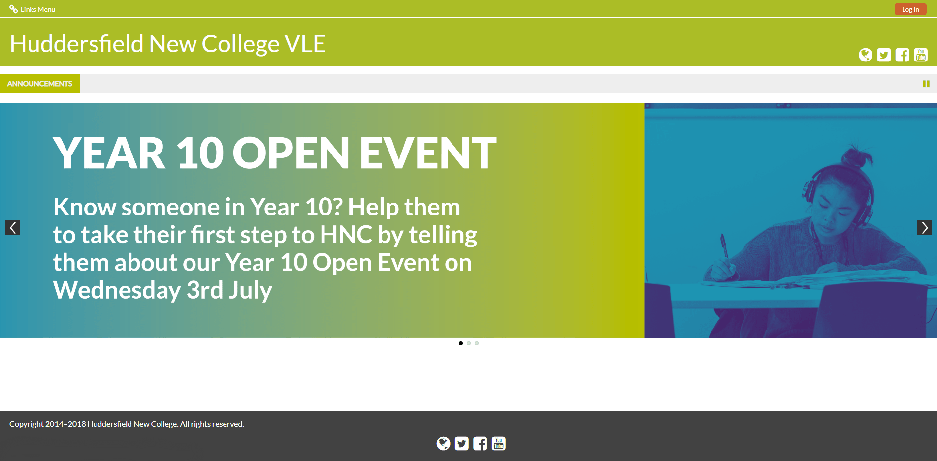
I know that it is an easy and obvious achievement but Bridgend College utilise the same colour palette on both their VLE and on the website! The opening slider is rather interesting to look at and, because the design is a template, the overall look is straightforward and effective. I later cover VLE home pages designed to be learners dashboards rather than website home pages but the VLE navigation is well divided between header's menu items and the four well explained call to action navigation buttons.
The obvious criticism is that the search navigation, header menu item hover effect and the dropdown menu background colour need to be changed from the template default/entirely random colour selection to one of the corporate colours, say #005d83 or #4d4d4f or #624166 . Using Chrome DevTools and/or Safari DevTools and with a Custom CSS file. No VLE Helpdesk Contact Details.
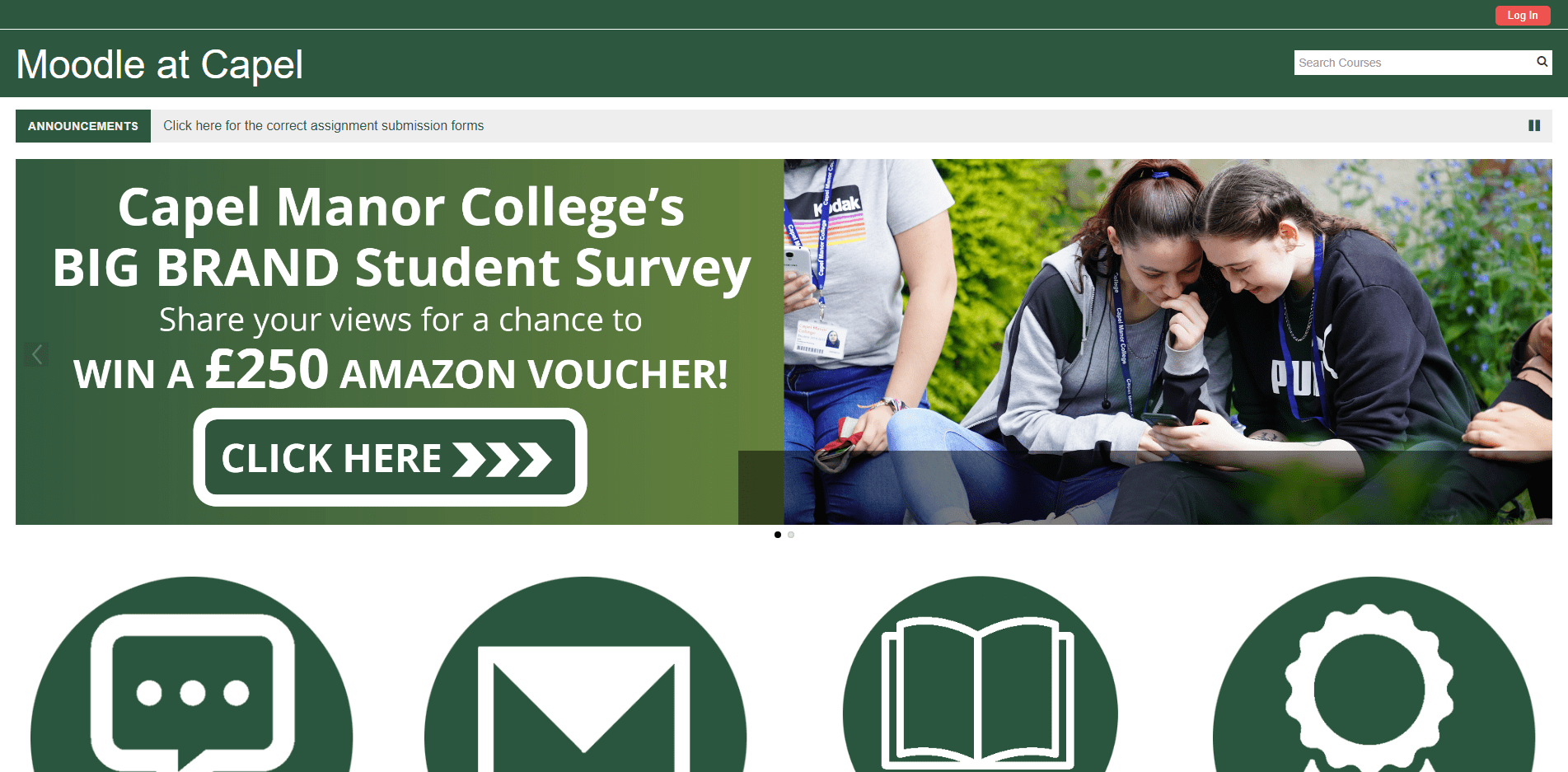
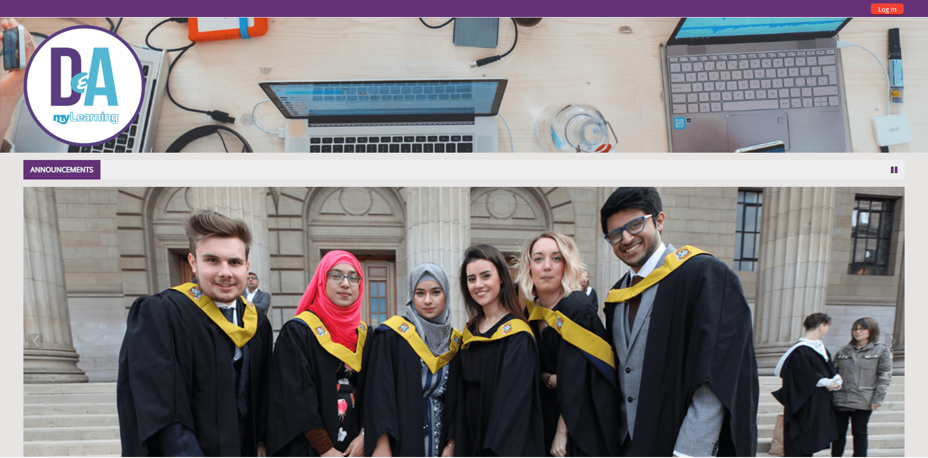
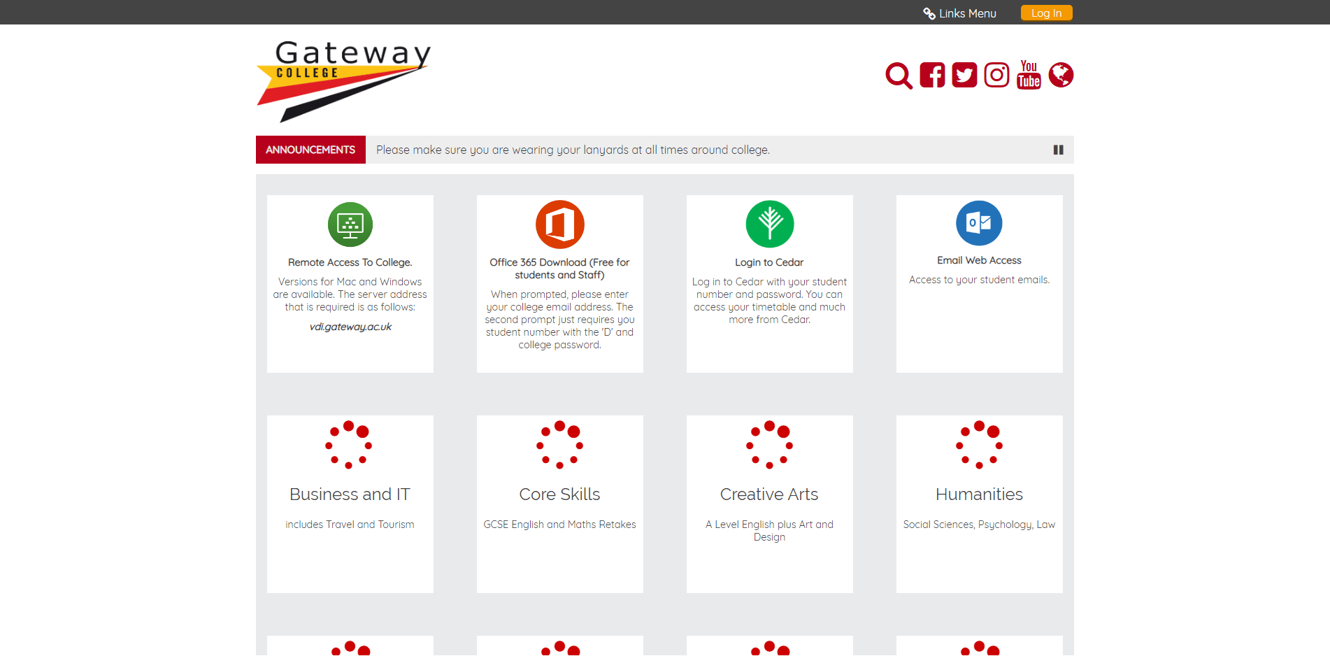
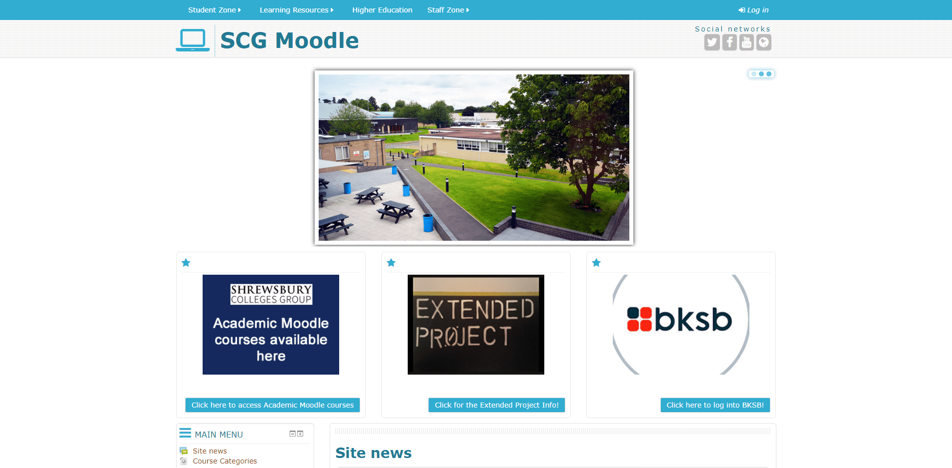
Bold is absolutely best, and the navigation buttons used by Capel Manor College are as bold as possible. The colour selection is great despite it only aligning with the College's social media channels and not the website.
The obvious criticisms are that the slider takes up too much space above the fold, and that there is no home page navigation presenting for visitors that are not logged in. A final criticism is that the Library%2520icon.jpg graphic has, for no obvious reason, a restricted width of 338px. No VLE Helpdesk Contact Details.
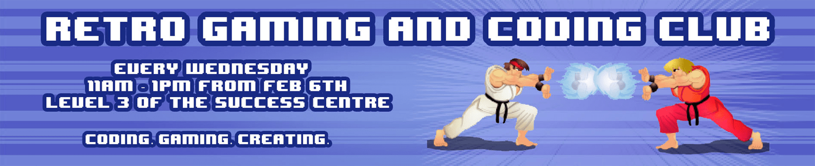
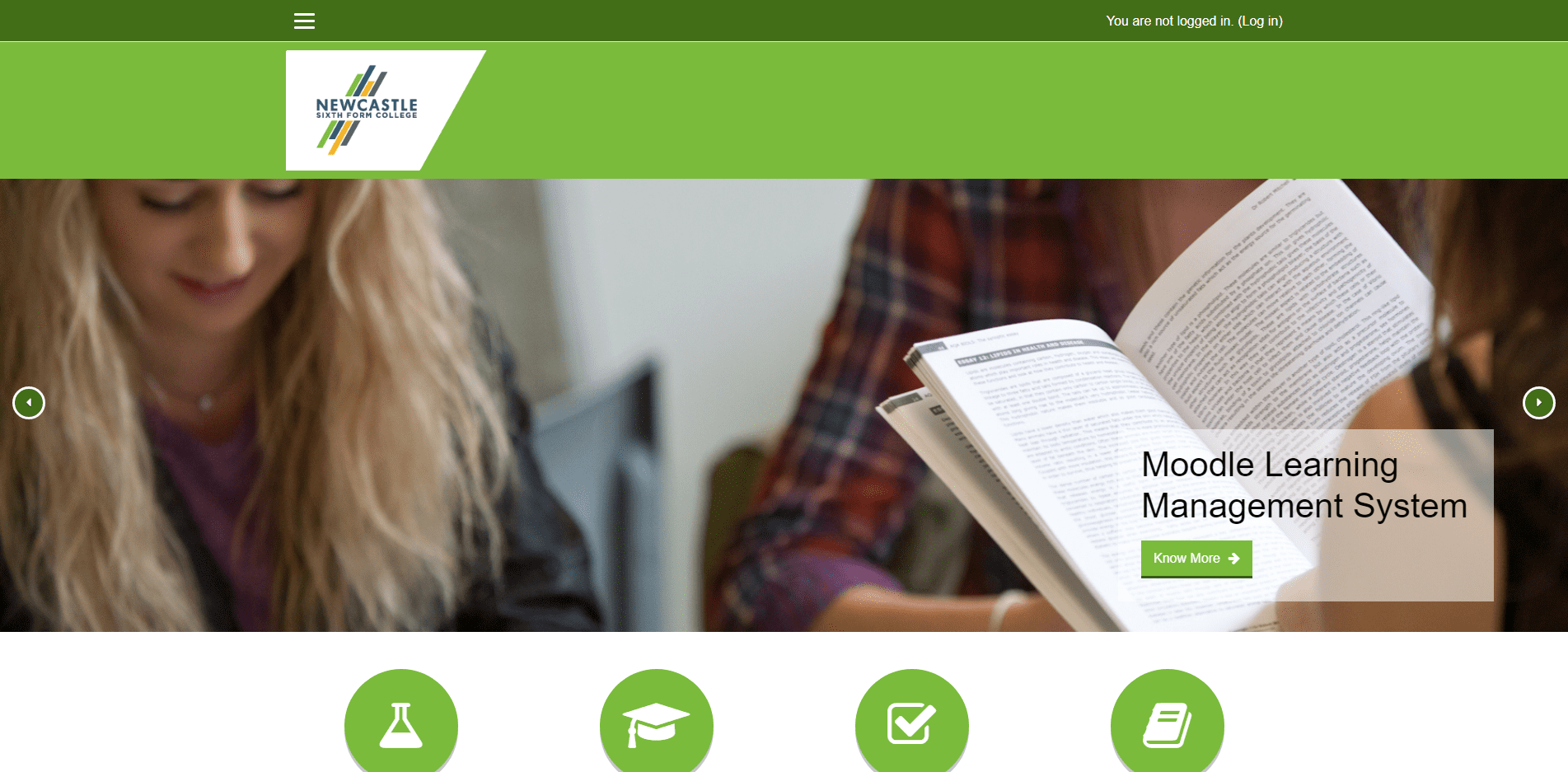
This is a really nice template layout (apologies to any designers that are building from the foundations up). The use of an outline version of the logo is great looking, and the sticky header and transition works really as well. The overlarge slider is embedded in the overall design, which makes it look fully part of the VLE. Two of the sliders, the Digital Experience Survey and the Retro Gaming & Coding Club, invite participation but the latter, a great looking part of an enrichment offer does lack a right facing caret carat ⏵ and a 'Click here to participate' call to action. ▶
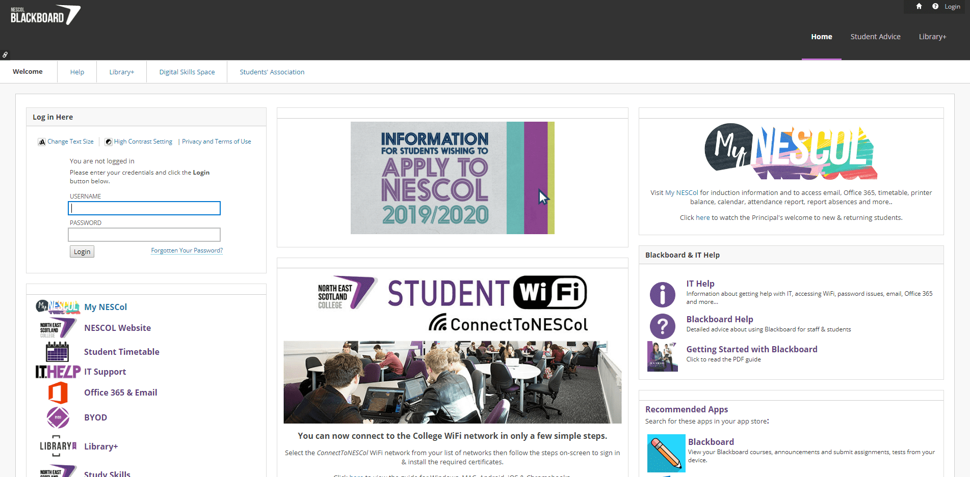
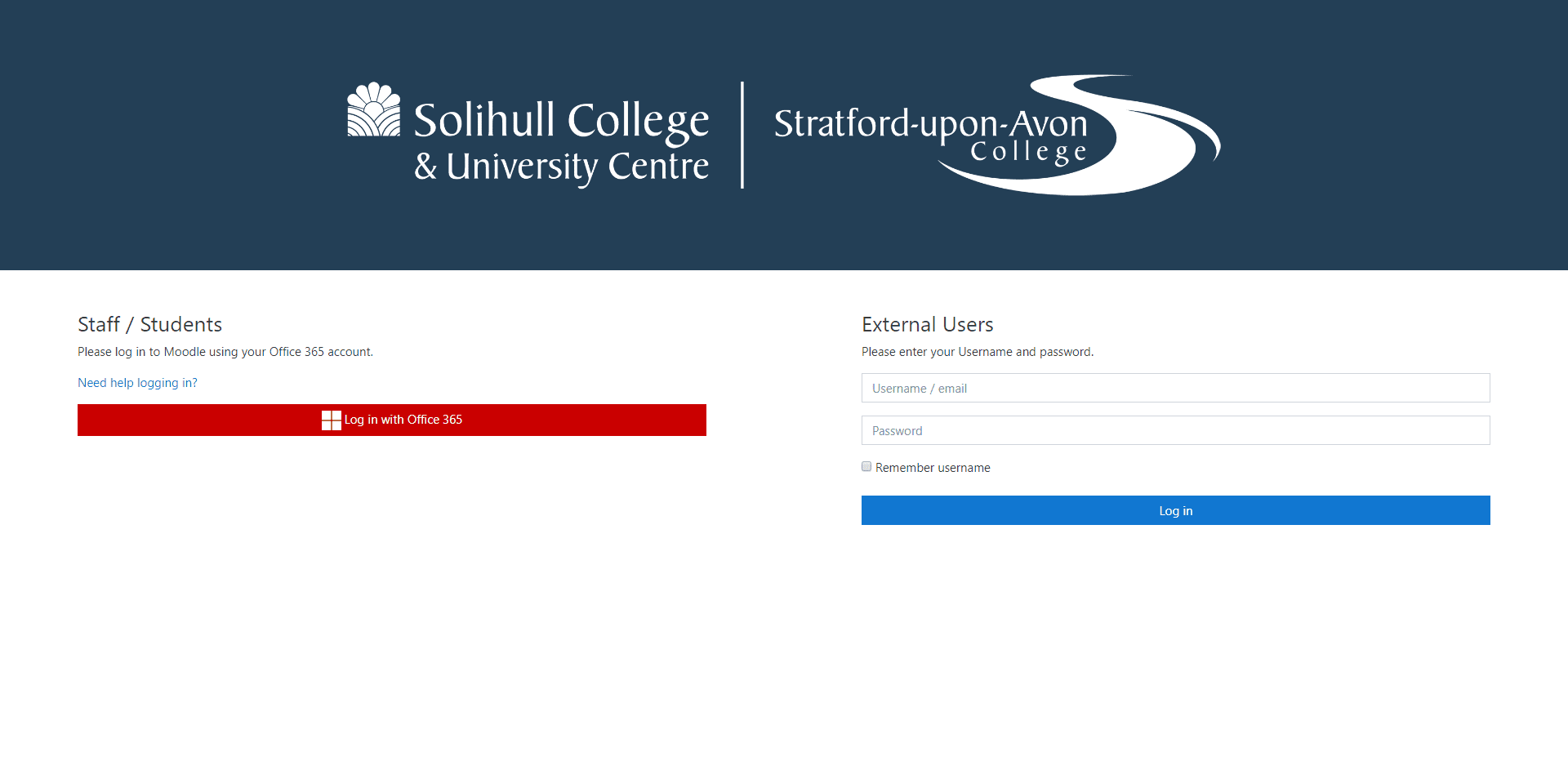
The search for a course looks great, with its popup guidance and the Need some help with Moodle contact form is great. The obvious criticism is the missing logo link and on nit-picking, why not included the email and phone number for the VLE helpdesk with the contact form as it costs nothing really does help. VLE Helpdesk: This email address is being protected from spambots. You need JavaScript enabled to view it.
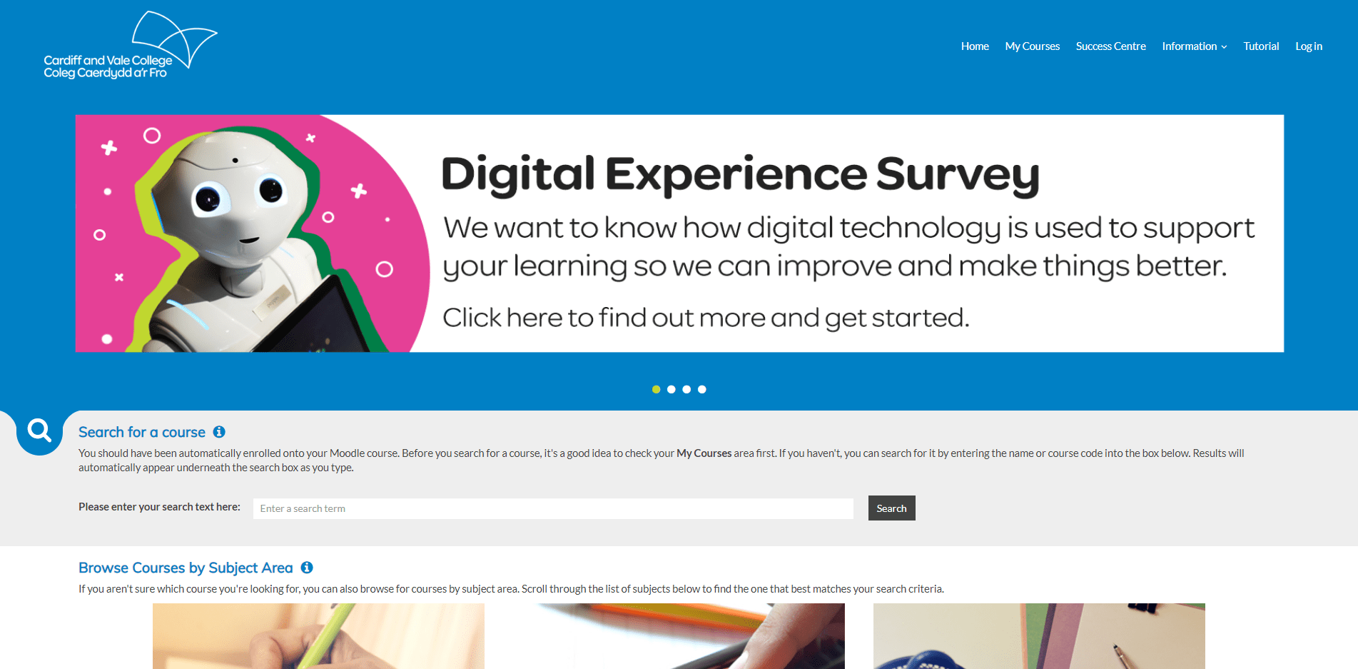
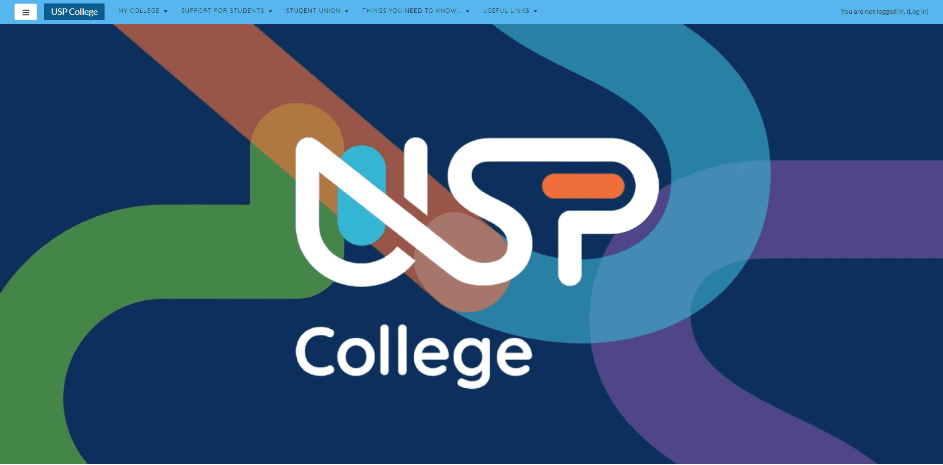
This is the first fully designed VLE. The header looks fantastic, the menu items are clear and the search field is perfectly presented. The principal software packages are listed using high quality official logos, the slider is subtle, and the tabbed content is almost absolutely perfect. Finally, in the footer there is an excellent accessibility tool.
There are no obvious criticisms but to do some nit-picking I would suggest the Events tab show a listing of events, rather than just being a direct link to an events calendar. To be really nit-picky, I would include the VLE Helpdesk contact details in the header and/or the footer, and I would use many more group portraits to illustrate the content. ▶ VLE Helpdesk: This email address is being protected from spambots. You need JavaScript enabled to view it. | 0151 2523232
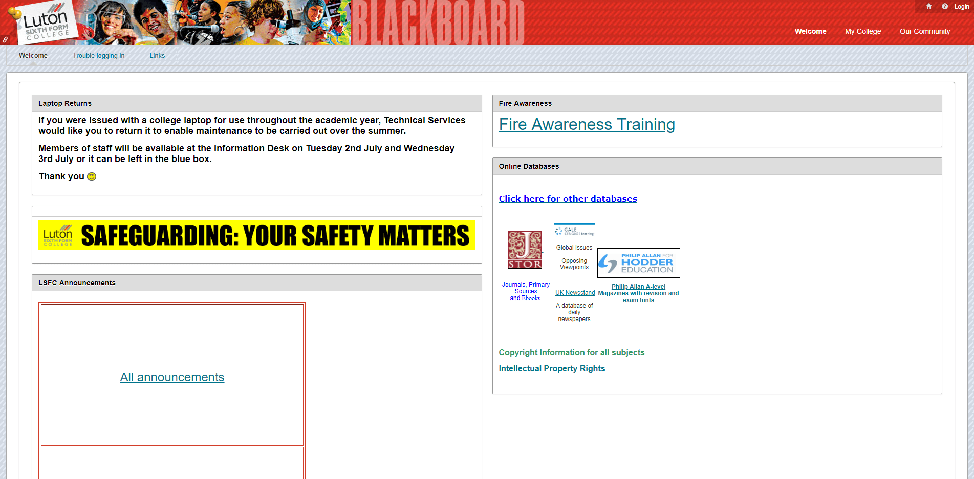
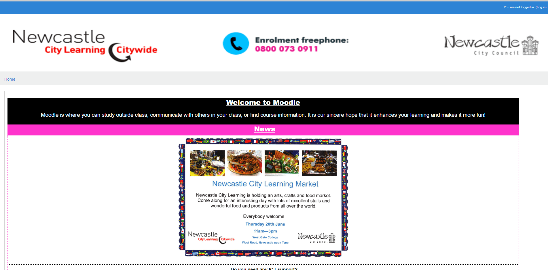
There are so many obvious criticisms of the design and content such as the underwhelming Site news | General news and announcements | (No announcements have been posted yet.), and overlooked 'This theme is Copyright (c) Webanywhere 2017', that I will focus on just one. Exclamation Marks! Please never use punctuation incorrectly! And please don't use them everywhere! Surprise, emphasis, or strong emotions only! This is part of the Level 2 English curriculum! No VLE Helpdesk Contact Details.
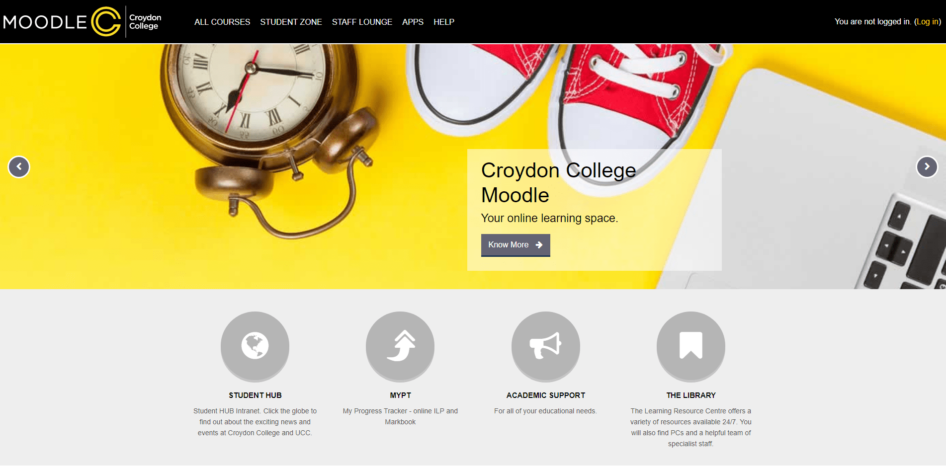
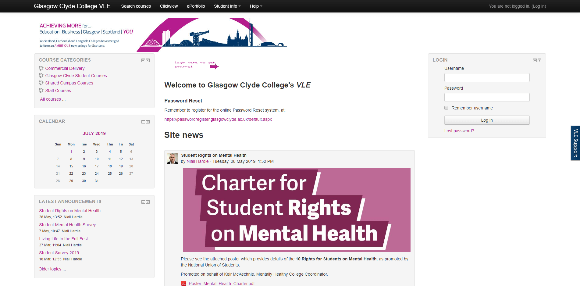
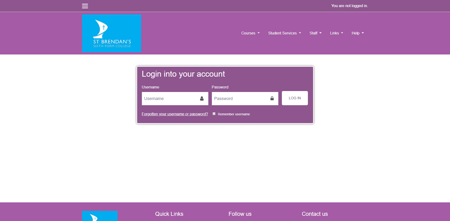
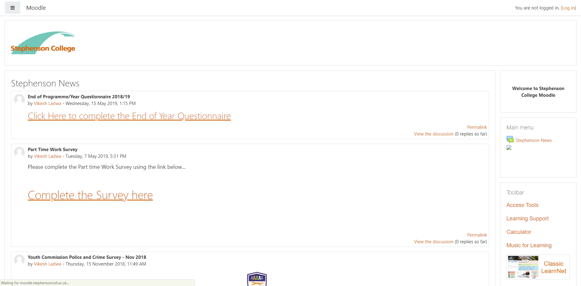
Croydon College has the most striking house styles of black and yellow, and this follows right through into the design of the VLE. It does deviate with the introduction of lots of grey but again, where the design keeps to the corporate palette it looks excellent. The integration of the corporate logo with the VLE title is great even if the 'Croydon College' text could be both larger and on one line. There is a login module below the fold but unfortunately it is placed next to a big unpopulated section of the home page; later I will refer at length on having home page login functionality in the header.
One aspect to the VLE that is outstanding is the About Us menu item that navigates to the E-Learning Team's Blog. All of the content of the blog is excellent and informative, and is certainly worth emulating. ▶
Obvious criticisms are that that first three slides, including Croydon College Moodle, Your online learning space, and Know More do not actually navigate to anything. Also, the four navigation button's backgrounds are not active with only the Font Awesome symbols being active links. One minor point is that the choice of Font Awesome character is not globe-europe. Finally, and rather importantly, there are no portrait photographs of learners presented anywhere on the VLE which can be an active choice but it would certainly make it much more engaging. VLE Helpdesk: This email address is being protected from spambots. You need JavaScript enabled to view it. | 020 86863145
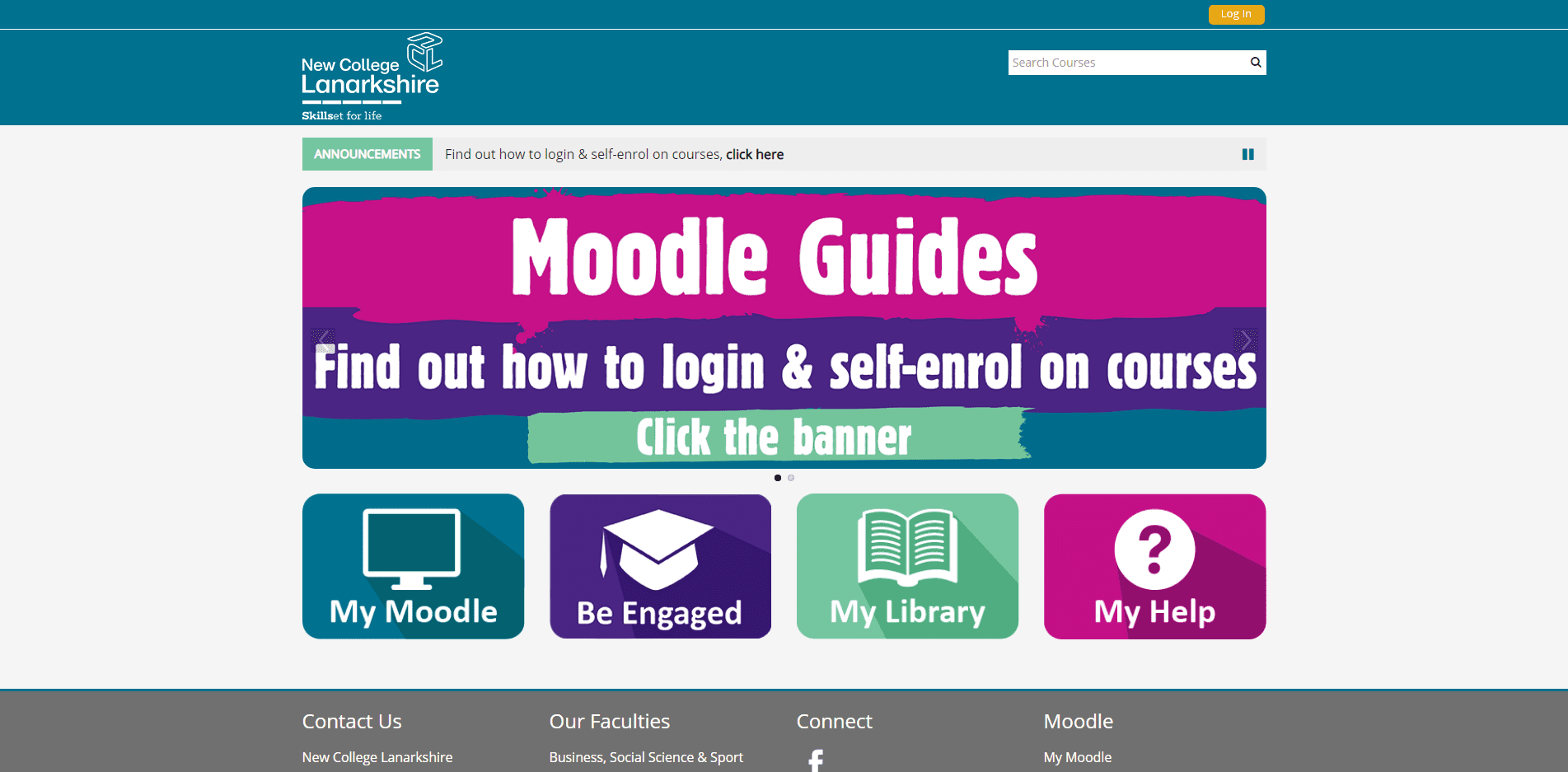
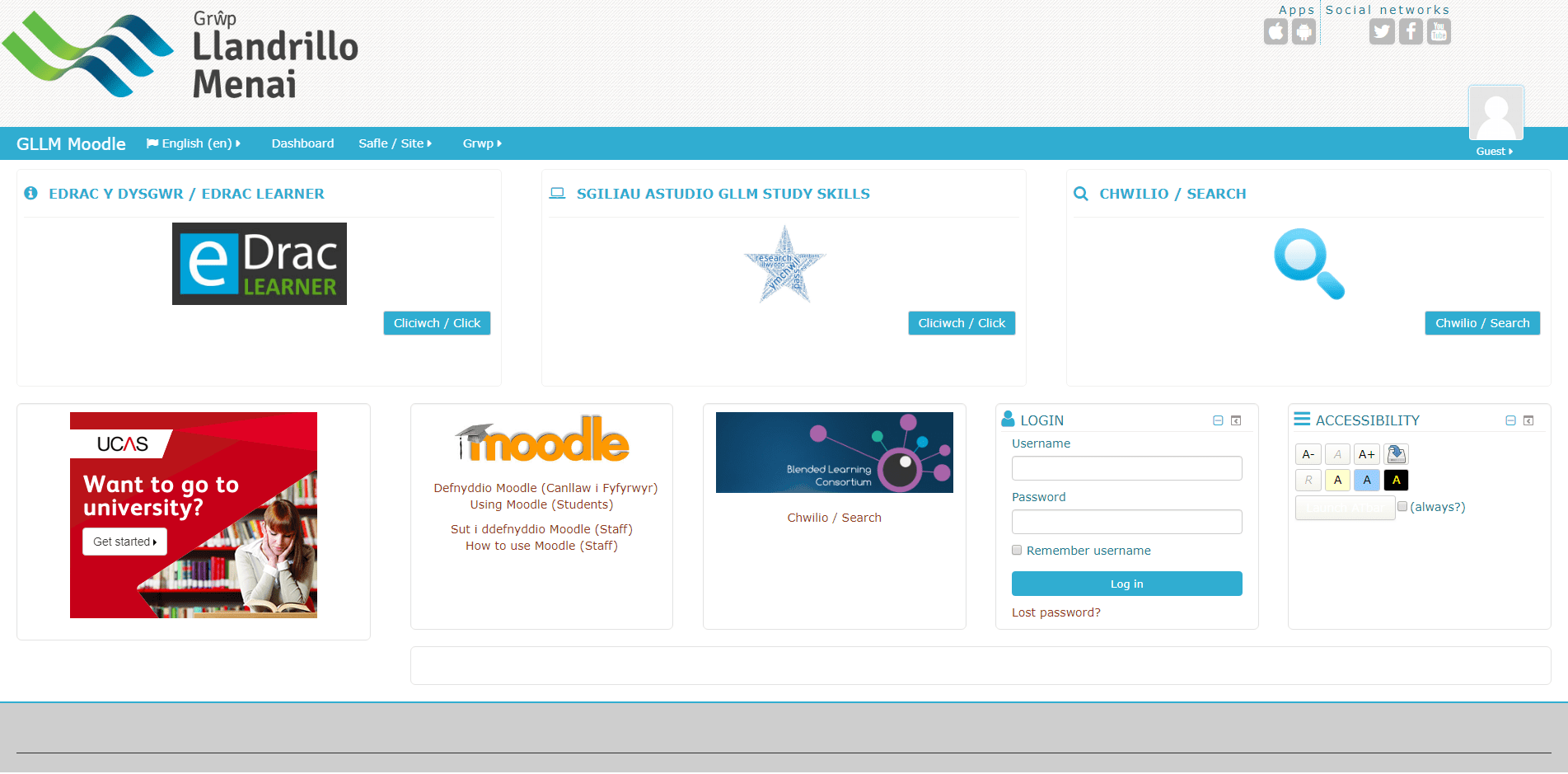
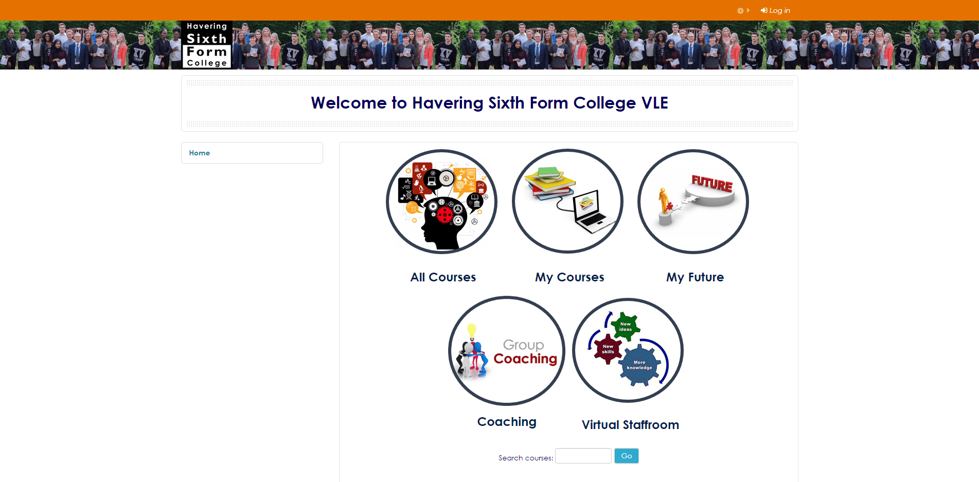
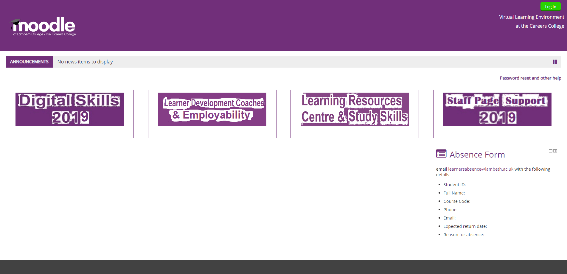
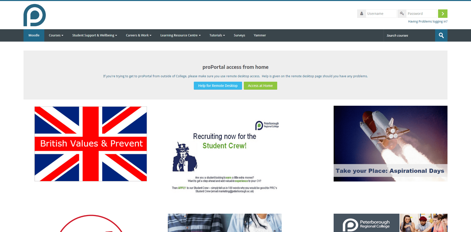
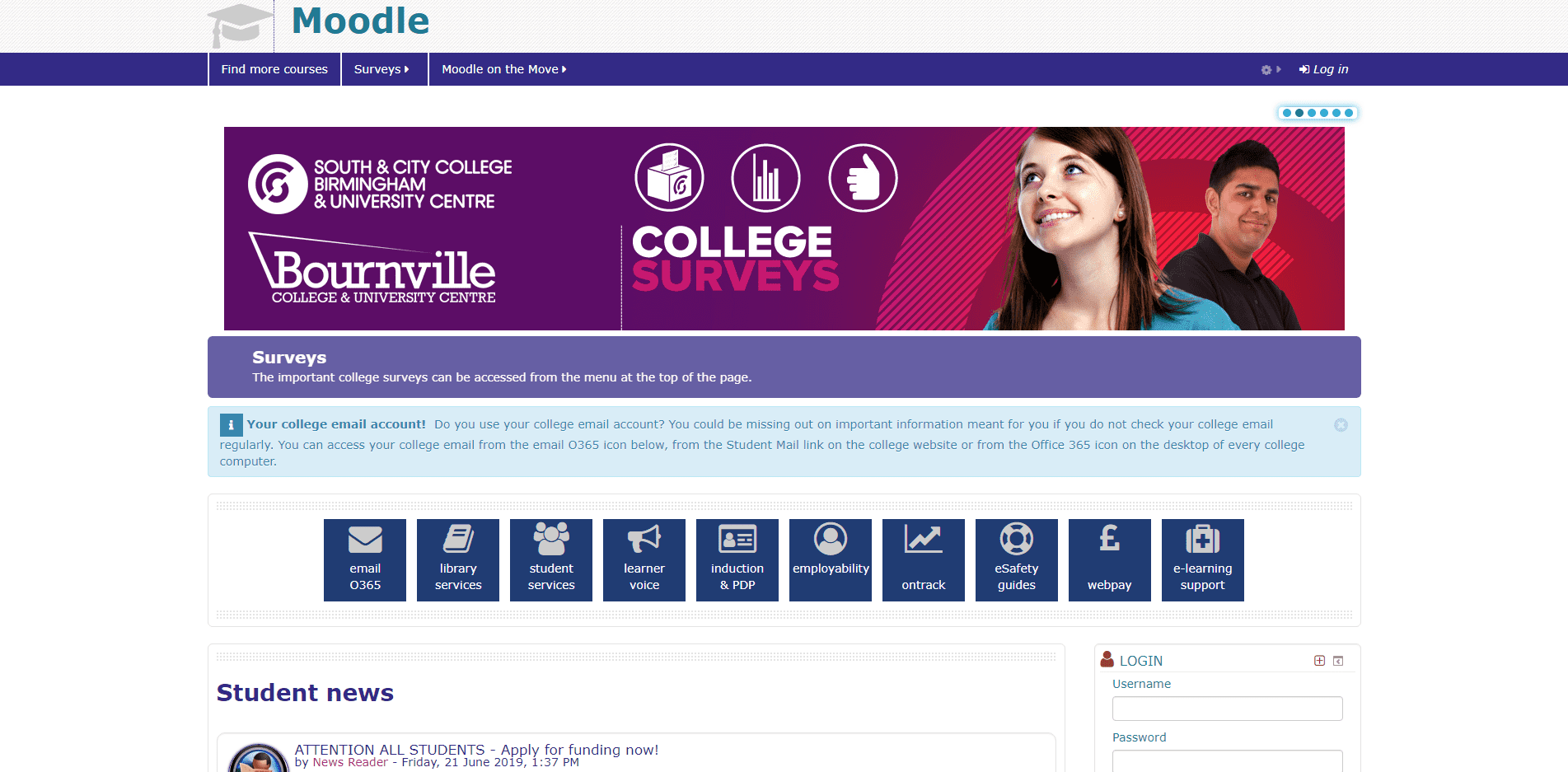
The dashboard design is really great. Using only four navigation buttons, and with a really handsome colour palette that is just in a different order to that used on the College website this is a well designed VLE. The the best feature of the VLE is the offer presented behind the navigation buttons, two of which are behind logins but if the other two, My Library and My Help, are anything to go by they are as equally fully developed: The Library & Learning Centres dashboard is almost as good as it gets, packed with guidance that is only let down by not being built using HTML. Then there is the E-Learning Guides, navigated to from My Help. This is a full YouTube channel of guidance on the Moodle VLE and Turnitin facilitate participation and set a great example of best practice.
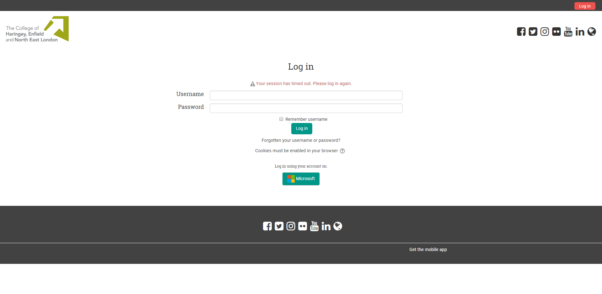
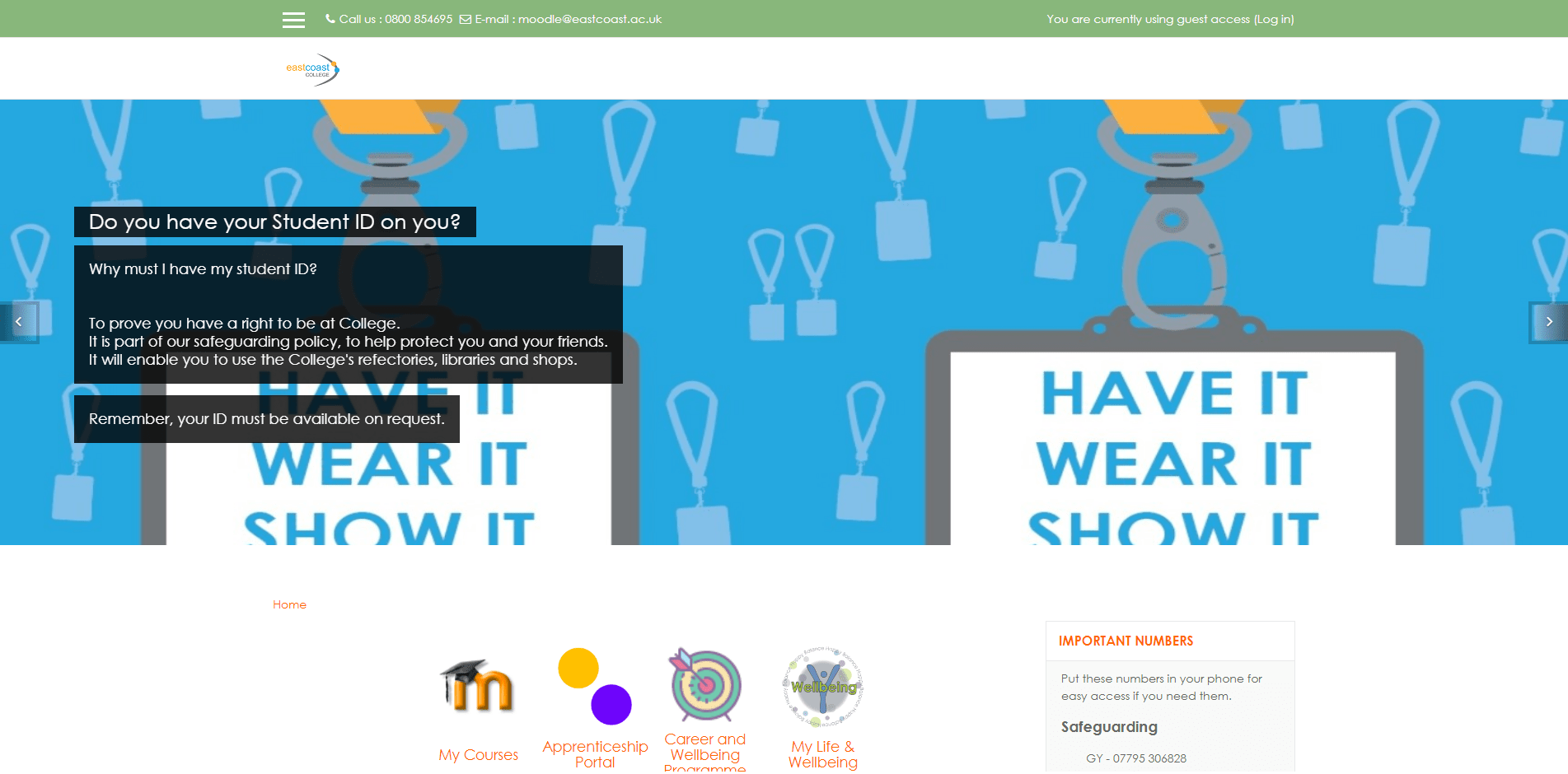
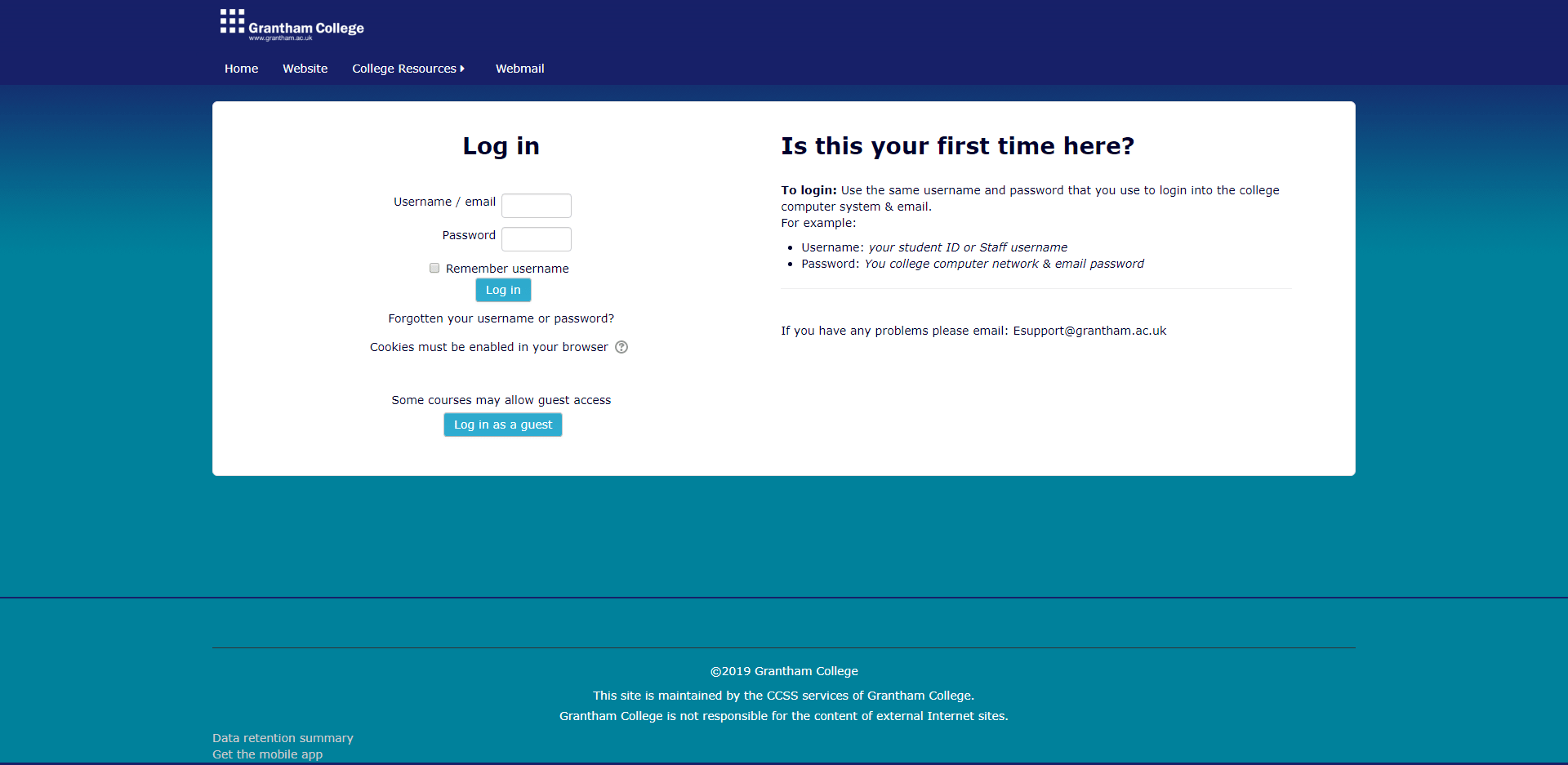
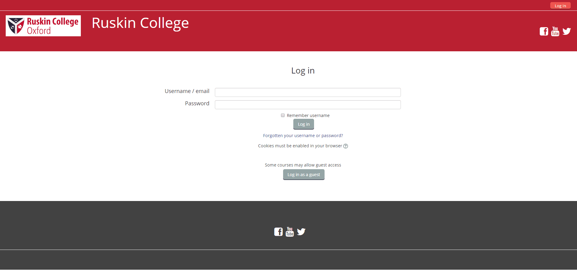
The obvious criticism, is super nit-picky but uniquely among UK College VLEs New College Lanarkshire is hosted offshore by Enovation Solutions in Dublin. Its not a bad thing, just mildly discordant to have a .ie top level domain https://ncuk.learnonline.ie/. No VLE Helpdesk Contact Details.
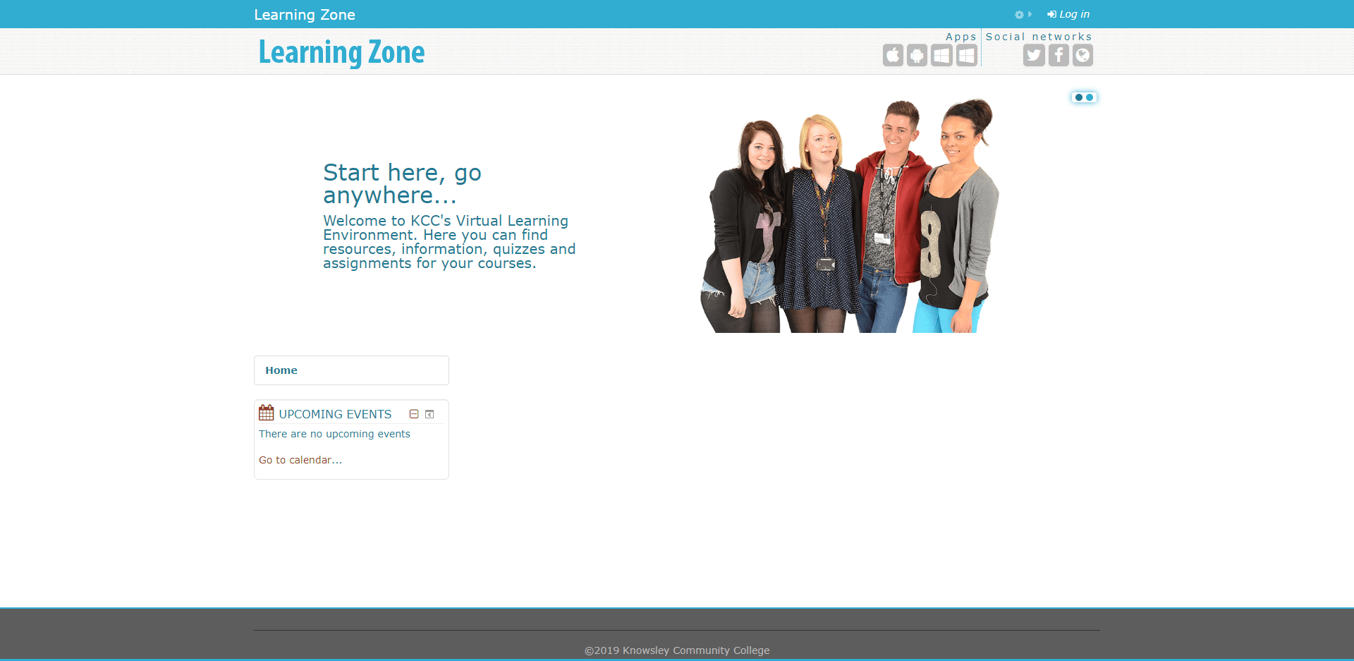
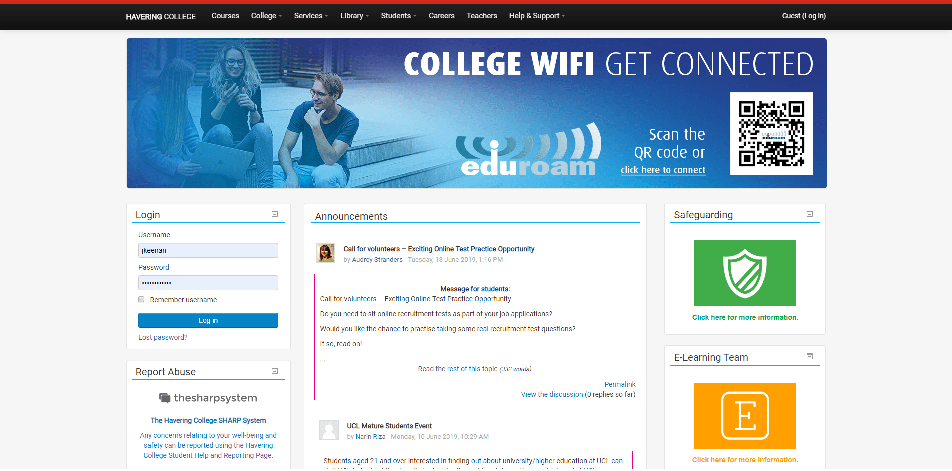
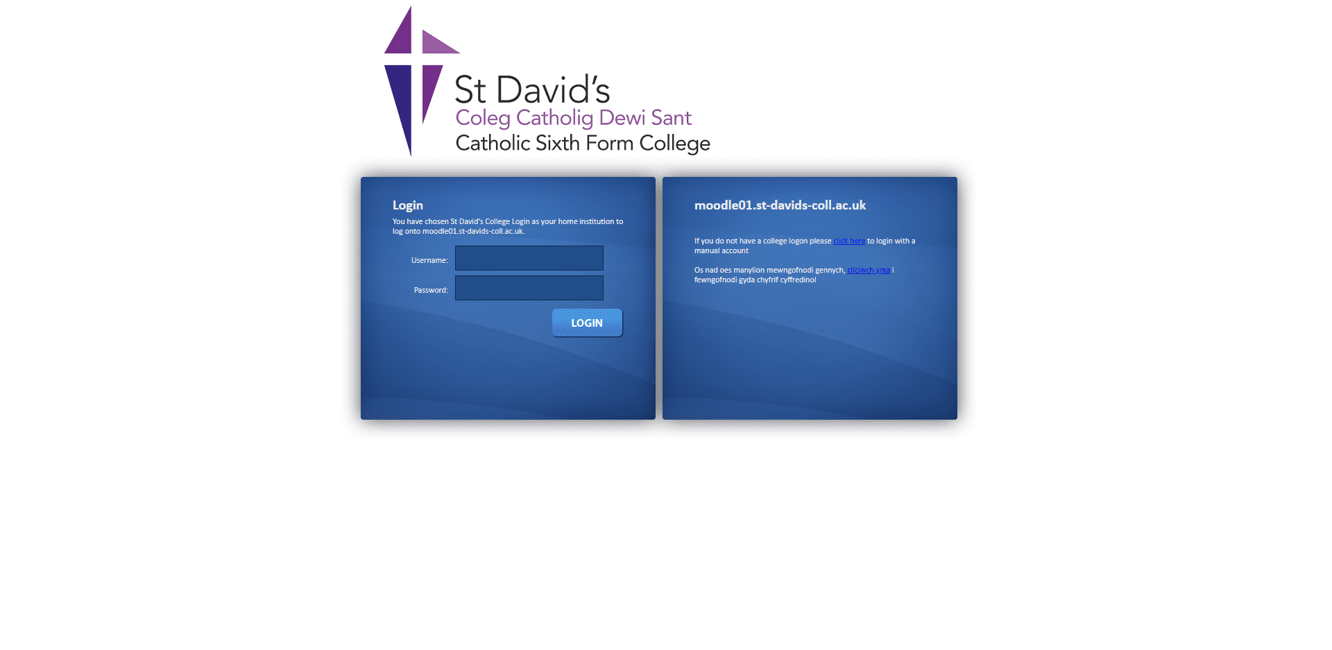
Unique among all UK College VLEs is an embedded login interface. It seems so blindingly obvious when it is pointed out but it negates all login pages, all navigation to a login pages, and login modules presented below the fold. It is given its proper status in the header, appears on every page, and is only really missing the guidance or link to the Forgotten Password form. It is so easy to activate the header login interface in the setting of the Moodle VLE. The contact details for the VLE Helpdesk are also the best and could only be more clear if they were bumped up to the header.
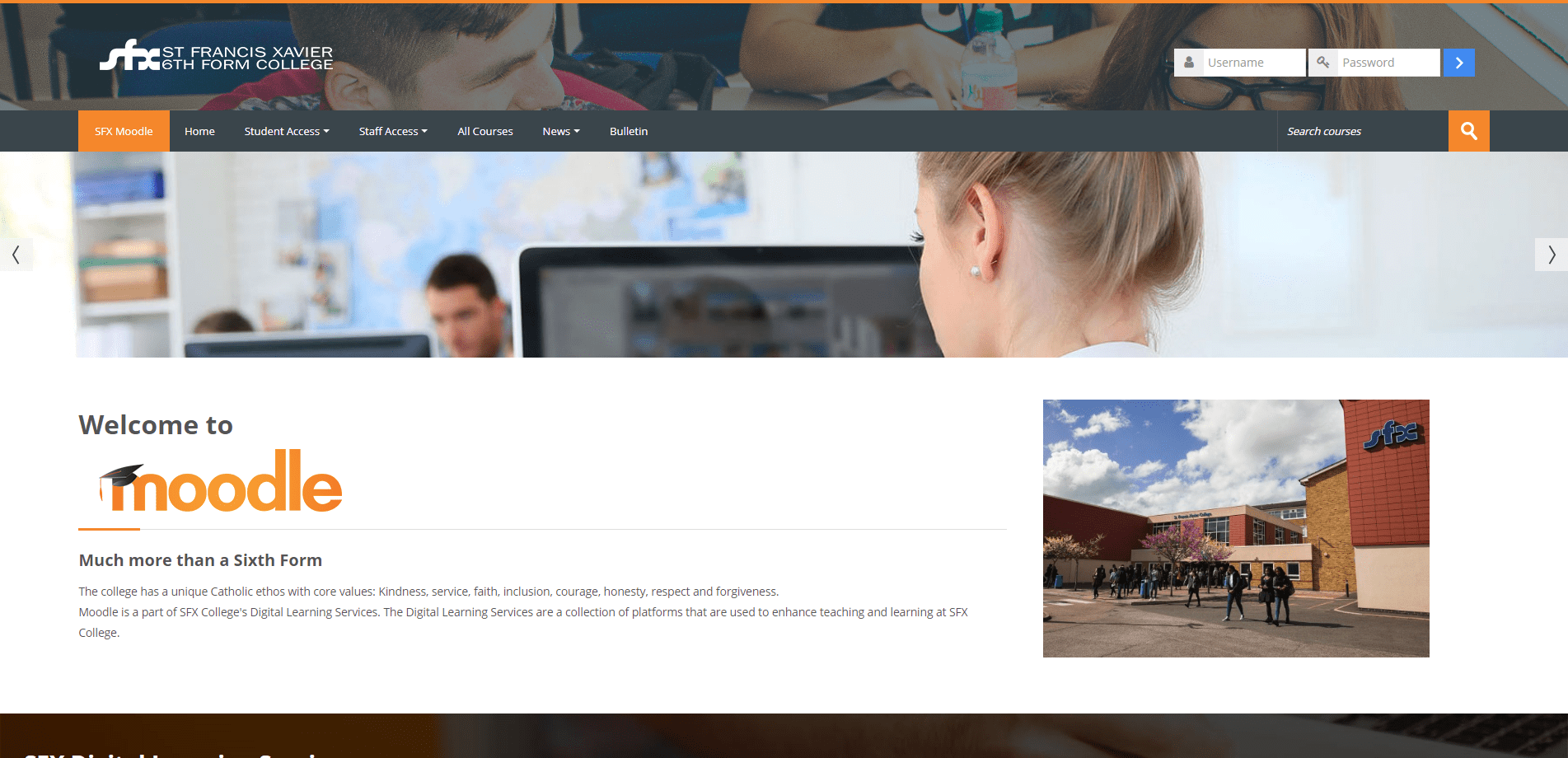
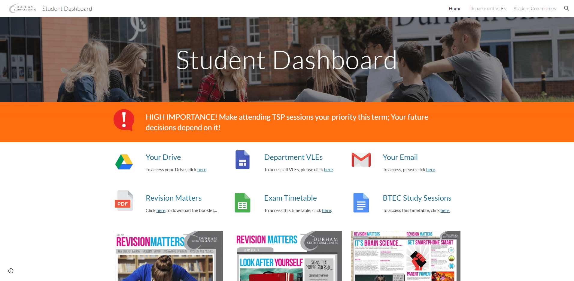
I don't want to point out the obvious criticism because these two aspects put Saint Francis Xavier Sixth Form College so far ahead of all other College VLEs that if feels churlish but, the dashboard design is fine but located below the fold. And calendar modules mostly look very empty whereas lists of events show all events including ones many months in advance. VLE Helpdesk: This email address is being protected from spambots. You need JavaScript enabled to view it. | 020 87726451
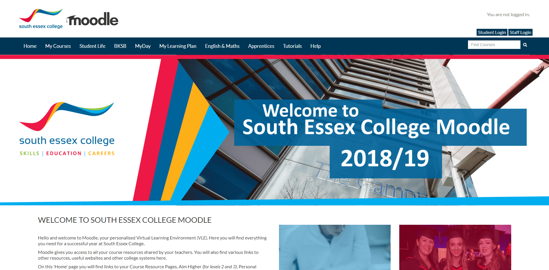
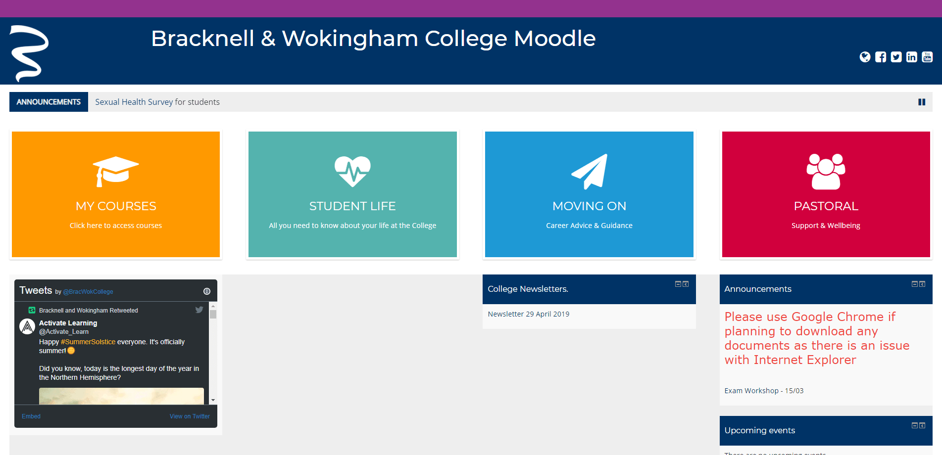
South Essex College's VLE has a great colour palette and, for as much as the body of navigation buttons and messaging is bumped down to below the fold by a single slide slider with an inactive link, it looks great. The one exemplary feature to note is the font sizes. Having big chunky font sizes for body text (16px) and the header menu items (17px) is an excellent way to maintain with equality of access. The offcanvas menu items drop down to 14px and of mild interest the South Essex College website has 16px for body and header menu items.
The obvious criticism has been pointed out already but I would also suggest that duplicating the logo is never good, the bold version isn't as handsome as the official logo, and the black version of the Moodle logo looks tacked on rather than designed to be integrated. Also, in the footer the Webanywhere Ltd. logo and template credit could be removed, or at least hyperlink to their website. VLE Helpdesk: This email address is being protected from spambots. You need JavaScript enabled to view it.
This is the by far the best designed VLE dashboard. Despite the clunky, undersized and inconsistent graphic elements, arbitrary fonts and font sizes, and all the broken links, this VLE shows that simple, well designed, and above the fold interfaces, are the best. In the responsive version it also slightly breaks down, but again, it still looks outstanding. The similarity to the design style of Microsoft menus is a great example of emulating an example of best practice. ▶
All the obvious criticisms, such as the very out of date news, the message below the fold 'There are no discussion topics yet in this forum', the absence of any pre-login support, no explanation provided for each button on hover, or anywhere else, can not dent the effectiveness of this VLE's great looking design. I would also include all of the social media buttons which uniquely among VLE home pages, are missing. No VLE Helpdesk Contact Details.
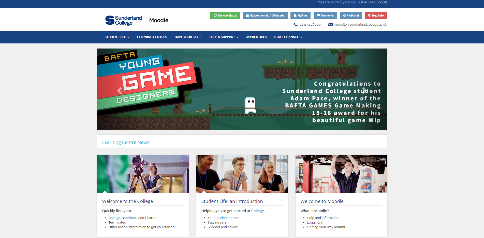
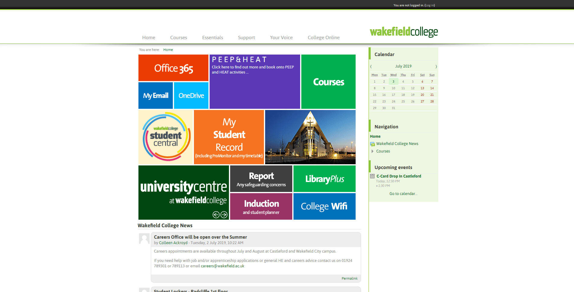
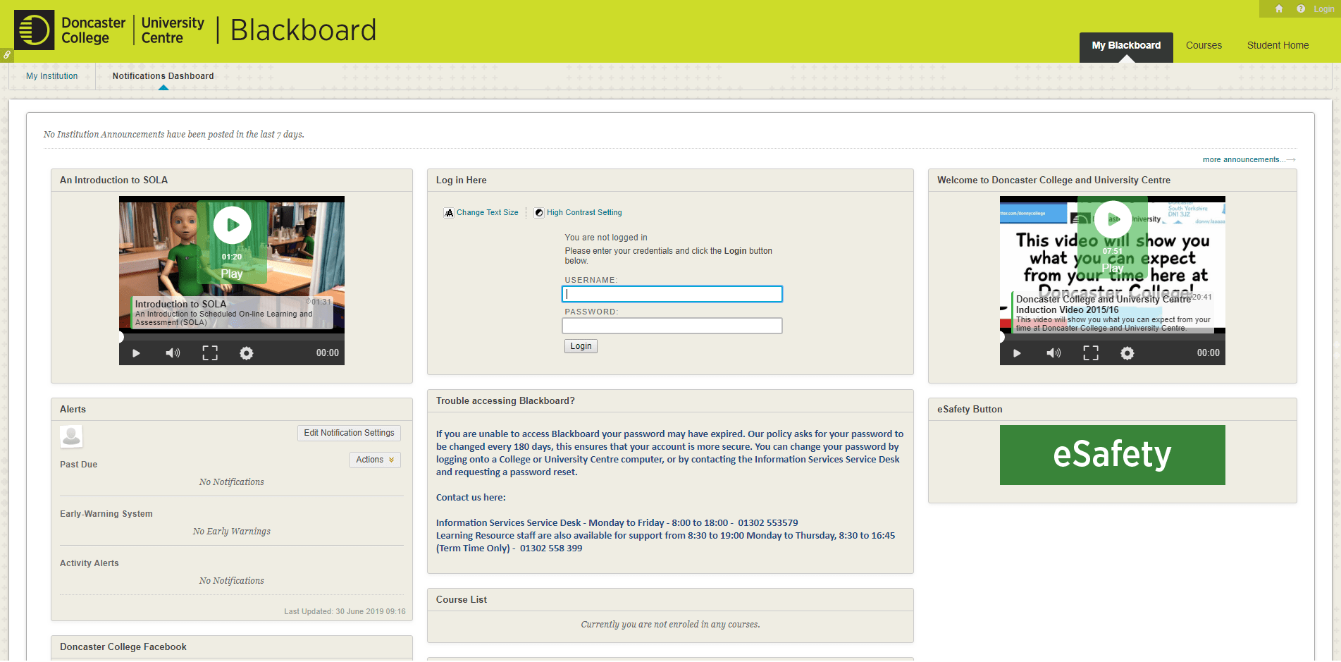
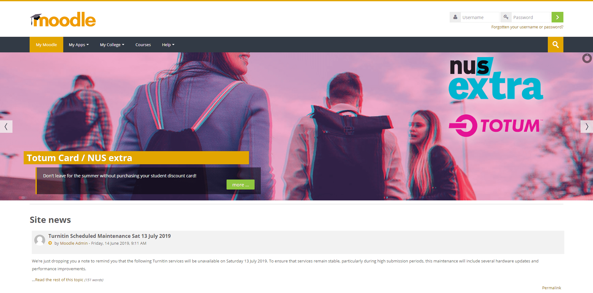
Overall Sunderland College's VLE is the most fully designed and technically developed currently provided in the UK. It includes contact details in the header, a fully loaded offer, and a great flourish of a 12-second video loop in the slider. Admittedly, the link is to a personal Twitter feed instead of an enrichment/informal education offer or to the BAFTA Young Games Designers website, but even so, one short looped video demonstrates an inspiring technical authority and is really confidence building. ▶
An obvious criticism is font size, which gets all the way down to 'font-size: 8pt !important'. Also sliders are bad generally because all the messaging presented on secondary slides are hidden. Having ten slides is a bad decision and completely pointless, especially so when they contain many great messages and there is so much space on teh home page to populate. One final issue, there should never be an footer empty of content and 'Upcoming events: There are no upcoming events' is instantly dispiriting. VLE Helpdesk: This email address is being protected from spambots. You need JavaScript enabled to view it. | 0191 5116000
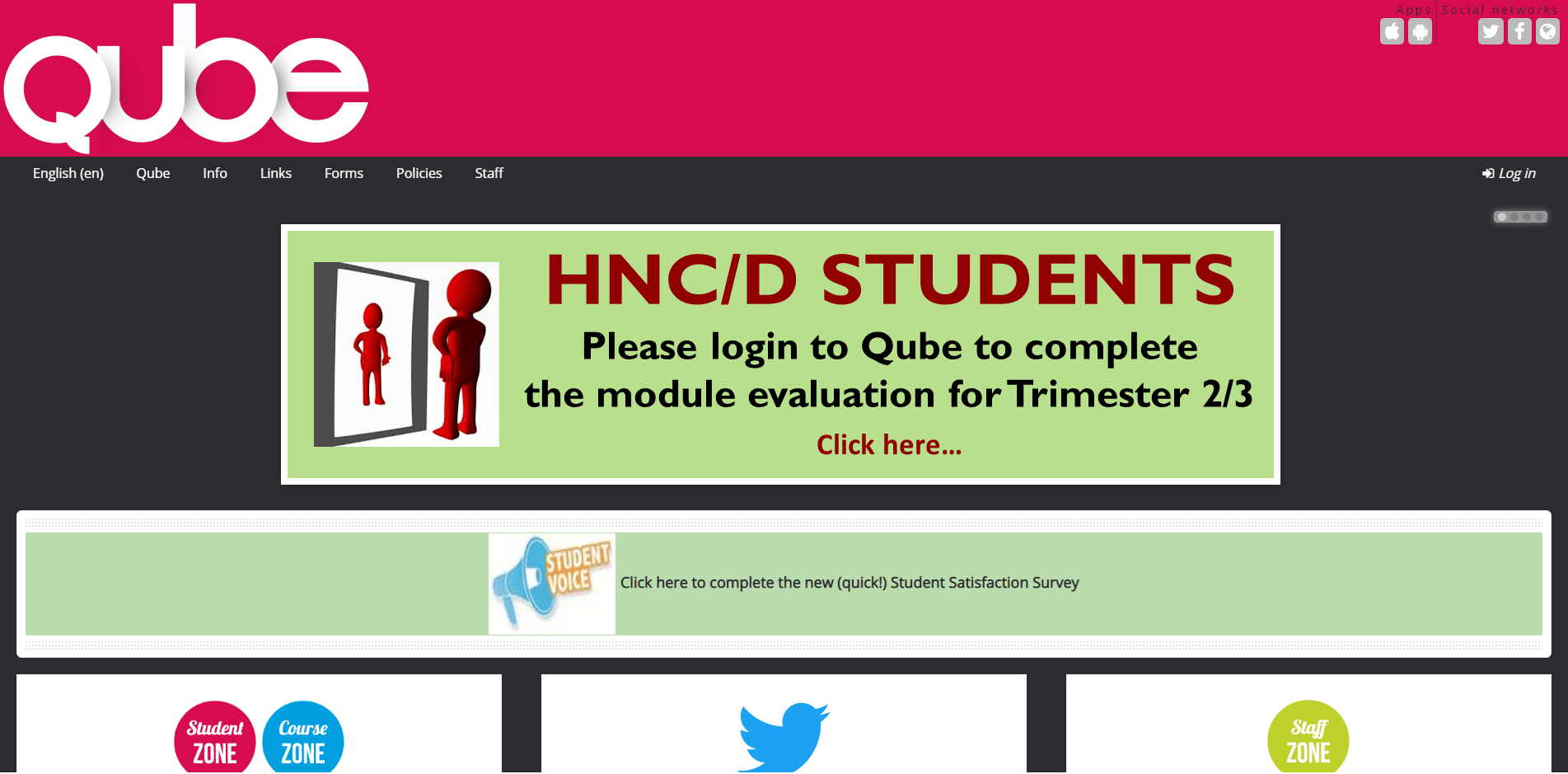
Okay, so there are many issues with this VLE that I will park them to just focus on the USP! It really is a Unique Selling Proposition that a six second autoplay video loop is used a background. That said, it actually looks really good. ▶ The obvious criticisms are that the VLE is not responsive and that the offcanvas menu is completely unpopulated so that when the VLE is viewed on a phone, it is without navigation. There are so many other obvious criticisms with the design and operation of this VLE that are listed in the obvious criticisms of the other examples provided here, but that said, and don't shoot the messenger, it subjectively looks very good. The USP VLE is a great example of large impact statement design and mostly override the underdevelopment and unresponsiveness. No VLE Helpdesk Contact Details.
This is the most fully developed VLE dashboard design, and this makes it a real shame that it isn't at all responsive. The VLE almost perfectly emulates the discontinued Windows Phone Operating System start menu, even using the same colour palette. It looses a great deal by seeding space to a right column of calendar and event listing modules, and the widths of each button is arbitrary, as is the colour selection.
Unfortunately, obvious criticisms abound with a logo that does not link to the home page, font sizes that get all the way down to x-small, no support contact details this side of logging in, an unresponsive template and an inconsistent design. But again, the dashboard design makes up for almost all of these major design issues. No VLE Helpdesk Contact Details.
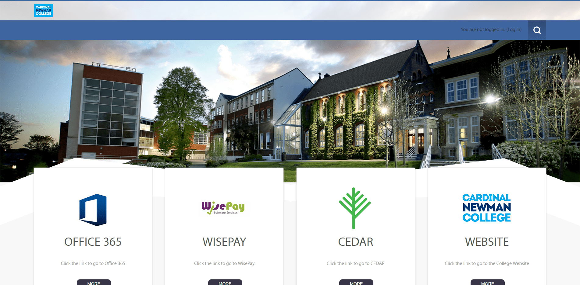
Wow. From the rather dull Maker template comes the very best looking VLE in the UK. This is most surprising since the 980px width College website is uniquely based on Wix rather than any of the industry standard propitiatory or opensource website CMSs. The palette is outstanding, the layout and design are almost perfect, and the only real issue is an absence of project completion. One small project would make this by every criteria, the very best VLE in the UK and not simply the best looking. The logo integrates the VLE title perfectly, taking full advantage of the similarity of the Moodle logo font and the font used by the College. The design choices are subtle, with the red section presenting a handsome linear gradient from #e51a2f to #e60065 that subtly attracts the attention of visitors.
There are lots of obvious criticisms of an incomplete project; an empty offcanvas menu, missing contact details, missing HTML or Font Awesome right facing caret icons in the call to actions '⏵More info here' , external links overwriting the VLE by opening in the same tab, and the absence of illustrative portrait images. ▶ But, then the use of the excellent Lightning Bolt icon for Student Action is absolutely inspired, and great design almost completely negates every single criticism. No VLE Helpdesk Contact Details.
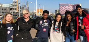
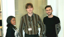
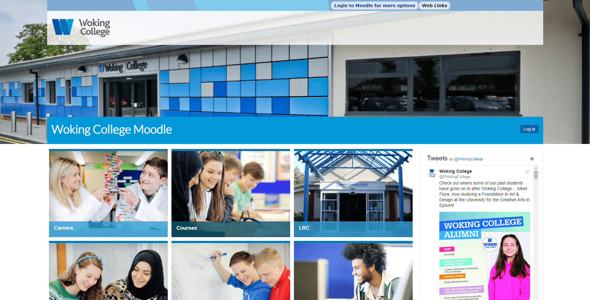
Of the nine navigation buttons on this VLE dashboard design, eight include handsome learners portraits, with seven featuring groups portraits of smiling, tactile young people. ▶ Integrating architectural features into the header is a very nice touch and the prominent presence of blue in almost all images is again very nice.
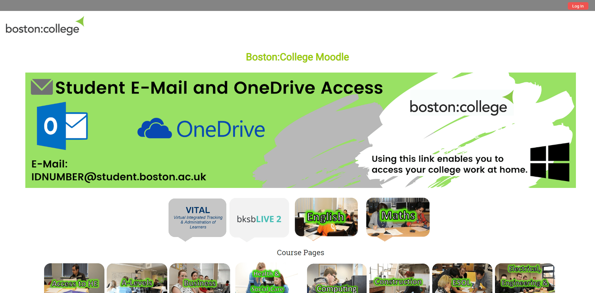
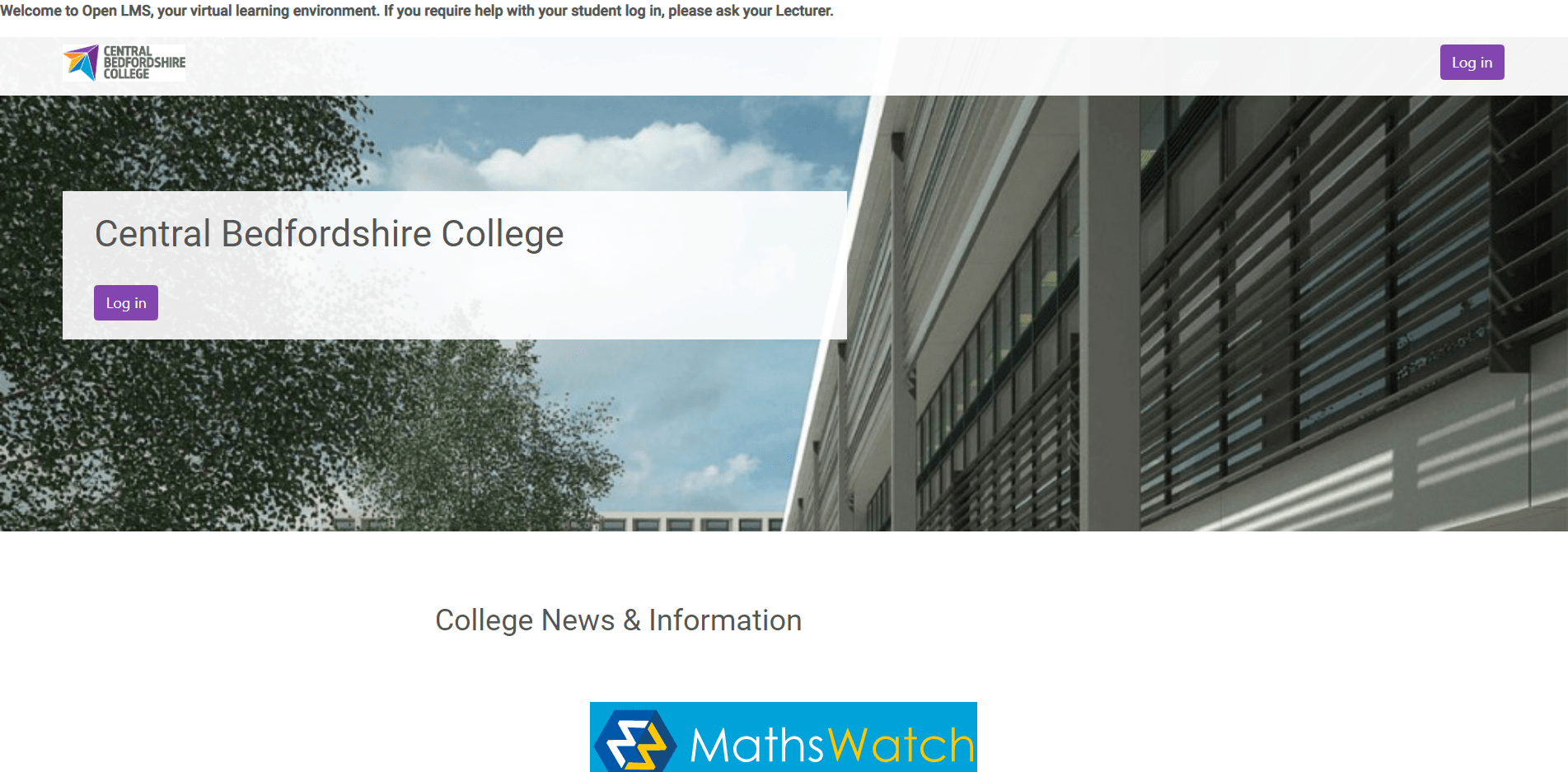
All obvious criticisms are limited to the completion and optimisation of a simple but really effectively designed VLE. The simple header menu is in need of a refresh as it features a menu item linking to Google. The header image titled 'IMG_4494-1357x452.jpg' is has too low a resolution for for FHD. Also, an image captured on a cloudy day, featuring the reflection of the photographer can be iteratively improved upon. It is an odd layout to repeat why repeat the text Woking College, and then why not simply remove the text from the logo? It is a shame the dashboard display is not entirely above the fold, even if it does obscure the header image, but then FAQ does feature the best answer, coined by Douglas Adams, for all questions presented by learners: 'Q. Why is my course average so low? A. Don't panic!' VLE Helpdesk: This email address is being protected from spambots. You need JavaScript enabled to view it.
The Conclusion, or 15 Quick, Technically Straightforward and Low/No Cost Development Project Goals
Change the Home Page viewing privilege to Public/Guest and have inbound links on the website directed to this Home Page.
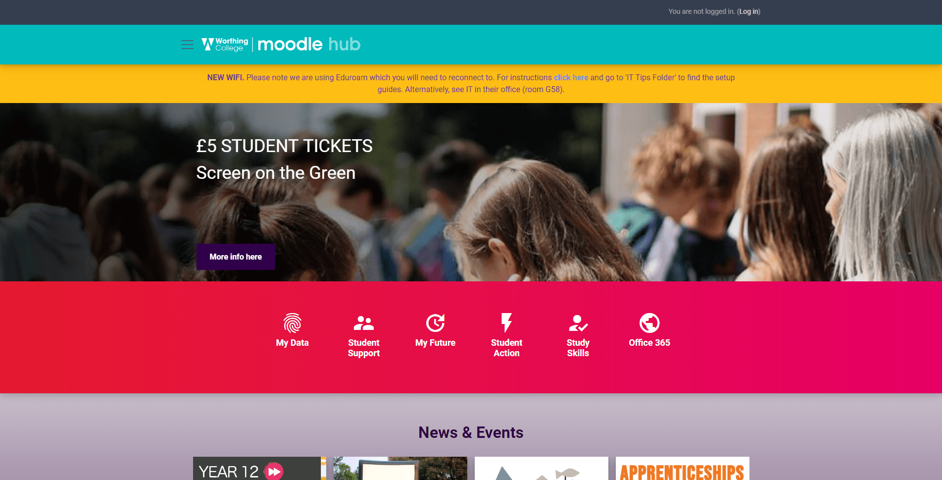
Upload a proper VLE Template. Its free, or costs no more than £30 and then calibrate the settings, it is really straightforward. (See Worthing College)
Create a grid of navigation buttons that link to the main VLE content and systems, ensuring that they are all visible above the fold. (See Suffolk One Sixth Form College)
Present set of navigation buttons and a header menu. (See Sunderland College)
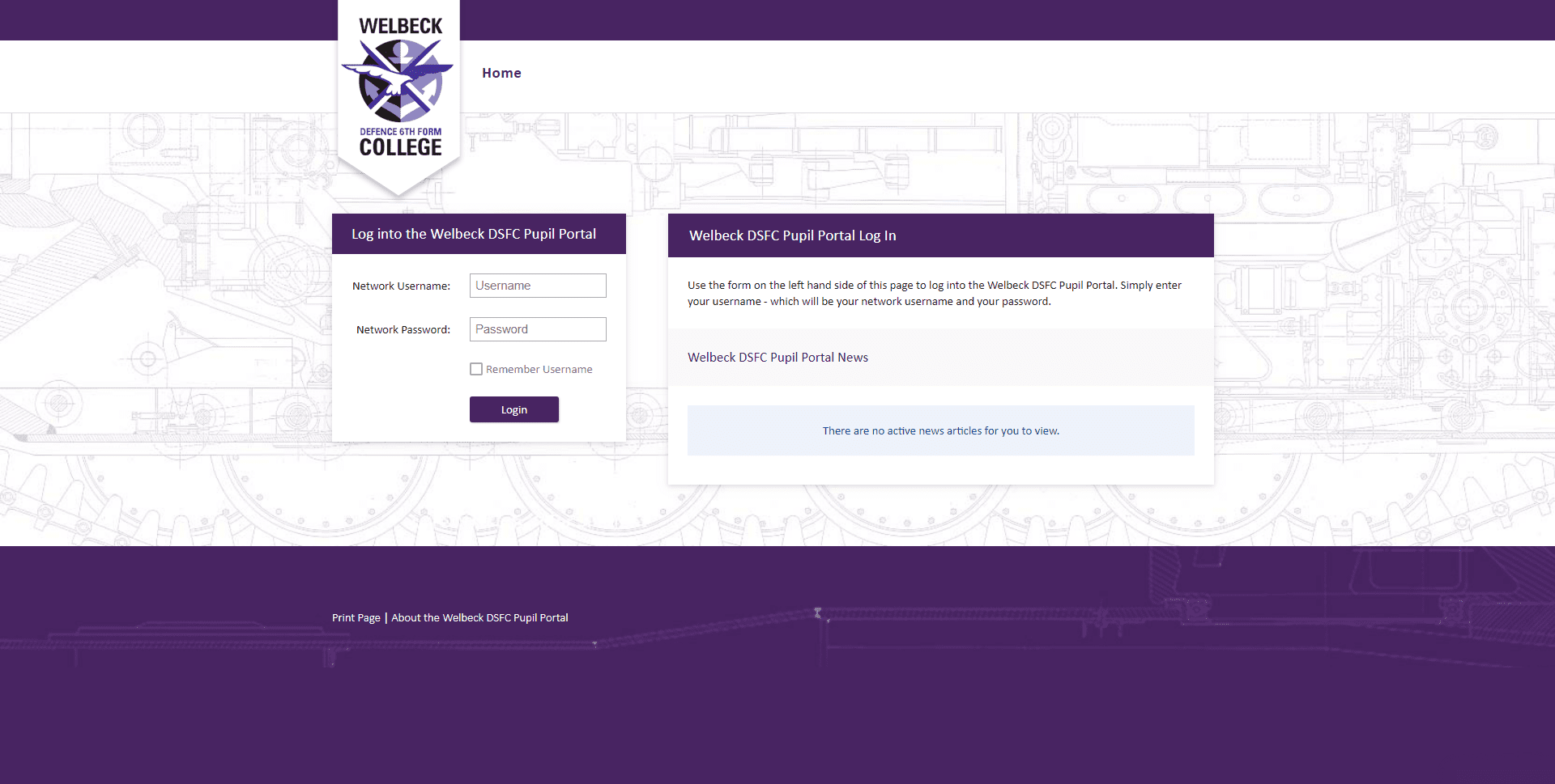
Feature the E-Learning Team and VLE Helpdesk contact details in the header and/or footer, and even develop a blog and present personal biographies. (See Croydon College)
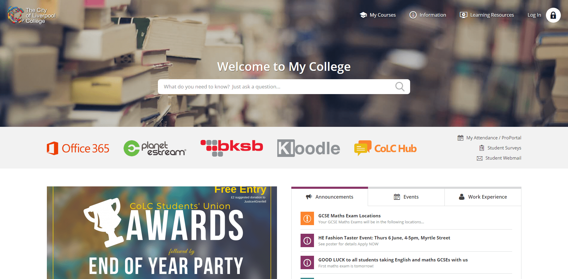
Create an Events Module that lists events rather than present a monthly calendar. (See the recommendation for City of Liverpool College)
Use all of the logos as navigation buttons linking to the various tools and portals, ensuring that all image files are PNG, that they have a mouseover effect, and - this is basic SEO - are not named logo1.png (See the recommendation for City of Liverpool College)
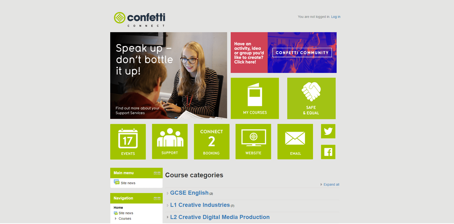
Create call to action modules and contact forms that prompt learners to access both the full learner support offer and the support available for them to initiate their own enrichment activities. (See Confetti Institute)
Add a montage video flourish, preferably featuring only learners, but cute animation is also super effective. (See Sunderland College)
Ensure minimum font size is at least 16px.
Schedule regular learner photoshoots, comply with GDPR, collate all participants' names, and title all images positively and not students1.jpg. Groups are best for desktops and smartphones. (See Woking College)
Add images of learners to all dashboard navigation buttons, maybe producing three times as many as needed and refreshing them regularly. (See Woking College)
(For Completely Different Reasons) The Best 18 FE/6F/AE College Virtual Learning Environments